

Japandi vs. Scandinavian Wall Art: Similar Calm, Different Character
A calm-source guide
Similar calm. Different character.
Japandi-leaning and Scandinavian-leaning wall art can share pale wood, restrained color, and open space. The useful distinction is not nationality by palette. It is the way the image produces calm.
Quick answer: choose a Japandi-leaning work when the room needs grounded material tension and an active pause. Choose a Scandinavian-leaning work when it needs clearer shape, light, or graphic rhythm. If both descriptions fit, identify the dominant source of calm and let the other become a supporting signal.
Do not shop the label first
“Japandi” is a contemporary hybrid label, not an authenticity certificate. “Scandinavian” names a broad design region and history, not one visual formula. A canvas does not become Japanese because it contains beige brush texture, and it does not become Scandinavian because it uses pale blue circles. Start with what is visible: edges, marks, open areas, repetition, visual weight, and the way those signals meet the room.
The stereotype also fails in both directions. Scandinavian modernism can be soft and organic: Cooper Hewitt describes Swedish designer Ingeborg Lundin’s postwar glass as part of a “softer, organic” modernism whose simple form works through light rather than ornament. Japanese works can be precise, graphic, richly colored, or densely patterned. These histories are larger than a shopping shorthand. Use style names as orientation, then make the room decision from the artwork itself. Cooper Hewitt’s object essay is a useful guard against equating Scandinavian character with rigid geometry.
Find the source of calm
The Artesty TRACE / INTERVAL / PULSE / RELIEF register is a practical editorial tool, not a standardized design classification. It avoids a score. The first strong conflict with the room can eliminate a candidate; the remaining signals explain why the survivor works.
Japandi-leaning: residue, fading, irregular pressure, a visible correction, or an edge that feels handled.
Scandinavian-leaning: clear silhouette, legible color field, or an organic shape whose boundary remains easy to read.
An open area carries weight. It may suggest mist, paper, distance, or a pause that balances a darker mass.
An open field resets the eye and keeps separate forms bright, distinct, and breathable.
The eye slows around one asymmetry, interruption, or concentrated event.
The eye follows repeat, alternation, stepped color, or several related shapes.
Often useful when the room feels slick, evenly lit, or visually anonymous.
Often useful when the room feels heavy, low-contrast, or materially dense.
Interval is not merely “unused background.” In The Met’s description of Irie Shikai’s Ink Landscape, dark washes contrast with blank space that represents water and sky. The quiet area does compositional work. That example does not create a universal Japandi rule; it shows why you should ask what an open field represents and balances rather than count how much blank space remains. See The Met’s object record.
Read the four signals in order, but do not force them into two sealed columns. A Scandinavian-leaning work may have a soft handmade-looking edge; a Japandi-leaning work may contain a crisp circle. The question is which device controls the encounter. Cover the small accent shapes with a sheet of paper or a simple digital crop. If the work still reads through one interrupted mass and a charged open field, TRACE and INTERVAL lead. If removing the repeated forms destroys its route, PULSE leads. This subtraction test is more useful than counting how many “organic” shapes appear.
Value deserves a separate glance. Convert a room photograph and the artwork mockup to grayscale. This does not predict the final color relationship, but it exposes whether the darkest canvas mass collapses into the furniture below or whether a pale composition loses its boundary against the wall. Restore color afterward and review undertones in morning and evening light. The grayscale pass is a diagnostic, not a rule that neutral work is automatically calmer.
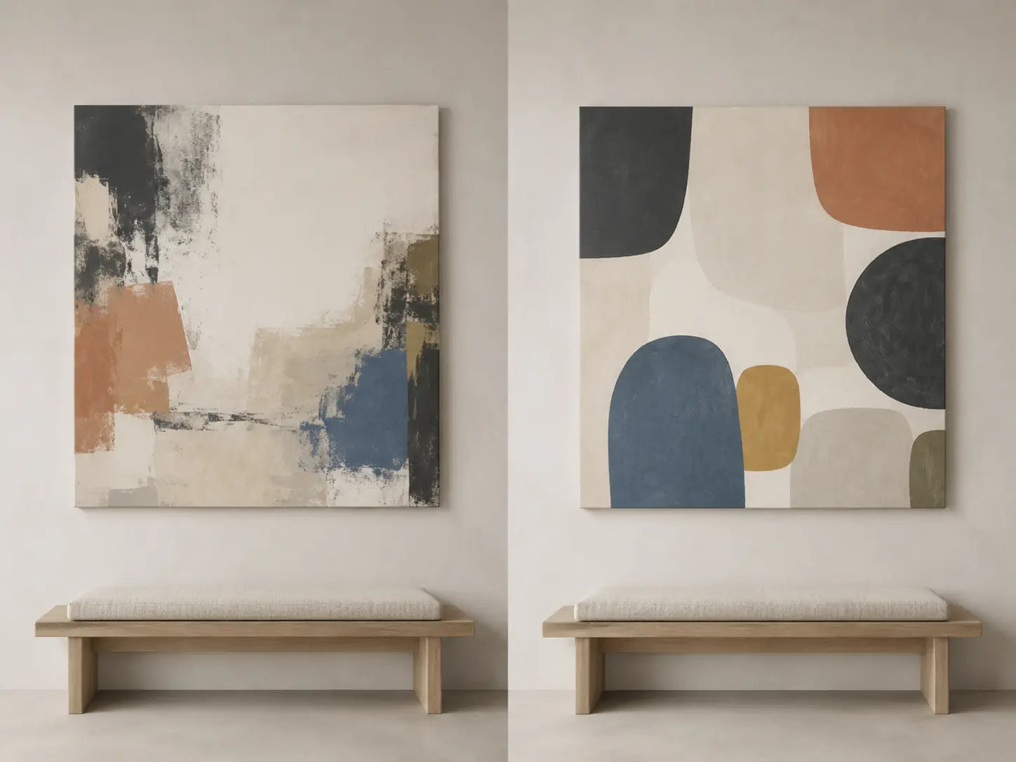
Let the room break the tie
A room described as “Japandi” may already contain dark oak, handmade-looking ceramics, irregular plaster, woven linen, and several low horizontal masses. Adding an equally earthy, distressed canvas can turn coherence into repetition. A clearer Scandinavian-leaning composition may provide relief while remaining calm. Reverse the room—white walls, pale flooring, precise cabinetry, repeated slats—and a work with material trace or asymmetrical weight may prevent the scheme from becoming thin and generic.
Audit only the signals inside the artwork’s real field of view. Count strong joinery lines, shelving divisions, window mullions, grain changes, lamps, and object silhouettes around the intended wall. Then describe the dominant room pressure in plain language: dark and compressed, pale and repetitive, rough and varied, or clear but anonymous. RELIEF asks what the art should subtract, interrupt, or restore.
Keep format and style separate. A pair of canvases introduces a gap and a repeat even when both images are trace-led; one large canvas can feel rhythmic when forms step across it. Include every panel, frame, mat, and gap in the installed outline, then use the orientation guide if the outside shape is still unresolved. Do not let a style comparison quietly become a sizing shortcut.
| Observed wall evidence | Test first | Why it may help | Reject or retest when |
|---|---|---|---|
| Dark wood, rough plaster, low light | Clear shape and lifted field | Adds separation without requiring loud color | Pale forms disappear at the actual evening light level |
| White wall, pale oak, precise cabinetry | Trace and off-center weight | Restores evidence of touch and a focal event | The printed distress reads muddy from the primary view |
| Many slats, shelves, or repeated seams | Singular interval | Stops another rhythm from joining the room | The open field merges with the wall and leaves the work underscaled |
| Large quiet wall, few architectural edges | Graphic pulse | Creates an internal route across the canvas | Every shape has equal emphasis and no pause survives |
| Strong dark furniture anchor | Either, at exact size | Value distribution matters more than the style name | Dark art and furniture collapse into one heavy band |
| Mixed handmade and precise materials | One dominant source plus one echo | Maintains hierarchy without forcing purity | Trace, color, repeat, and texture all compete equally |
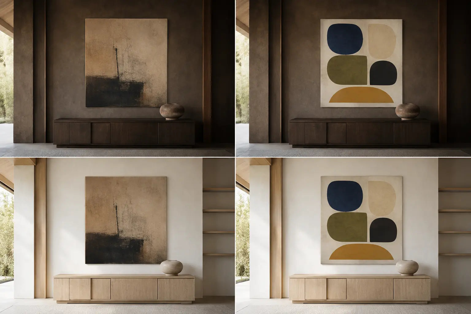
Test the read from far and close
TRACE and PULSE do not survive distance in the same way. Fine scratches, faint erasures, and subtle fibers may reward a nearby seat but disappear from an entry view. A large color shape or repeated interval can remain legible across the room, yet feel simplistic when examined for several minutes. Neither behavior is superior. The right behavior follows the room’s real route.
Mock the exact outer size on the wall. Photograph it from the main doorway or seated position, then from the closest place where someone naturally pauses. At distance, ask whether the intended weight and interval still read. Up close, ask whether depicted texture remains convincing at print scale and whether crisp forms retain enough variation. If one candidate works only in a tightly cropped product image, it has not passed the room test.
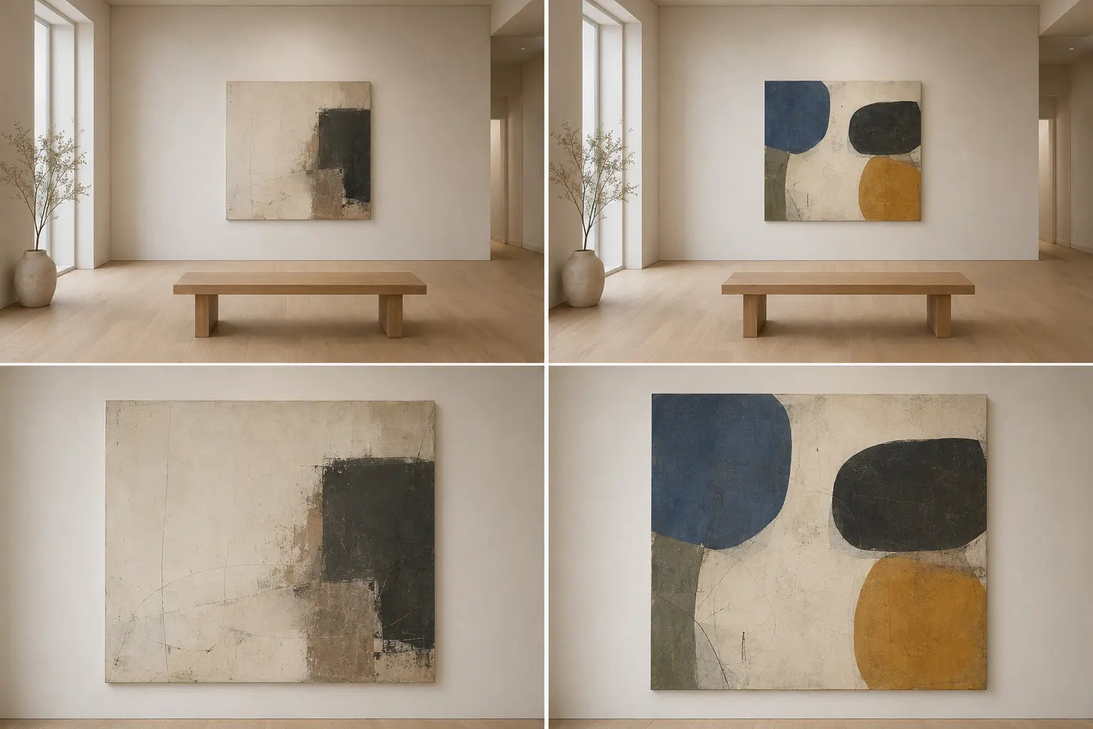
A hybrid needs hierarchy
A hybrid is strongest when one source of calm leads and the other supports it. Start with a trace-led composition and add one clean shape, or start with a clear rhythmic field and introduce one irregular interruption. The result can connect a materially rich room to precise architecture without pretending the two vocabularies are identical.
Reject the “half of everything” compromise: distressed ground, several outlined shapes, multiple accent colors, repeated bars, organic forms, and equal visual weight across the canvas. Each feature may be calm alone, but their equal claim on attention removes the pause. Hybrid does not mean undecided.
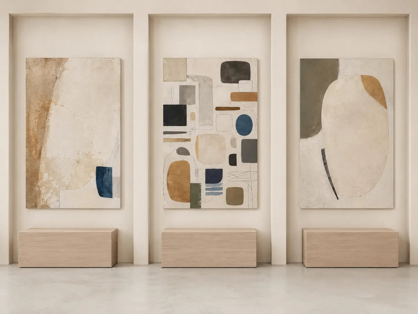
Six rooms, six reject conditions
Dark-oak living room
Evidence: a low dark console, warm plaster, linen, and weak evening contrast already create grounded material weight. Likely survivor: a Scandinavian-leaning canvas with clear pale field and a restrained graphic pulse.
Reject: the lifted work if its light shapes vanish at night; retest a trace-led candidate with more open area instead of adding saturation.
White kitchen–dining wall
Evidence: precise cabinet seams, pale oak, and repeated verticals make the room orderly but anonymous. Likely survivor: a Japandi-leaning work with one off-center mass, visible erasure, and a broad active interval.
Reject: another grid or repeated shape sequence that turns cabinetry and artwork into one continuous pattern.
Bedroom with slatted headboard
Evidence: the headboard and bedside joinery already supply pulse. Likely survivor: one quiet canvas whose interval interrupts the repeated lines while its weight remains connected to the bed.
Reject: fine vertical stripes, repeated arches, or a faint canvas that disappears against the bedding from the doorway.
Bright family room
Evidence: a broad empty wall and few architectural edges need a route, not more blankness. Likely survivor: a Scandinavian-leaning organic sequence with one dominant shape and two quieter repetitions.
Reject: a busy equal-weight pattern that reads as activity rather than a controlled pulse.
Mixed-material home office
Evidence: metal shelving, oak desk, woven chair, and paper objects already mix precise and tactile signals. Likely survivor: a controlled hybrid with one dominant calm source.
Reject: a canvas that repeats every material cue. The wall should edit the room, not inventory it.
Hallway seen in passing
Evidence: the main view is distant and brief. Likely survivor: whichever candidate retains a complete mass-and-interval relationship from the approach—often clear shape, but not automatically.
Reject: a work selected only for close-up texture if its composition collapses into a pale rectangle from the actual route.
Write the art brief before browsing
ROOM PRESSURE: The wall currently feels __________.
RELIEF: The artwork should reduce __________ and restore __________.
DOMINANT SOURCE: TRACE / INTERVAL / PULSE.
SUPPORTING SIGNAL: One quiet echo of __________.
PRIMARY VIEW: From __________, the work must still show __________.
REJECT IF: The room and artwork repeat __________ or lose __________.
Choose the calm source first. Then browse a collection broad enough to compare trace, shape, rhythm, and visual weight.
Browse Minimalist Wall ArtFrequently asked questions
What is the main difference between Japandi and Scandinavian wall art?
For room selection, treat the difference as a tendency in how calm is produced. A Japandi-leaning work often relies on material trace, asymmetry, concentrated weight, and an active interval. A Scandinavian-leaning work often relies on clear shape, luminous field, and repeatable graphic rhythm. These are working descriptions, not cultural definitions or authenticity tests.
Can Scandinavian wall art be warm and organic?
Yes. Scandinavian design is not limited to cool colors or hard geometry. Organic form, soft color, material sensitivity, and light have substantial histories within Scandinavian modernism. Judge the actual silhouette and pulse rather than assigning the work by temperature alone.
Does Japandi wall art need visible texture?
No. A Japandi-leaning composition can create depth through ink-like value, asymmetrical spacing, restraint, or a concentrated mass. Also distinguish depicted texture on a print from physical relief. If surface depth matters, verify the actual medium and finish.
Can I use color in either style?
Yes. Muted cobalt, ochre, olive, rust, or deeper charcoal can work in either direction. Ask whether color is a grounded weight, a clear shape, or part of a repeated pulse. Its structural role matters more than a preset “approved” palette.
How do I choose when my room already mixes both styles?
Do not average every signal. Name the room’s dominant pressure, then choose the relief it lacks. Let one calm source lead in the artwork and one signal echo the room. A hybrid with hierarchy is clearer than a composition where texture, geometry, color, and repetition compete equally.
Should the artwork match the wood tone in the room?
It does not need an exact match. Compare visual weight and undertone in real light. Dark wood may need a lifted field, or it may support a dark mark if enough open area remains. Test the full canvas beside the actual furniture rather than comparing small swatches.
Which direction works better in a small room?
Neither style is automatically safer. A pale graphic work can still become busy; a dark trace-led work can still feel open. Use the complete installed size, existing room edges, dominant value, and the primary viewpoint. Delegate exact sizing and hanging mechanics to the dedicated guides.
How can I avoid cultural clichés?
Describe visible composition rather than using symbols as proof of style. Avoid assuming that calligraphy, a torii, a wave, a bonsai, or generic “imperfection” makes a work Japanese. Verify authorship, subject, text, rights, and context when a work makes a specific cultural claim.
Method note: TRACE / INTERVAL / PULSE / RELIEF is an Artesty editorial decision tool. It does not define Japanese or Scandinavian culture, certify authenticity, or replace verification of a work’s authorship, medium, rights, or context.