

How to Match Wall Art With an Area Rug: Color, Pattern, and Visual Priority
Quick Answer
Wall art does not need to copy an area rug. It needs a clear relationship with the part of the rug that is actually visible in the room. Observe the installed rug from the entrance and main seat. Note its persistent colors, contrast, motif scale, and direction. Then decide which element should lead: the rug, the artwork, or the room’s architecture. Keep the proposed artwork’s wall position and outer size fixed while you compare one variable at a time, such as palette, internal detail, or tonal contrast. A vivid patterned rug can support calmer art, while a quiet textured rug can leave room for a stronger canvas, but neither outcome is automatic. Mock up the exact artwork footprint and inspect it in daylight and ordinary evening light from more than one viewpoint. Accept the pair only when the visual hierarchy remains legible. If both elements compete, disappear, or require several extra purchases to feel connected, retest another candidate, use another wall, or buy nothing.
PAIR: lead → cue → interval → review
Why a Rug and Artwork Can Compete Even When the Colors Match
A rug and a work of wall art occupy different planes, but the eye often reads them in the same room view. The rug establishes a horizontal field under furniture. The artwork establishes a vertical field above or beside it. Color is only one part of that relationship. A rust accent repeated in both objects may create a useful connection, yet the pair can still feel unresolved if both contain dense small marks, equally sharp black-and-white contrast, or competing centers.
Do not judge the complete rug shown in a product image. In the room, a sectional may cover much of its field, a coffee table may interrupt its center, and a chair may hide part of its border. What remains visible may be one muted edge rather than the vivid medallion that influenced the purchase. That visible evidence matters more than the catalog view when art is being chosen for the wall.
Do not assume coordination means equal emphasis. Two attractive objects can weaken each other if both demand first attention from the same viewpoint. A better question is not “Do these colors match?” but “What should I notice first, and what helps me notice it?”
Pattern also has scale. A rug built from many tight repeating motifs behaves differently from one with two broad color blocks. Artwork with a few large shapes may give the dense rug visual release even when both use several colors. Conversely, a quiet jute or tonal wool rug may support a more intricate image because it contributes texture without creating a second graphic event.
Light creates another source of uncertainty. Surface color depends on illumination and viewing conditions; official color-appearance work from CIE and NIST explains why reflective materials can appear different under different light sources. Use this as a safeguard: compare the real room in normal daylight and evening light instead of expecting an exact screen match.
This guide focuses on that art-and-rug relationship. For the broader sequence of choosing art by room, purpose, and wall, use the room-by-room wall art process.
The PAIR Method: PRIORITIZE / ANCHOR / INTERVAL / REVIEW
PAIR is a four-stage decision method. It does not assign a universal color ratio or require the rug and artwork to share a style label. Each stage produces an output that can be checked before a purchase.
PRIORITIZE: Read the Real Room and Choose the Lead
Set the room as it is normally used, then inspect it from the entrance and primary seat in daylight and evening light. Record the rug area left visible by furniture, its persistent colors, motif scale, direction, and contrast. A bright accent hidden under a table should not control the shortlist. Describe evidence rather than labels: “Half the rug is visible; muted blue persists; small motifs are dense; the wall is broad and quiet.”
Now choose the rug, artwork, or architecture as the visual lead. The rug may lead when its visible field or geometry anchors the zone. Art may lead when the rug is quiet, heavily covered, or mainly textural. Architecture may lead when a window, paneled bay, or long axis is stronger than either object. Write one sentence: “The rug leads; art supplies a quiet vertical counterweight.” If both must be equal leaders, the priority remains unresolved.
Define the artwork footprint from its unobstructed vertical wall field, not from rug width. Use the wall art size guide once that envelope is known.
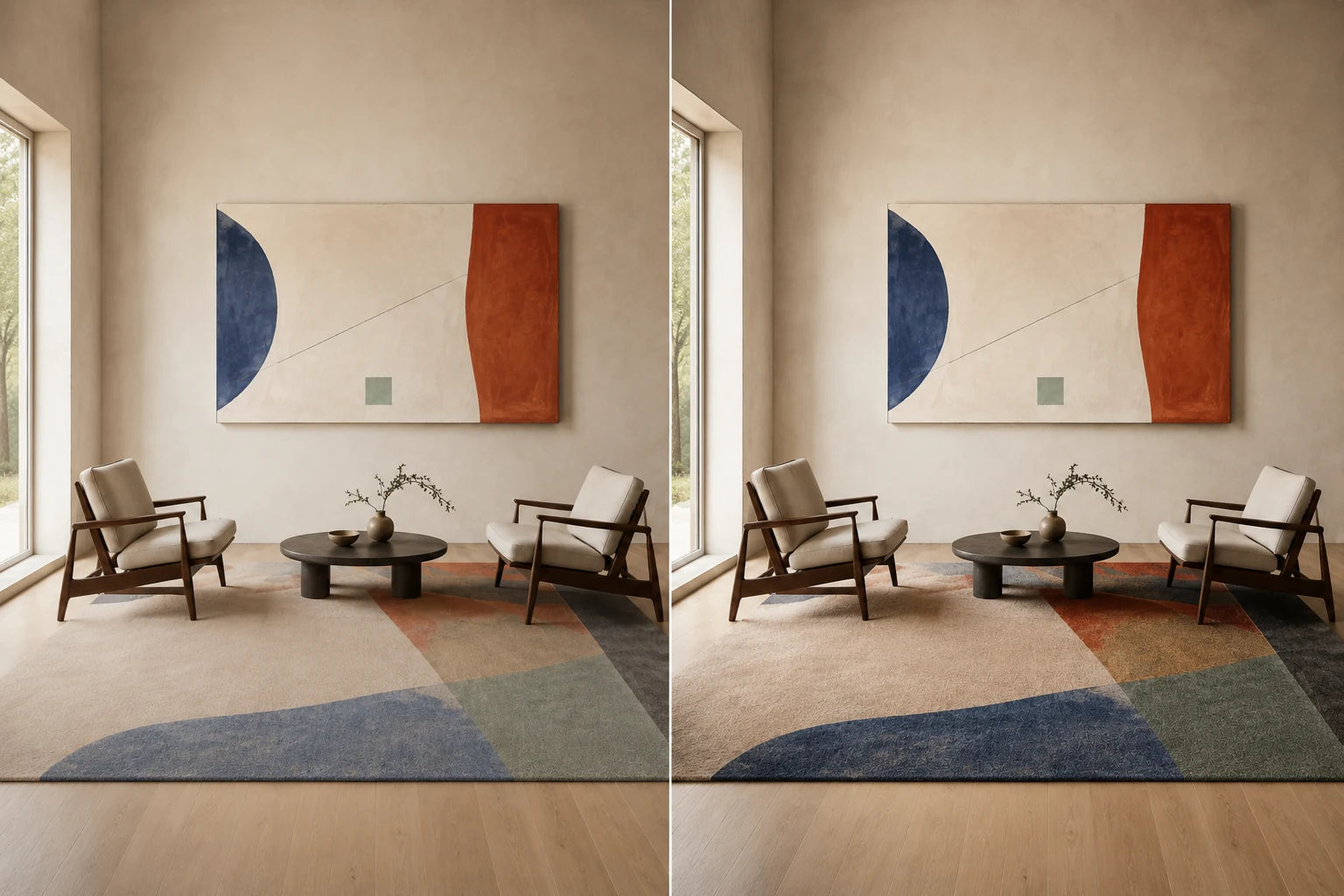
ANCHOR: Select One Persistent Connection
Choose what will connect the two planes. The anchor may be one rug color visible from more than one viewpoint, a shared tonal range, a neutral that separates both objects from their surroundings, or a deliberately related line direction. It is not required to be an exact dye-to-print match.
Keep the anchor subordinate to the elected lead. A rug-leading room may use one minor rug tone in a quieter artwork. An art-leading room may let a neutral rug support the canvas without visible color repetition. If the connection requires new cushions, curtains, and objects to explain it, the anchor is too weak or the candidate is wrong.
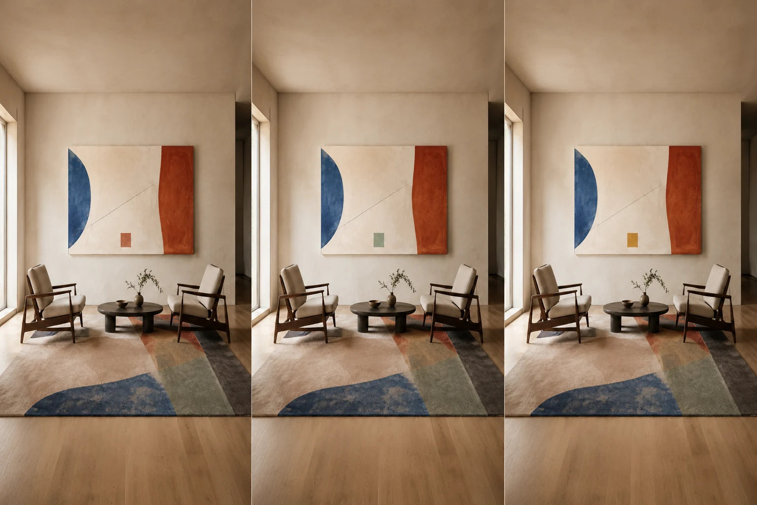
INTERVAL: Create Separation Between Pattern Scales
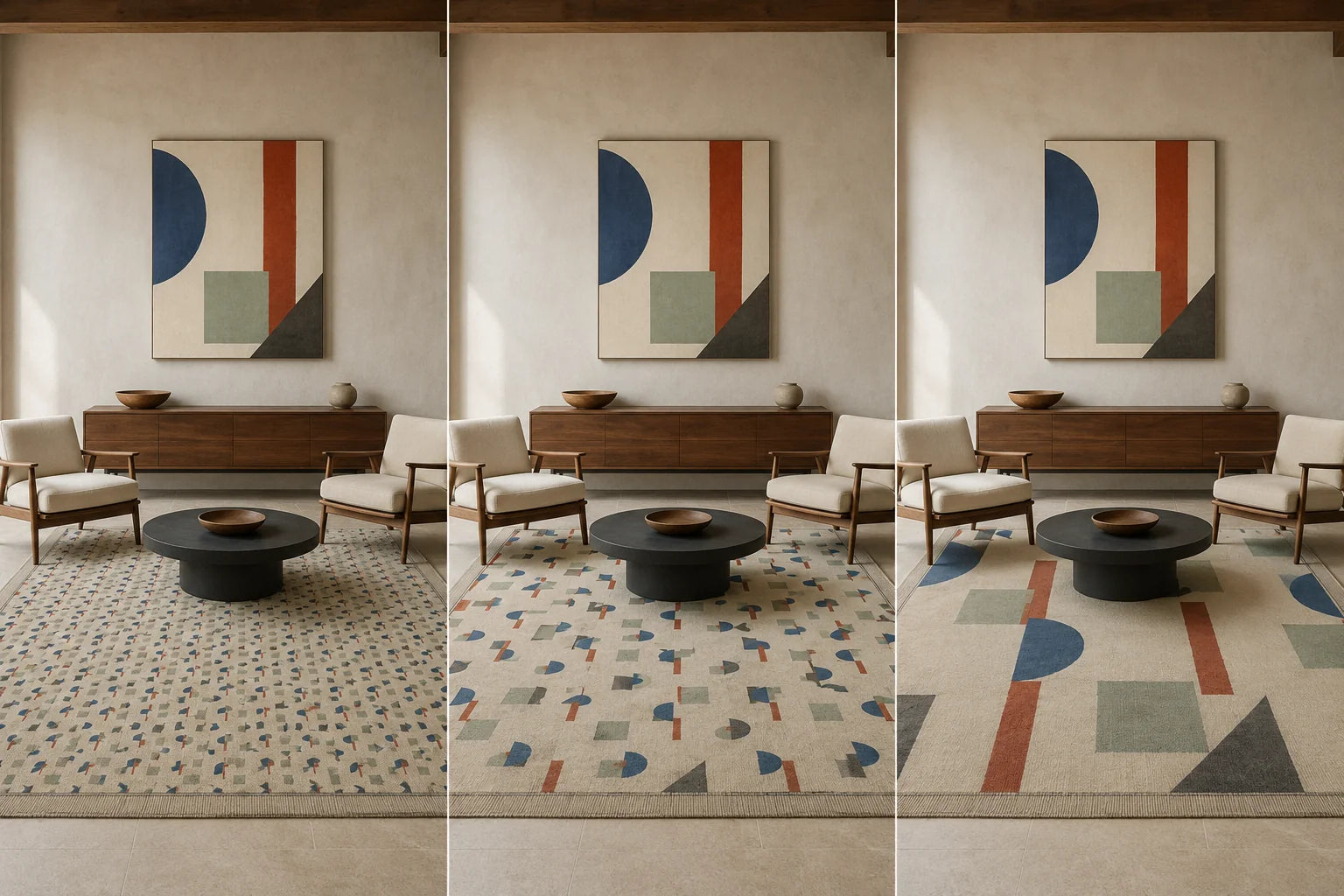
Interval is the visual distance between the rug’s activity and the artwork’s activity. Hold wall position and outer footprint constant while changing one variable at a time. With a dense small-motif rug, compare broader forms or more open image space against art of similar density. With a quiet tonal rug, test whether greater detail can lead without overwhelming the wall.
Then compare tonal pressure. A many-colored image can remain quiet when its light and dark values are close; a two-color image can be forceful when its contrast is sharp. Patterned art and a patterned rug can coexist, but the same direction, frequency, and contrast can erase their separate jobs.
Reduce the set to two candidates and state why the others failed. For an abstract shortlist, use the living-room abstract art guide. If orientation is still open, consult the vertical, horizontal, and square guide without changing the accepted priority or anchor.
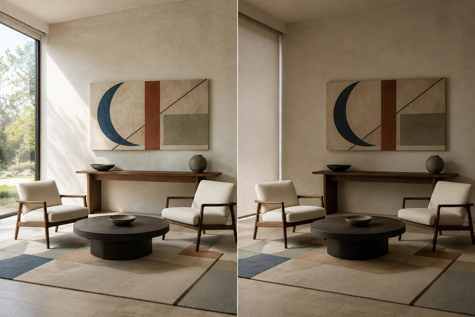
REVIEW: Test the Exact Footprint in Real Viewing States
Create a paper template or proportionally accurate mockup at the intended outer dimensions. Inspect it from the entrance, primary seat, and any route where rug and art appear together. Repeat the review in normal daylight and evening light. The question is not whether color stays perfectly constant, but whether the elected lead and supporting job remain legible.
Finish with one output. Accept means the hierarchy survives the important states. Retest changes one variable. Relocate moves the art outside the direct rug relationship. Buy nothing recognizes that the room needs no additional visual event. Address hanging height and hardware only after accepting the footprint, using the wall art height and spacing guide.
Decision Router: What the Room Evidence Suggests
The table is a semantic router, not a set of fixed prescriptions. Use the first column to find the closest observed condition, then test the suggested job rather than assuming it will work.
Swipe or use the horizontal scrollbar to review all table columns.
| Observed room evidence | Possible priority | Filter for | Reject or retest when |
|---|---|---|---|
| A dense, high-contrast rug remains highly visible from the entrance | Rug leads | Broader forms, clearer open areas, or a limited palette | The artwork repeats the rug’s motif frequency and contrast |
| A neutral rug contributes texture but little chromatic contrast | Art leads | The amount of color or detail the wall can support | Every option stays beige only to imitate the rug |
| A graphic rug has strong stripes, grids, or diagonals | One elected lead | A clearly different internal scale or direction | Floor and wall create the same rhythm at the same strength |
| Most of the rug is hidden by furniture | Art or architecture leads | Only colors and marks visible in normal use | The catalog image of the hidden field controls the decision |
| Two rugs appear across one open-plan route | One zone leads; another relays or pauses | A hierarchy that remains clear while walking through the space | Each zone becomes a separate equal-strength vignette |
| The rug changes strongly between daylight and evening light | Priority remains provisional | Candidates that preserve their role in both states | A combination succeeds under only one unusual light condition |
| Both rug and artwork are quiet | Architecture may lead, or art may lead gently | Edge clarity, footprint, and one intentional connection | Extra objects are added only to manufacture a match |
| No candidate produces a stable hierarchy | Empty wall or another wall | A different location before a different purchase | The room requires repeated compensating purchases |
This router separates the art-and-rug decision from format. If one continuous image and a divided set are both plausible after filtering, use the one large canvas versus three-panel comparison. If the shortlist becomes a group of independent works, the gallery wall layout guide should own spacing and arrangement.
Six Room Scenarios
These scenarios show how PAIR changes the output without declaring one palette or style universally correct.
Scenario 1: A Vivid Vintage or Persian-Style Rug on a Quiet Floor
- Evidence
- A large part of the rug remains visible. Its medallion and small motifs provide the room’s strongest detail, while muted blue persists from the doorway and seat.
- Decision
- Prioritize the rug. Anchor art with that persistent blue, a nearby neutral, or intentional contrast, then preserve interval through broader forms or more open image space.
- Reject
- Avoid a canvas that copies the medallion, motif frequency, and complete palette; neither object would retain a distinct job.
- Retest
- At one footprint, compare a lower-density image with one more active image. If the rug cannot lead cleanly, relocate the art or leave the wall open.
Scenario 2: A Neutral Jute or Tonal Wool Rug
- Evidence
- The rug is visible, but its palette and contrast are narrow. Texture appears nearby while the restrained room lacks a vertical focal area.
- Decision
- Prioritize the artwork. Let the rug support through texture; it need not provide the canvas’s literal palette.
- Reject
- A natural material does not automatically require beige, botanical, or “organic” art. Do not add accessories merely to justify an uncertain canvas.
- Retest
- At one footprint, compare higher contrast with a softer tonal option. If the soft image disappears at night, change edge contrast rather than purchasing compensating decor.
Scenario 3: A Black-and-Ivory Geometric Rug
- Evidence
- Bold diagonals or a grid remain readable even where furniture covers the rug. Few colors still create strong tonal pressure.
- Decision
- Prioritize either rug or art. If the rug leads, use larger asymmetrical areas, softer value transitions, or a separate accent on the wall.
- Reject
- Avoid the same grid, line thickness, frequency, and black-white intensity on both planes.
- Retest
- With footprint and palette fixed, change only internal density. Review from across the room, where small distinctions merge, and accept only a clear lead.
Scenario 4: A Multicolor Rug Mostly Hidden by a Sectional
- Evidence
- A sectional and table hide the dramatic catalog pattern. Normal views show only one border, a muted field, and isolated marks.
- Decision
- Use those fragments as anchors. Art may lead because the installed rug exerts less pressure than its full product image suggests.
- Reject
- Do not match a central color nobody can see or move useful furniture only to expose a motif.
- Retest
- Photograph the installed room, then shortlist from the visible field at a fixed art footprint. If modular seating changes, restart PRIORITIZE rather than transferring the first result.
Scenario 5: Two Rugs Across an Open-Plan Living and Dining Route
- Evidence
- Living and dining rugs define functions, but the entrance reveals both floor fields and several walls at once.
- Decision
- Prioritize one zone for lead art. Let the other relay one restrained cue or remain a pause; literal matching is unnecessary.
- Reject
- Do not match every wall independently to its nearest rug, creating equal-strength vignettes with no clear route.
- Retest
- Walk through both zones in daylight and evening light, temporarily covering one artwork. Use the open-plan wall art method for the larger zone system.
Scenario 6: The Artwork Is Fixed but the Rug Is Not
- Evidence
- Meaningful art already works on its wall, while the rug is being replaced, sampled, or changed seasonally.
- Decision
- Prioritize the artwork. Filter rugs that support one persistent cue, provide a quiet foundation, or create deliberate contrast without copying the image.
- Reject
- Do not replace successful art for a temporary rug or choose from a small screen swatch that triggers compensating purchases.
- Retest
- Review a physical sample or returnable option in normal light after furniture is placed. If each rug becomes a second lead, postpone the purchase or choose a quieter field.
Build a Pre-Purchase Brief Before You Browse
A useful brief is short enough to carry into a product comparison and specific enough to prevent decorative drift. Complete it after PRIORITIZE and ANCHOR, before opening a large set of artwork tabs.
- Fixed object: State whether the rug, artwork, or both are already owned.
- Visible rug evidence: Record what remains visible from the entrance and main seat, including persistent tones, motif scale, and contrast.
- Usable wall envelope: Note the accepted orientation and proposed outer dimensions without deriving them from rug width.
- Hierarchy sentence: Write “rug leads,” “art leads,” or “architecture leads,” followed by the supporting job.
- One comparison variable: Choose palette relationship, internal density, or tonal contrast for the first filter.
- Two viewing distances: Include the close or seated view and the longest routine view.
- Two light states: Use the room’s ordinary daylight and evening condition, not a special staging setup.
- Stop condition: Define in advance when you will relocate the art, retain the empty wall, or buy nothing.
The brief should not specify a fashionable subject merely because the rug has been labeled with the same style. “Muted rug, modern art” is less useful than “rug leads through dense small motifs; art supports with larger forms and one persistent blue trace.” The latter describes evidence and an output that can be tested.
Keep the shortlist small. Saving twenty dissimilar images can feel productive while changing several variables at once. Two candidates at one footprint reveal more. If neither passes REVIEW, revisit the priority or anchor before browsing another twenty.
Frequently Asked Questions
1. Does wall art have to match an area rug?
No. A successful relationship can use repetition, contrast, or deliberate separation. What matters is whether one element has a clear lead and the other supports the room without becoming an accidental rival. Exact color copying is only one possible relationship and may fail when pattern scale, contrast, or light is ignored.
2. Should you choose the rug or the wall art first?
Start with whichever object is fixed, meaningful, difficult to replace, or already successful in the room. If neither is fixed, elect which one should lead before shopping for both. Buying two statement pieces independently and trying to reconcile them afterward creates a harder filter.
3. Which color from a patterned rug should the artwork repeat?
If you choose repetition, use a tone that remains visible from the important viewpoints rather than the most exciting color in the full catalog image. A secondary border tone can be more useful than a dominant color hidden under a table. The repeated tone does not need to be exact if the overall relationship remains intentional.
4. Can patterned wall art work with a patterned rug?
Yes. Compare motif frequency, direction, tonal contrast, and open space instead of treating “patterned” as one category. Clearly different scales can coexist. Two patterns with the same frequency and visual pressure are more likely to obscure the hierarchy, so test one variable at a fixed footprint.
5. Should the artwork and rug be the same interior style?
Not necessarily. Style labels can help with browsing, but they do not predict the actual shared view. A vintage rug can work with contemporary art when the roles, scale, and palette relationship are clear. Two objects with the same marketing label can still compete.
6. Does rug size determine wall art size?
No direct formula is needed. The rug helps define a floor zone, while the artwork must fit a usable wall and its furniture or architectural reference. Decide the art footprint from that vertical envelope, then return to the rug relationship for hierarchy and pattern testing.
7. How do you coordinate art and rugs in an open-plan room?
Assess the full walking route, not each vignette in isolation. Let one zone lead and use another as a relay or pause. Test what enters the same sightline from the doorway, because rugs may define functions on the floor while the walls remain visually continuous.
8. Why can the combination look different at home than online?
Screens, photography, daylight direction, lamp spectrum, wall color, and nearby materials all affect the comparison. A mockup can test composition and approximate footprint, but it cannot guarantee a physical color match. Inspect the real objects or best available samples under the room’s routine light states.
Final Decision: Coordinate the Hierarchy, Not Every Color
The most useful art-and-rug decision is not a catalog-perfect match. It is a stable hierarchy that survives normal furniture coverage, real viewing distance, daylight, and evening light. PRIORITIZE reads the installed room and names the lead. ANCHOR selects one persistent connection. INTERVAL separates competing activity. REVIEW makes relocation and no purchase legitimate outputs rather than failures.
This process also protects the room from a chain of compensating purchases. A canvas should not require new pillows, curtains, and objects merely to explain why it belongs. When the elected relationship is clear, a single persistent color trace may be enough; sometimes no repeated color is necessary at all.
Once the evidence card, hierarchy sentence, footprint, and two-candidate review are complete, browse Artesty canvas prints for the option that fulfills the tested wall-art job. Keep the room brief beside the shortlist, and accept only what preserves the intended relationship in the room you actually use.