

Psychedelic Canvas Prints: How to Use Psychedelic Art in a Modern Room
Let the canvas move. Make the room hold still.
A psychedelic canvas does not need a retro room, neon accessories, or a repeated rainbow palette. It needs a deliberate relationship between the artwork’s visual pulse and the room’s stable surfaces. The useful question is not “Is this too colorful?” It is “Where does the movement begin, where is it held, and where does the sightline release?”
Use four checks in order: PULSE / HOLD / RELEASE / RECHECK. The first hard failure eliminates a candidate. This replaces the old article’s unsupported interview, psychological promises, and keyword lists with an observable room decision.
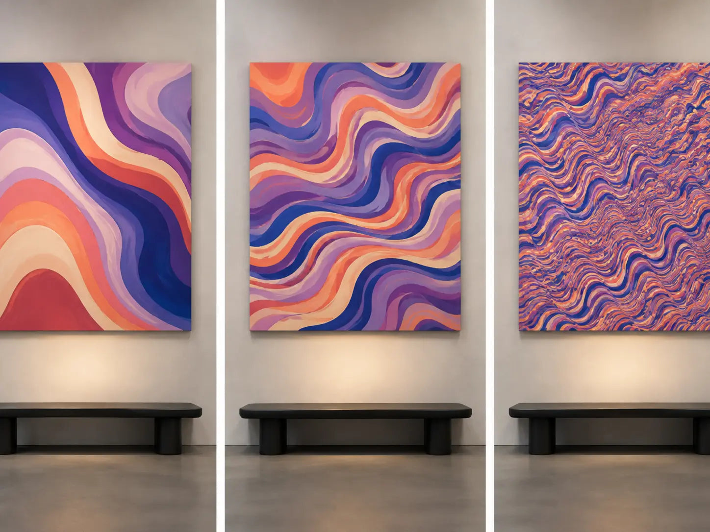
PULSE describes the size, frequency, and direction of repeated forms inside the image.
HOLD names the furniture group or architectural field that keeps the active canvas connected.
RELEASE is the lower-information surface in the same view—not necessarily a neutral color.
RECHECK tests the exact footprint from real positions and under daytime and evening light.
Classify the image by behavior, not by a marketplace label
“Psychedelic” is used broadly in wall-art catalogs. One listing may show concentric optical waves; another may use liquid color transitions, fantasy landscapes, cosmic scenes, fractal-like repetition, transformed figures, or poster-derived graphics. These images do not create the same installation problem. Record what is actually visible before accepting the category name.
Separate four properties. Repetition describes how often lines or shapes recur. Transformation describes whether familiar objects bend, merge, multiply, or change scale. Depth cue describes whether the image appears flat, layered, tunneling, or radiating. Subject load records faces, symbols, text, creatures, landscapes, and other recognizable content. A canvas can be highly saturated but low in repetition; another can be nearly monochrome yet visually fast.
This distinction also keeps adjacent intents clean. Surreal art may depend on impossible subject relationships without using repeated optical rhythm. Fluid art may emphasize continuous color flow without a central symbolic scene. Geometric art may repeat precise modules without producing the same nested or transforming behavior. Choose the individual composition first; use the collection label only as a discovery path.
Inspect the exact product rather than a room mockup. Confirm the crop, orientation, printed edge treatment, panel configuration, and whether apparent glow or depth belongs to the printed image rather than a physical material or lighting feature. If a recognizable person, character, logo, poster, or known artwork appears, require product-level source information before proceeding.
Read repetition before reading color
Psychedelic imagery can create motion through nested curves, repeated contours, radiating centers, mirrored forms, compressed waves, color reversals, and scale changes. Two canvases with the same colors can behave very differently: one may carry a few broad bends, while another repeats dozens of fine lines across the entire surface.
Describe the candidate without using mood words. Record the largest repeated unit, the smallest repeated unit, the dominant direction, the number of competing centers, and whether any outer edge feels visually crowded. This makes the comparison about composition rather than a vague reaction to saturation.
Do not use “calm” as a synonym for pale
A dark violet canvas with broad shapes may be compositionally slower than a cream canvas filled with high-contrast micro-patterns. Conversely, a saturated image can remain legible when one large path controls the smaller marks. Separate hue intensity from repetition frequency before deciding that a modern room needs less color.
Mock all candidates at approximately the same installed footprint. Holding the size steady prevents the densest image from losing simply because its product thumbnail was smaller. For numerical footprint planning, use the Wall Art Size Guide; this article owns optical activity, not universal furniture-width formulas.
Give active imagery one physical carrier
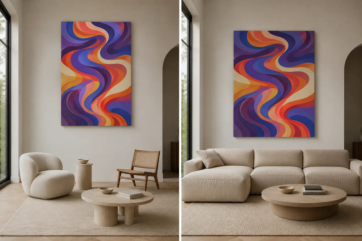
A composition that bends, expands, or radiates needs a stable outside relationship. The hold is the object or architectural field that visually carries the complete canvas: a sofa group, low console, headboard, desk, wall bay, recess, or terminal sightline. The gross wall is often too broad to be useful.
Name the hold in one sentence: “The canvas belongs to the sofa group,” or “The canvas closes the bay between the openings.” Then inspect the full outside envelope, including an optional frame and all panel gaps. The canvas should connect without touching trim, hovering as a token object, or being blocked by lamps and plants.
Alignment is not the only solution
The internal motion does not have to copy the furniture axis. A broad sofa can hold a vertical canvas when the work is intentionally scaled as a centered node and the complete group remains connected. A horizontal canvas can contain rising internal motion. Orientation belongs to the outside object; pulse belongs to the image.
Use the Orientation Guide when the outside ratio is unresolved. Reject the placement when it works only in a tightly cropped mockup, when the main curve appears to spill into an opening, or when furniture fragments cannot establish one visual base.
| Observed evidence | What it suggests | Next test | Reject when |
|---|---|---|---|
| Fine pattern becomes texture from entry | Fast pulse exceeds useful distance | Test a larger footprint or broader repetition | Only the close product view works |
| Canvas floats above several small objects | No single hold is established | Mock it with one furniture or bay carrier | Connection remains ambiguous |
| Room repeats every artwork color | The bridge has become a theme | Retain one color role only | Accessories compete as separate signals |
| Pattern continues across rug, pillows, and shelving | No release field remains | Temporarily remove one activity layer | Canvas and room still have equal priority |
| Dark boundaries merge at night | Evening contrast changes the reading | Review under ordinary room lamps | Primary forms collapse in normal use |
| Several optical centers pull equally | Composition may need more wall air | Test a clearer edge field and real distance | The image remains restless for the intended location |
Protect a lower-information surface in the same sightline
Release is not “paint everything beige.” It is the place where repeated edges and competing focal signals stop. A dark uninterrupted sofa, a broad timber cabinet, an open wall segment, a plain curtain, or a single-color rug can all function as release fields.
Photograph the complete sightline from the room entrance and the primary seat. Count active surfaces rather than objects: patterned rug, window grid, open shelving, screen, cushion group, adjacent artwork, colored lighting, and the psychedelic canvas itself. Decide which surface leads and which one can be simplified.
Edit before you replace the art
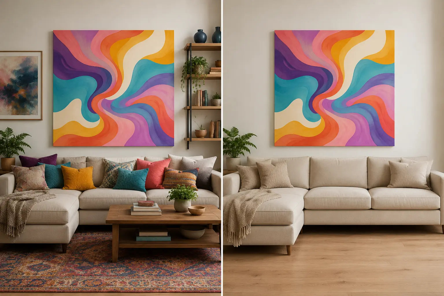
Temporarily remove the second artwork, patterned throw, several cushions, or dense console objects. If the canvas becomes clear, the problem was distributed activity. If it still appears weak or disconnected, return to HOLD and size. A large active canvas can work in a collected room when the collection has one hierarchy; a sparse room does not automatically rescue an underscaled piece.
Use one color connection rather than a room-wide palette copy. Repeat either a structural dark, a broad field color, or one small accent. Avoid matching every violet, turquoise, coral, and yellow area with separate accessories. The canvas should remain the source of its own complexity.
Choose psychedelic art because you want to live with its image, color, and movement—not because a product description promises creativity, meditation, therapy, altered perception, or a mental-health outcome. This article makes no medical or psychological-effect claim.
Review the exact candidate in real light and real use
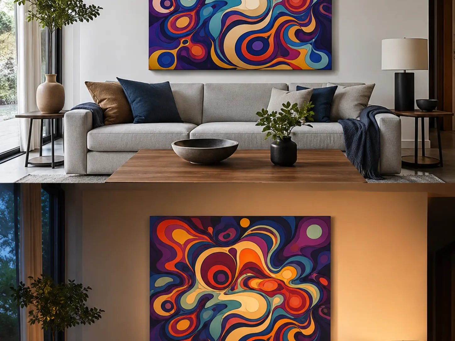
Online images are viewed on illuminated screens. A printed canvas is lit by the room. Recheck the exact product crop and size in neutral daytime light and under the lamps normally used in the evening. The goal is not laboratory color matching; it is to confirm that the main paths remain separated and that dark boundaries do not merge into one block.
Also recheck two distances. From the longer view, identify one primary motion or color mass. From the closer view, inspect secondary repetitions, edge crowding, print detail, and whether any symbol, text, face, or subject matter was missed in the thumbnail. A useful candidate should pass the room’s real routine, not only a frontal product mockup.
Check the outer edge and crop
Psychedelic compositions often carry movement to the boundary. Compare every available ratio rather than assuming the crop is interchangeable. A cut that removes visual breathing room from one side can make a previously balanced swirl press against the edge. For multi-panel options, inspect every gap; do not split a face, symbol, optical center, or essential path merely to fill a wide wall.
If choosing between canvas and a glazed framed paper print, review actual build, glare, depth, finished footprint, weight, and care in the Canvas Print vs. Framed Print guide.
Use conditions, not room-name formulas
Write the installation in six lines
Primary viewFrom __________, the canvas first reads as __________.
PulseThe dominant repetition is slow / mixed / fast because __________.
HoldThe complete canvas belongs to the __________.
ReleaseThe lower-information field in the same view is __________.
Color bridgeRepeat only the artwork’s __________ through __________.
RecheckReject if range, crop, edge separation, daytime, or evening light fails.
PULSE / HOLD / RELEASE / RECHECK is an Artesty editorial selection tool, not a scientific vision model or health framework. For the broad home-selection process, use How to Choose Wall Art for Your Home.
Choose the room behavior first. Then review the exact image, crop, size, panel option, product information, and current availability.
Browse Psychedelic Canvas PrintsPsychedelic art in modern rooms
Does psychedelic art require a colorful room?
No. The canvas can carry most of the color while furniture and architecture provide HOLD and RELEASE. A colorful room can also work when one surface clearly leads and the remaining patterns follow a controlled hierarchy.
Can psychedelic canvas work with minimalist furniture?
Yes. Simple furniture can create a stable outside relationship for an active image. Judge the exact canvas footprint and pulse; do not assume every minimal room needs one oversized statement or every psychedelic work is automatically suitable.
How do I know whether a psychedelic pattern is too busy?
Define the primary view and identify the first readable path. Then remove one competing room layer. If canvas, rug, shelves, screen, and textiles still demand equal attention, the installation has no hierarchy for that sightline.
Should I repeat all the canvas colors in the room?
No. Choose one connection: structural dark, broad field, or limited accent. Repeating the entire palette through many accessories usually creates several new focal signals and weakens the canvas’s role.
What size works above a sofa?
Use the exact clear wall field, complete product footprint, furniture group, lamps, and primary viewing range. Make a real-size tape or photo mockup. This guide intentionally avoids a universal sofa percentage.
Can psychedelic art help creativity or meditation?
This article makes no medical, therapeutic, cognitive, or wellness promise. Choose the individual image because you want its visual behavior and subject in the room, not because marketing copy predicts a personal outcome.
Is one canvas better than a psychedelic gallery wall?
One canvas concentrates movement inside one boundary. Several independent works distribute it across frames and gaps. Decide which behavior the room needs before using the Gallery Wall Guide for layout mechanics.
Why should I check the canvas at night?
Ordinary warm lamps can change the separation between violet, blue, red, cream, and dark contours. The evening check is not about perfect color accuracy; it confirms that the main paths remain legible during normal use.