

What Wall Art Goes With a Gray Sofa? Undertone, Contrast, and Room Light
The Chromatic Loom
A gray sofa is not a request for “gray art” or a shortcut to one approved accent color. It is a fixed surface whose apparent cast, lightness and texture change beside the wall, rug, wood and everyday light. The useful decision is to give the artwork one clear job—quiet support, connection or contrast—and then test that job without changing everything else at once.
The decision this guide owns
This guide answers a specific question: how to choose the color direction and visual contrast of wall art when a gray or grey sofa is the fixed starting point. It separates four observations that are often collapsed into a list of fashionable colors: the sofa’s apparent cast, its light–dark value, the wall field behind the art, and the existing room cue that the art may repeat or oppose.
It does not decorate the entire gray living room. Rugs, curtains, pillows, paint and lighting fixtures are evidence here, not a shopping list. It also does not promise that ochre, navy, blush, rust, black-and-white or any other family will always work. A color can succeed in one room because it repeats the rug, separates from the wall or supports a deliberate tonal scheme; the same color can become isolated or muddy in another room.
Keep neighboring intents separate. If the upholstery reads taupe, mushroom, tan or cognac rather than gray, start with the brown and cognac sofa guide. If you already know the work must be abstract, use the abstract living-room guide for composition and density. This article owns the gray-sofa fit, not those broader style decisions.
General dimensions, hanging height and hardware also remain separate. Here, footprint is held constant to make color comparisons honest. After a palette passes, use the dedicated size and installation resources. A valid answer can be a neutral canvas, a brighter or darker candidate, another wall, or no purchase yet.
Use CART: CAST / ANCHOR / RANGE / TRIAL
CART is a four-stage decision sequence, not a style recipe. Each stage produces a different output: a room observation, a palette job, a contrast range and a real-room verdict. Hold the selected room and artwork variables steady, change one declared variable, and name what would make you reject the result.
- CASTObserve the sofa’s value and repeatable color direction in the light you actually use; record uncertainty instead of inventing precision.
- ANCHORChoose one job for the artwork palette: repeat a cue, bridge fixed surfaces, introduce an independent accent, or stay tonal.
- RANGEAdjust the artwork’s light–dark spread so its edge and main forms remain legible against wall and seating field.
- TRIALTest the unchanged shortlist from normal viewpoints and light states; keep, retest, relocate or stop.
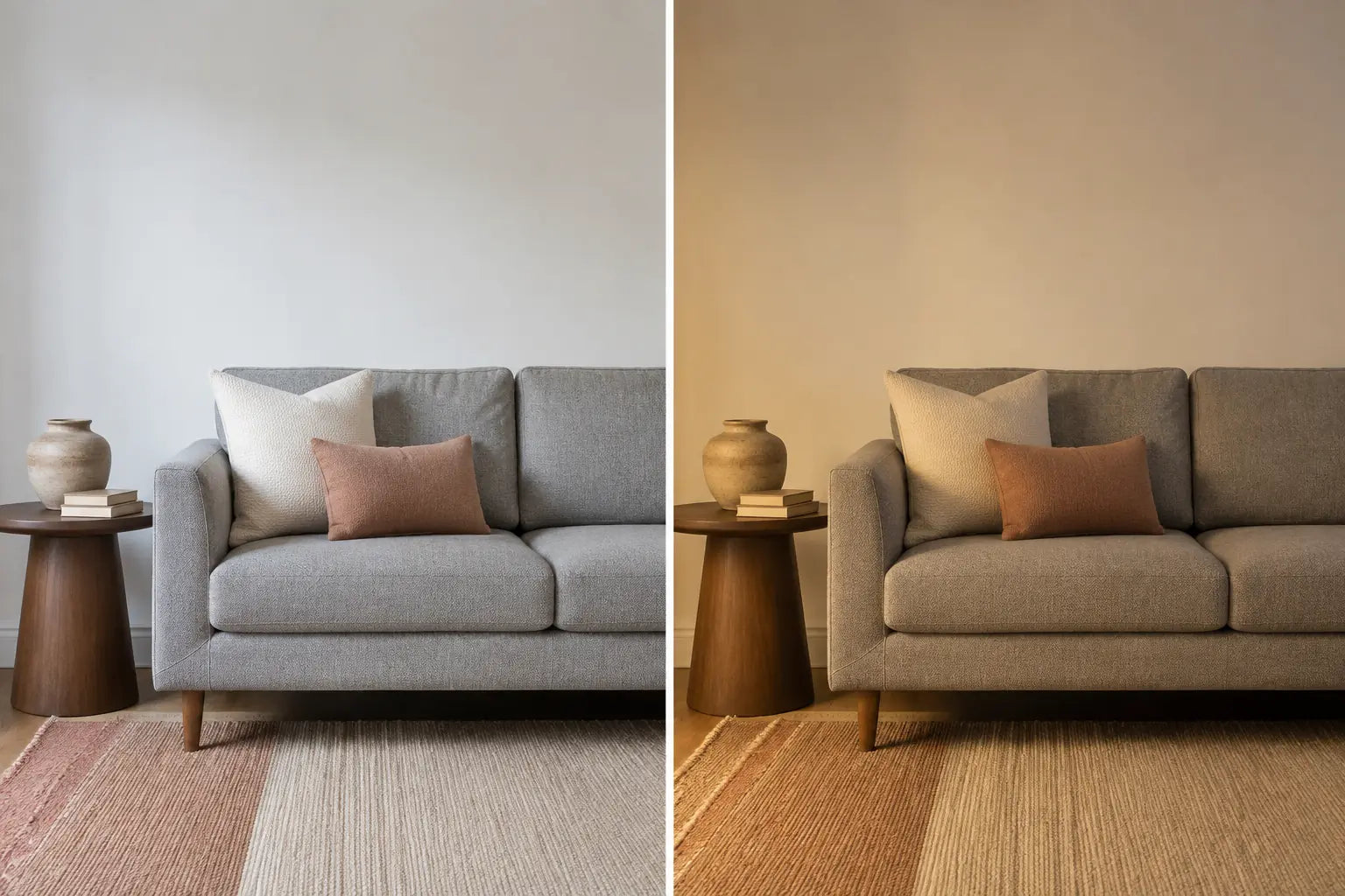
CAST: read the sofa without forcing an undertone
Start with the sofa, wall, floor and fixed textiles visible together. Look once in useful daylight and again under the lamps normally used in the room. Record two separate things. First, is the upholstery light, middle-value or charcoal relative to the wall? Second, does it repeatedly lean blue, green, violet, brown or beige beside the same objects? “Undertone” is convenient search language, but your working note should describe appearance in this room, not claim a laboratory reading of the fabric.
Heathered upholstery may contain several fibers and change direction across the day. A phone photograph can help you compare placement, but camera processing and the viewing screen are not proof of the color you see. If the direction does not repeat, write uncertain. That branch is useful: it prevents an unverified cool/warm label from controlling every later choice.
The pass condition is modest. You can name the sofa’s value and either a repeatable direction or honest uncertainty. Reject a conclusion copied from a product page, sampled from one styled photograph or reached under a single dramatic light. Retest with the same surrounding objects and ordinary lighting; do not add artwork yet.
ANCHOR: give the artwork one palette job
Now decide what the art should connect. A repeat route borrows one existing cue, such as muted clay from the rug or deep blue from a curtain. A bridge route carries a restrained combination that relates two fixed materials, perhaps warm wood and a cooler textile. An independent accent introduces a new family deliberately. A tonal route stays with cream, graphite, gray or black-and-white because quiet structure—not added color—is the goal.
Choose one route before browsing. The anchor is evidence, not a matching command. Repeating every rug color can make the artwork subordinate to the rug, while a tiny unrelated accent may look accidental. One legible connection is often enough to test. If blue is your selected family, the specialist blue wall-art guide can narrow navy, teal and turquoise without taking over the gray-sofa decision.
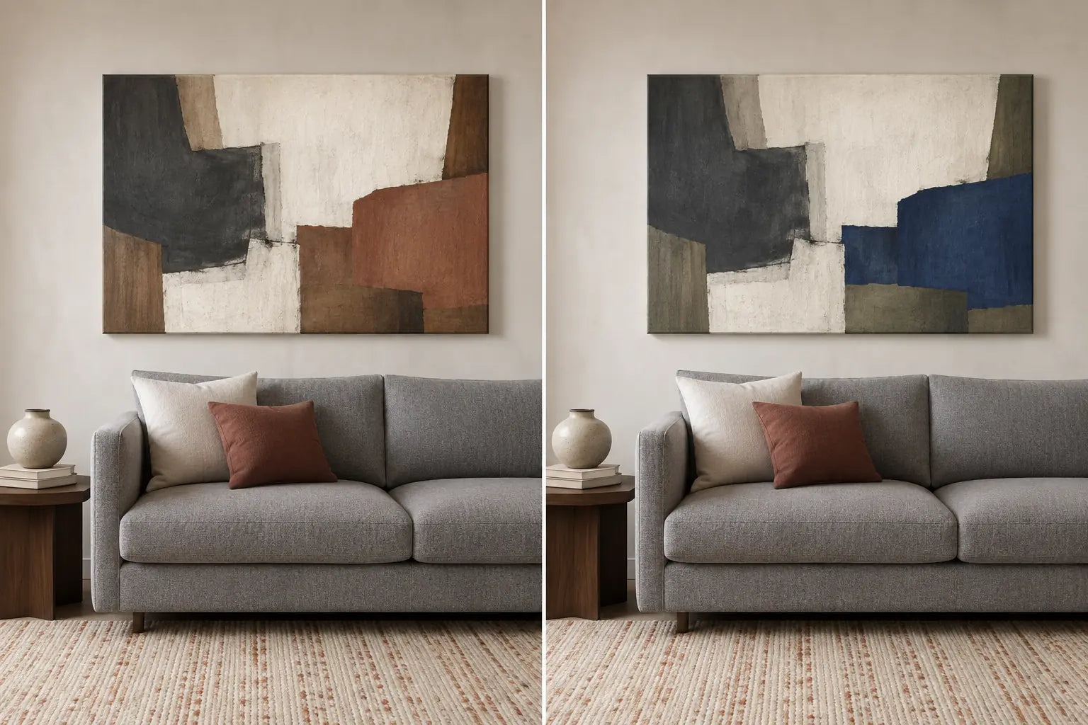
RANGE: separate art, wall and seating field
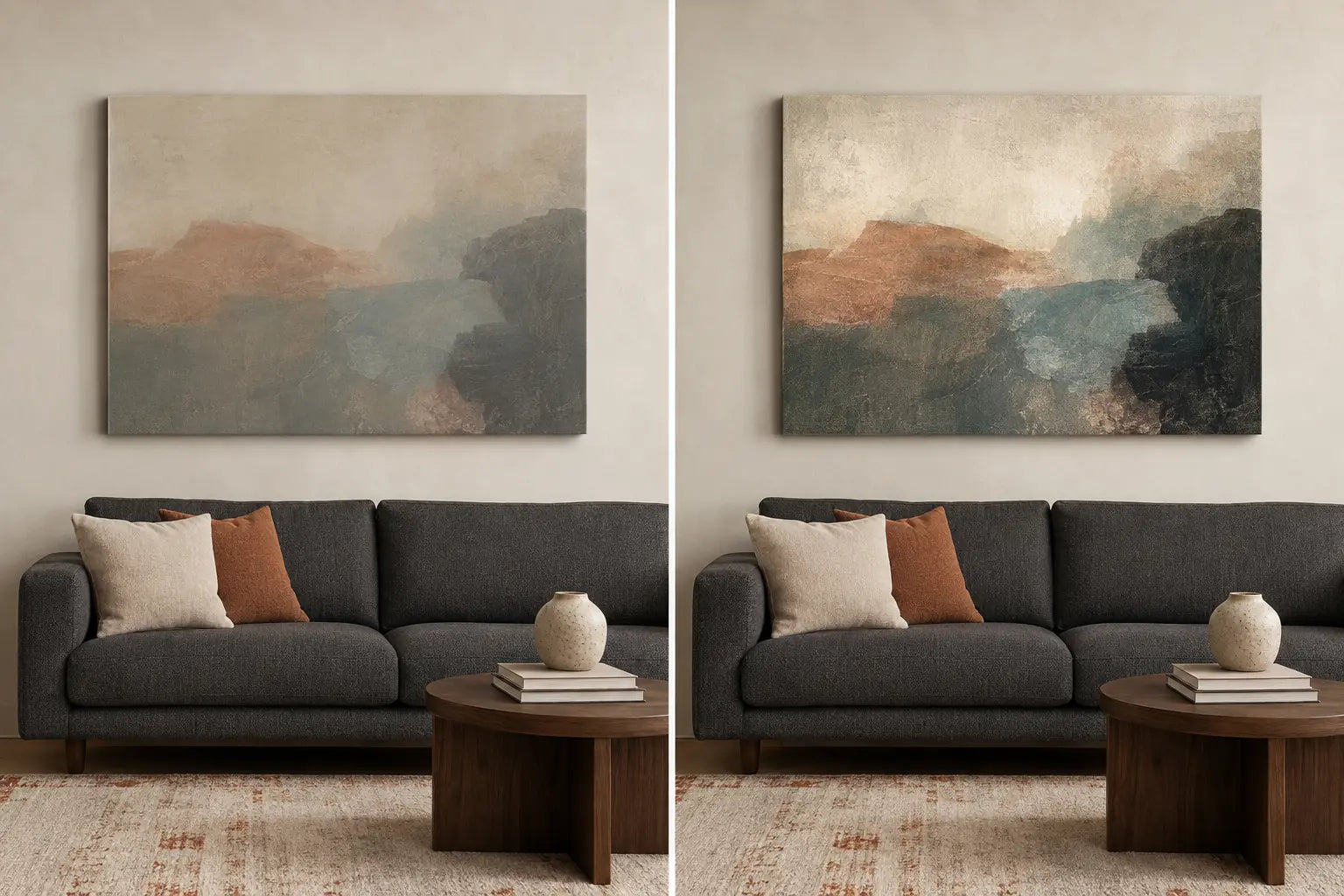
Color family and tonal range are different decisions. Two canvases can use the same blue, clay and cream families while one stays in compressed middle values and the other includes clearer pale and deep passages. Hold the palette, image structure, footprint and room constant. Change only the light–dark range and view the result from the normal distance.
Judge three boundaries: the outside edge of the canvas against the wall, the main subject or large forms inside the art, and the complete wall–art–sofa stack. The artwork does not have to contrast strongly with the sofa if the wall already supplies a clean field. Conversely, pale art on a pale wall may still disappear above a charcoal sofa even though sofa-to-art contrast looks dramatic in a cropped image.
A pass means the intended hierarchy survives without unwanted merging. Quiet tonal art can pass when its edges and structure remain deliberate; broad range can pass when dark or bright passages do not overwhelm the room. Reject a candidate only for the failure you can name. Retest range before simultaneously changing hue, subject, saturation and size.
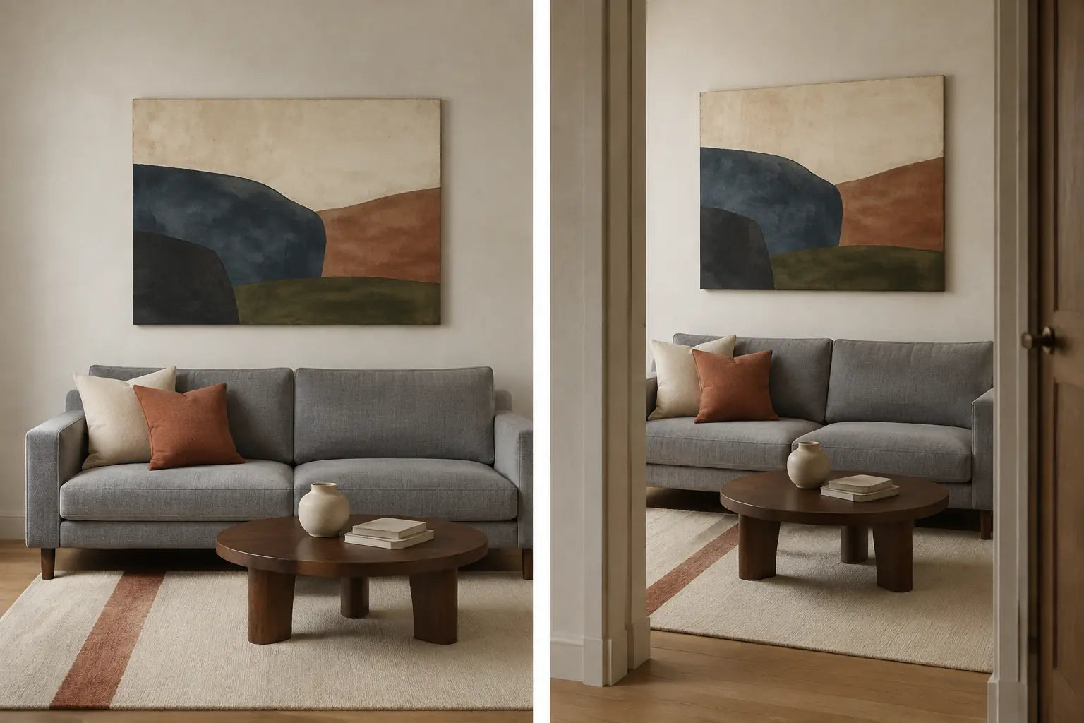
TRIAL: prove the shortlist in the actual room
Build full-size paper outlines or use equally sized proxies for the shortlisted footprints. Keep center point and orientation fixed while comparing palette or range. Then freeze the preferred arrangement and look from the main seat, the entrance approach and any adjoining space that normally sees the wall. A front-facing mock-up can hide a doorway, table lamp or wall edge that changes the composition from daily routes.
Repeat the unchanged shortlist in ordinary daylight and evening light. Do not require identical appearance; require the intended job to remain readable. A connecting color should still relate to its anchor. A tonal piece should retain structure. A contrasting piece should not become an isolated block. If the result fails, change one thing: footprint, center, palette job or range. Use the format guide only when orientation is the next declared variable.
The final output is a short verdict: keep, retest, relocate or stop. “No purchase yet” is not indecision when the sofa changes cast strongly, the wall already has enough activity, or every candidate depends on a flattering crop.
Choose the first controlled test
Start with visible evidence, not a favorite color name. The table identifies the first variable worth testing while the room, artwork footprint and other decisions remain fixed.
On a narrow screen, scroll the table horizontally to compare all columns.
| Observed condition | Hold constant | First variable to test | Visible pass | Reject and retest |
|---|---|---|---|---|
| Sofa cast is uncertain | Room, light state and fixed materials | Observation time, not artwork color | Value is clear; uncertainty is recorded honestly | One photo drives the label; observe in another normal light state |
| One strong rug or curtain cue | Canvas footprint, range and room | Artwork palette route | One cue connects without copying the whole textile | Palette becomes a catalogue of every room color; simplify the anchor |
| Charcoal sofa and deep wall | Hue family, subject and footprint | Artwork tonal range | Canvas edge and main forms remain readable | Dark passages merge into the wall; broaden range or test another wall |
| Pale wall and light-gray sofa | Palette job and installation field | Edge and internal value separation | Art remains intentional without becoming a harsh block | Everything dissolves or contrast dominates; adjust range only |
| Deliberate monochrome room | Neutral palette and footprint | Composition density | Structure is legible without an added accent | Texture and subject vanish; simplify or widen the value range |
| Mock-up works only straight on | Complete installed arrangement | Viewpoint | Palette job and hierarchy survive normal routes | Doorway view breaks the field; shift, resize, relocate or stop |
Six gray sofas, six different decisions
The scenarios below do not assign permanent colors to sofa categories. Each one begins with evidence, states a decision, identifies a visible failure and retests one variable.
1. Light blue-gray sofa against a white wall
- Evidence
- The upholstery repeatedly appears silver-blue in daylight; the white wall supplies clear edge separation; warm oak and one clay textile are already present.
- Decision
- Test either a tonal blue-green composition for continuity or one restrained clay accent that connects the existing textile. Keep both candidates the same size.
- Reject
- Mustard or rust is added automatically to “warm up gray,” or pale art disappears because only sofa-to-art contrast was considered.
- Retest
- Hold the footprint and composition density. Change only the palette route, then repeat under evening light.
2. Warm greige sofa, cream wall and oak
- Evidence
- The sofa consistently leans brown beside a cream wall, and oak already dominates the fixed material palette.
- Decision
- Use an earth-neutral work for a quiet field or test a controlled blue-green counterpoint. If the sofa is truly taupe or mushroom, hand the decision to the brown-sofa owner.
- Reject
- A beige canvas merges into sofa and wall without intentional structure, or “greige” is treated as gray merely to preserve the chosen topic.
- Retest
- Keep hue family and footprint; broaden only the artwork’s tonal range so its perimeter and main forms become readable.
3. Charcoal sofa with a deep wall or media unit
- Evidence
- The sofa, wall and nearby dark unit form one large low-value field; fine dark artwork detail disappears from the normal seat.
- Decision
- Shortlist a composition with useful pale negative space or a clear saturated focal area, while keeping the selected color family and footprint constant.
- Reject
- A dark, dense canvas becomes an extension of the wall, or a nearly white work is chosen solely because the sofa is charcoal.
- Retest
- Change only tonal range. Recheck from the doorway and in the evening state when the dark field is most active.
4. Mid-gray sofa with a multicolor rug
- Evidence
- The rug already carries several strong colors, while the sofa and wall are quiet. One rug family remains visible from both seat and entry.
- Decision
- Repeat that one family in the artwork or use a neutral bridge that lets the rug remain the color leader.
- Reject
- Every rug color is reproduced in the canvas, creating a second competing pattern, or cushions are moved simply to make the artwork appear coordinated.
- Retest
- Keep the room exactly as lived. Remove one artwork accent family while preserving composition, footprint and range.
5. An intentionally monochrome room
- Evidence
- The desired result is quiet and architectural; black, white, cream and layered gray are deliberate rather than unfinished.
- Decision
- Keep the palette tonal. Let subject scale, negative space, texture and value separation provide hierarchy instead of forcing a bright accent.
- Reject
- Color is introduced only because gray is called boring, or low-contrast detail disappears against both wall and sofa.
- Retest
- Hold the neutral palette. Change only composition density or range, then compare from the normal viewing distance.
6. Heathered gray under mixed daylight and lamps
- Evidence
- Different fibers become blue, violet or beige at different times, and no single cast remains stable across the room’s normal use.
- Decision
- Mark cast uncertain. Compare one restrained mixed palette with one neutral candidate rather than selecting a corrective color.
- Reject
- A catalog image or phone eyedropper declares the “true” undertone, or the shortlist succeeds only during one temporary light state.
- Retest
- Keep both candidates at equal footprint for several ordinary viewings. If neither remains coherent, postpone or use another wall.
Write the pre-purchase brief
A useful brief is shorter than a mood board and stricter than a color wish list. Record the evidence before opening product pages, then compare only options that can satisfy the same test.
- Sofa observation
- Light, mid-gray or charcoal; repeatable blue, green, violet or brown direction—or uncertain.
- Wall field
- Its apparent lightness, color direction, texture and interruptions behind the proposed art.
- Palette job
- Repeat one cue, bridge fixed materials, introduce a controlled accent, or remain tonal.
- Chosen anchor
- The specific rug, curtain, wood, ceramic or metal cue that provides evidence; “the whole room” is too broad.
- Range target
- Compressed, moderate or broad enough for the canvas edge and main forms to remain readable.
- Fixed comparison
- Same outer footprint, center and orientation while palette or range changes.
- Real-room proof
- Main seat, entrance approach and normal daylight/evening states, with one variable changed per retest.
- Availability gate
- Confirm the actual subject, dimensions, panel format and current option on the specific page; do not infer availability from this guide.
- Fallback
- A quieter palette, different range, smaller or larger footprint, adjacent wall, or no purchase yet.
After the palette and range pass, calculate the finished outer dimensions with the wall art size guide and resolve placement with the hanging-height guide. Do not import a universal sofa ratio or fixed gap into the color test.
When one palette job, tonal range and real-room trial have passed, keep the written brief beside you while you browse canvas prints. Verify the current option and exact dimensions before treating any artwork as the final candidate.
Frequently asked questions
What color wall art goes best with a gray sofa?
There is no single best family. Start with the artwork’s job: repeat one existing cue, bridge fixed materials, add deliberate contrast or stay tonal. Compare candidates at equal footprint, then judge them against both wall and sofa in the room’s normal light.
Does wall art have to match a gray couch?
No. Matching can create a quiet tonal result, but connection can come from one rug, wood or curtain cue instead. An independent accent can also work when it is clearly intentional. The test is a readable relationship, not identical colors.
How can I tell whether my gray sofa is warm or cool?
Observe it beside the wall and fixed room materials in ordinary daylight and evening light. Note a direction only when it repeats. Heathered fabric and changing light may make “uncertain” the most accurate result; do not rely on one retailer photo or screen sample.
What if the sofa looks blue, green, violet or beige?
Treat that appearance as evidence, not a defect to correct. You can repeat it, bridge it to another material, or oppose it with a controlled accent. If beige or brown remains dominant, the upholstery may belong to the taupe or brown decision path instead.
Should art be lighter above a charcoal sofa?
Sometimes a broader range or pale negative space improves separation, but the wall field matters as much as the sofa. Dark art can remain intentional on a pale wall, while pale art can disappear on another pale surface. Test range without changing the palette and size.
Can neutral or black-and-white art work with gray seating?
Yes. A neutral palette is a complete choice when the room is meant to stay quiet. Make sure the canvas edge, subject and negative space remain legible. If the result feels flat, change composition density or tonal range before adding color.
Should the artwork match the rug or pillows?
It may repeat one cue, but it does not need to copy every color. Rugs are usually more fixed than removable pillows, so they often provide steadier evidence. Keep the room unchanged during comparison; do not restyle accessories merely to rescue a weak artwork fit.
How large and how high should art hang above the sofa?
Those are separate decisions. First compare palette and contrast at an equal proxy footprint. Then use the measured wall, finished artwork dimensions, furniture and actual viewing position to determine scale and height; verify hardware and installation for the real wall and artwork.