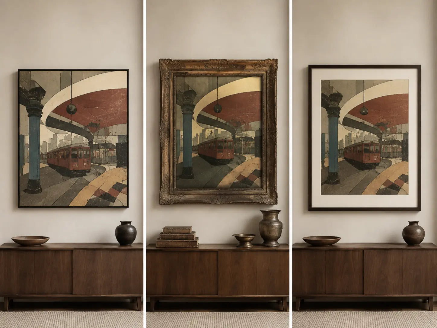
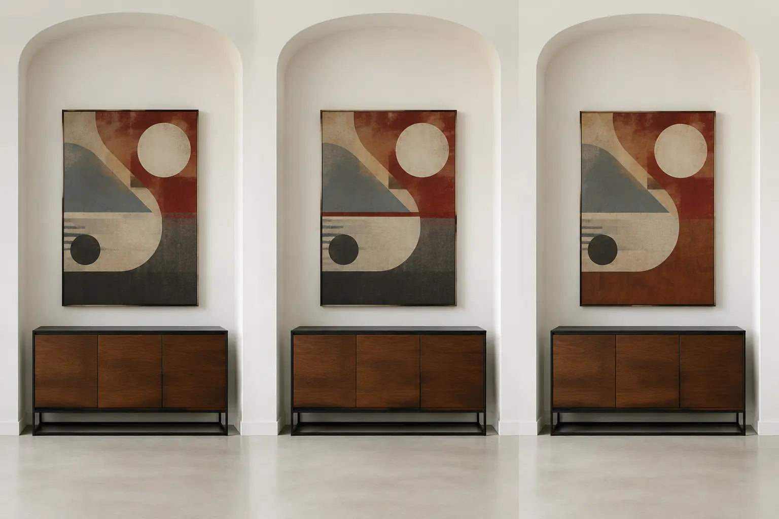
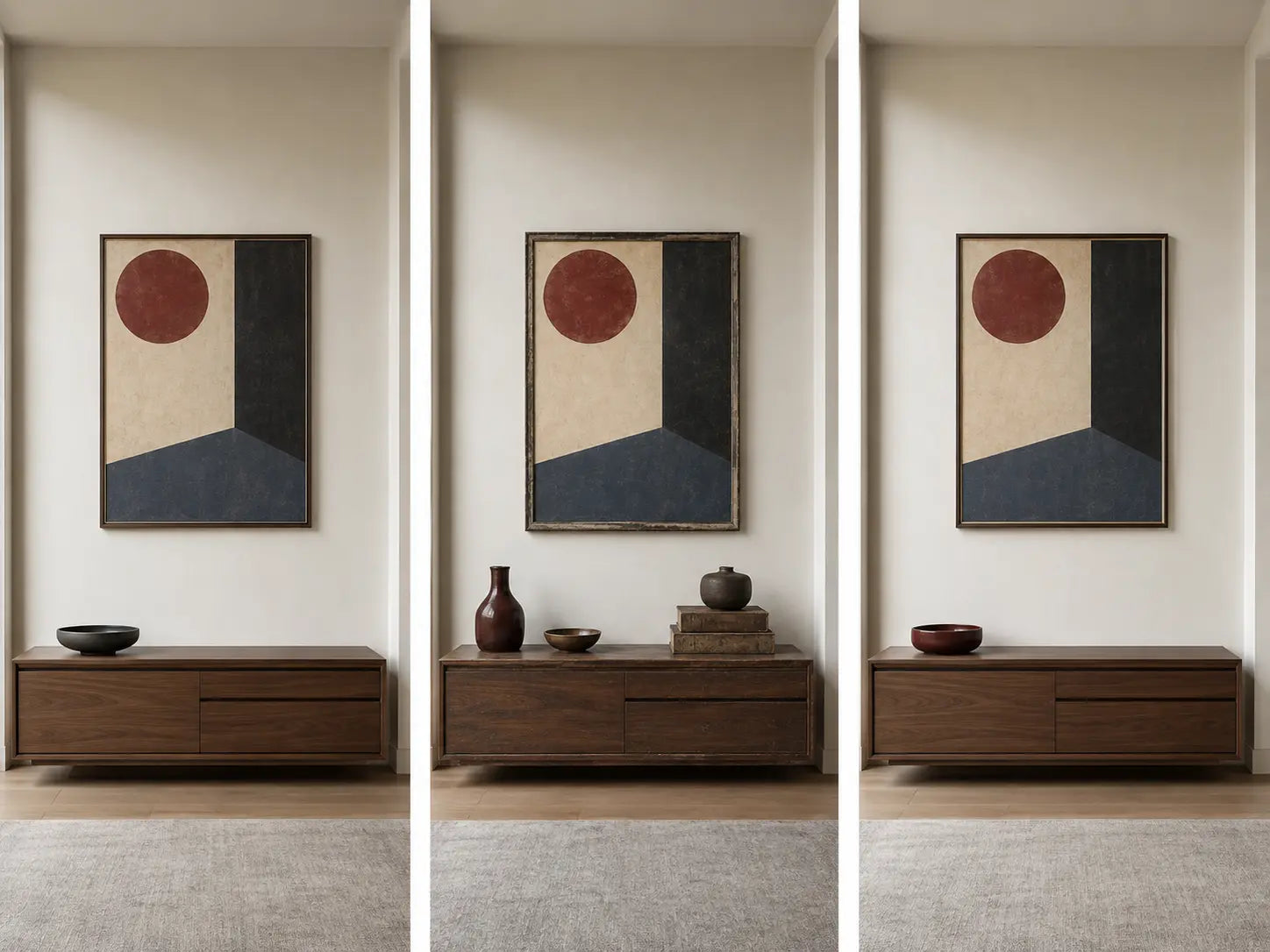
Vintage Wall Art with Modern Furniture: How to Mix Eras
Share
Pair vintage wall art with modern furniture by choosing one clear reference to an earlier period, connecting it to the room through color or shape, and keeping the remaining furniture and wall space controlled. The artwork does not need to match the age of the sofa, table, or lighting. It needs a visible relationship with them.
Start by identifying what is actually vintage about the listing: the original image, the subject, the graphic language, or only the current design’s appearance. Then measure the wall, compare the artwork’s level of detail with the furniture, and use one bridge element to connect the two periods without turning the room into a historical theme.
In this guide
- Identify what “vintage” means on the listing
- Choose one clear period signal
- Read the modern furniture first
- Build a bridge between the eras
- Decide what should contrast
- Choose the scale and visual weight
- Choose a vintage subject family
- Plan the color relationship
- Choose the physical format
- Use the method by room
- Verify the image source and rights
- Build a practical shortlist
- Avoid common mistakes
- Frequently asked questions
Identify what “vintage” means on the listing
“Vintage wall art” is often used as a broad shopping label. It may describe an older original image, a newly produced canvas based on an older image, a current photograph of an older subject, or a new design that uses colors and graphic methods associated with an earlier period.
Do not assume that the physical canvas itself is old. A recently printed canvas can show a historic photograph, imitate an aged travel poster, or use a newly created retro composition.
| Listing type | What may be older | What may be new | What to verify |
|---|---|---|---|
| Older original object | The physical photograph, print, poster, illustration, or artwork | Nothing, unless it has been restored or remounted | Age, condition, creator, provenance, and seller description |
| New reproduction of an older image | The source image or original artwork | The canvas, printing, crop, and physical presentation | Original image date, source, reproduction status, dimensions, and current format |
| Current image of an older subject | The car, building, clothing, object, or design shown | The photograph or artwork and the physical canvas | Creator, image date, subject, and rights status |
| New vintage-style design | The visual references only | The image and the physical canvas | Which period signals are intentional and whether the product title describes them accurately |
The word retro often describes a newer design that deliberately refers to an earlier period. A retro-style image does not need to be physically old. It may use an earlier color scheme, crop, lettering structure, object, or photographic treatment within a newly created composition.
Choose one clear period signal
A room usually needs only one strong reference to an earlier period. The artwork can provide that reference through its subject, palette, composition, photography, typography, or apparent printing method. The furniture does not need to repeat all of those features.
| Period signal | How it may appear | Modern room connection | Main risk |
|---|---|---|---|
| Historic subject | Older transport, architecture, clothing, machinery, streets, interiors, or household objects | Connect through furniture material, line, or one repeated color | Adding several matching objects can make the room feel like a themed display |
| Black-and-white photography | High contrast, soft gray range, film grain, strong crop, or documentary viewpoint | Works with black metal, gray fabric, pale wood, glass, or a strong wall color | Dark images can disappear against charcoal furniture or walls |
| Earlier graphic design | Large flat shapes, simplified illustration, limited colors, geometric layout, or poster-like composition | Repeat one shape or accent color in a current object | Typography and commercial marks may create source or trademark questions |
| Aged visual treatment | Faded color, simulated paper tone, scratches, grain, worn borders, or uneven printing | Contrast with smooth current furniture and clean wall surfaces | Repeating distressed furniture and accessories can make the treatment too literal |
| Decorative period motifs | Fans, sunbursts, stepped geometry, ornamental borders, curves, or repeated linear patterns | Connect with one furniture curve, metal finish, or repeated geometry | Several ornamental surfaces can compete with one another |
| Historic color structure | Sepia, muted blue, olive, rust, ochre, cream, burgundy, or restricted printed color | Repeat one color in a small textile or object and keep the rest controlled | Using every artwork color across the room can make the relationship forced |
Some period references are easier to identify than others. The V&A’s Art Deco overview traces the style through furniture, fabrics, ceramics, metalwork, glass, geometric forms, and contrasting materials. A canvas using stepped geometry or repeated fan shapes can therefore connect with one modern brass, glass, or dark-wood detail without requiring a complete Art Deco room.
When that visual direction fits the wall, compare deco-inspired wall art separately from the broader vintage category.
Read the modern furniture first
Modern furniture is not one fixed style. A current room may contain low modular seating, tubular metal, molded shapes, pale wood, dark wood, glass, stone, or several references to twentieth-century design. Identify the furniture’s dominant lines and materials before choosing the artwork.
The V&A’s survey of Modernist chairs shows how twentieth-century furniture explored tubular steel, bent plywood, molded forms, and new relationships between furniture and interiors. These materials remain useful visual clues when connecting current furniture with an earlier image.
| Modern furniture condition | Useful vintage-art direction | Possible bridge | What to avoid |
|---|---|---|---|
| Low cream or gray modular sofa | Large black-and-white photograph, muted travel image, architectural scene, or restrained retro graphic | Black line, cream field, gray value, or one muted accent | A small pale image that looks detached from the width of the sofa |
| Tubular-metal chair or glass table | Earlier industrial photography, geometric poster-style design, transport subject, or black-and-white city image | Black line, chrome-like gray, circular form, or structured crop | Several thin black grids competing with furniture legs and window frames |
| Pale-oak furniture | Muted botanical image, travel scene, warm monochrome photograph, or graphic work with blue, green, rust, and cream | Wood tone, cream background, or one cool contrast | Several similar beige and brown areas merging into one low-contrast block |
| Dark walnut or brown leather | Black-and-white photography, pale travel graphics, blue-green illustration, or vintage architecture | Dark outline combined with a lighter background | Dark sepia images disappearing against the furniture after daylight changes |
| Curved sculptural seating | Earlier fashion photography, a centered portrait, circular graphic design, or a contrasting architectural image | One repeated curve or an intentional straight-line contrast | Repeating every curve in lamps, tables, rugs, and wall art |
| Simple black-and-white room | Monochrome vintage image or one restricted retro color group | Black, white, gray, and one selected accent | Introducing several unrelated saturated colors in both artwork and accessories |
Identify the dominant line
Look for the line that appears most often in the furniture arrangement:
- Long horizontal sofa and cabinet edges
- Vertical shelving and window divisions
- Curved chair backs and rounded tables
- Thin black metal frames
- Large uninterrupted upholstery surfaces
- Repeated rectangular cushions, panels, or doors
The artwork can repeat one of these lines or provide a deliberate contrast. A horizontal railway scene can continue the line of a low sofa. A vertical fashion photograph can interrupt a long wall filled with low furniture. A circular retro graphic can soften a room containing several rectangles.
Build a bridge between the eras
A bridge is one visible element shared by the artwork and the modern furniture. It prevents the combination from looking accidental without requiring the room and image to belong to the same period.
Color bridge
Repeat one artwork color in a small object, textile, book, lamp, or furniture detail. A muted blue from a travel image may reappear in one cushion. A rust-colored graphic may connect with a walnut cabinet or leather chair.
Shape bridge
Repeat one circle, diagonal, rectangle, or curved line. A round glass table can connect with a circular element in the canvas. A narrow vertical cabinet can relate to a vertical photograph without copying its subject.
Material bridge
Connect the apparent material language of the image with the physical room. Industrial photography can relate to black metal. A botanical plate can relate to pale wood or stone. A travel image with a cream background can connect with linen upholstery.
Value bridge
Value means the relative lightness or darkness of a color. A black-and-white photograph can connect with a pale sofa through its light areas and with black furniture through its dark edges. This allows one image to bridge several room materials without repeating their exact colors.
Subject bridge
Use the subject only when it has a real connection with the room or the person using it. A transport image may suit a home office or bar because the subject is relevant to the user, not because all vintage rooms require cars, trains, or aircraft.
Decide what should contrast
A successful mix of eras usually includes a visible difference. The contrast makes the older reference and current furniture easier to recognize. Choose which quality should differ and keep the other relationships controlled.
| Contrast type | Example | What connects the combination | Main risk |
|---|---|---|---|
| Detailed image with simple furniture | Historic city photograph above a plain modular sofa | Shared black, gray, or cream values | Nearby bookshelves and patterned textiles adding another layer of detail |
| Worn visual treatment with smooth surfaces | Simulated faded poster above a clean glass-and-metal console | One repeated line or accent color | Adding distressed furniture, worn signs, and several aged objects |
| Curved vintage graphic with straight furniture | Rounded poster composition above a rectangular cabinet | Similar outside scale or one shared color | The graphic appearing too small relative to the cabinet |
| Warm artwork with cool furniture | Rust-and-cream travel image near gray seating and black metal | Neutral cream, charcoal, or wood detail | The warm image becoming isolated if no bridge neutral is present |
| Monochrome artwork with colored furniture | Black-and-white photograph above a blue, green, or rust sofa | Dark furniture legs, pale wall, or repeated gray object | A small photograph losing emphasis beside a strongly colored sofa |
Do not remove every difference in an attempt to make the artwork “match.” The purpose of mixing eras is not to hide the difference. It is to give the contrast a clear structure.
Choose the scale and visual weight
Set the physical footprint from the wall and furniture before judging the period reference. Above a sofa, cabinet, console, or sideboard, a practical starting width is approximately 60% to 75% of the furniture below it. Treat this as a test range rather than a rule for every wall.
| Furniture width | Approximate metric width | Starting artwork range | Approximate metric range |
|---|---|---|---|
| 72 inches | 183 cm | 43 to 54 inches | 109 to 137 cm |
| 84 inches | 213 cm | 50 to 63 inches | 127 to 160 cm |
| 96 inches | 244 cm | 58 to 72 inches | 147 to 183 cm |
| 120 inches | 305 cm | 72 to 90 inches | 183 to 229 cm |
Use the Artesty sizing guide to compare current horizontal, vertical, square, three-panel, and five-panel size groups. Confirm the actual dimensions and configurations on the individual listing.
Compare visual weight as well as width
Two canvases with the same dimensions can carry different visual weight. A dark portrait, high-contrast advertisement, or dense city photograph may appear stronger than a pale botanical image or travel scene with a large open sky.
Visual weight increases through:
- Large dark areas
- High light–dark contrast
- One large face or figure
- Several small architectural details
- Strong red, yellow, blue, or black areas
- Large typography or a bold central symbol
- Several figures or objects within one scene
A high-weight image may need more open wall and fewer nearby objects. A low-weight image may need a larger physical size or stronger contrast with the wall rather than additional accessories.
Use equal footprints for comparisons
Mark one outside rectangle with removable tape and compare each shortlisted image within the same physical boundary. This prevents a larger candidate from appearing more suitable only because it occupies more wall.
Choose a vintage subject family
The subject often carries the strongest period signal. Choose one that fits the room and the normal viewing distance rather than selecting a historical reference only because it appears old.
Black-and-white photography
Street scenes, architecture, transport, fashion, industrial subjects, and anonymous figures can connect with current furniture through black metal, gray upholstery, glass, and pale walls. Detailed photographs work best where viewers can approach the canvas or see it from medium distance.
Compare black-and-white wall art when the room needs a limited palette.
Travel and transport imagery
Railways, ships, road scenes, bicycles, aircraft, and older vehicles can introduce strong horizontal lines and recognizable machinery. Use one transport subject as the room’s main period reference instead of adding matching signs, models, maps, and equipment around it.
Architecture and city scenes
Historic buildings, streets, bridges, shops, stations, and interiors can work with current sofas, tables, and lighting because architecture provides a clear line system. Check whether small signs, people, windows, and street details remain visible at the selected size.
Botanical and scientific illustration
Plant studies, natural-history plates, diagrams, and specimen-like compositions can work with pale wood, stone, cream upholstery, glass, or restrained color. Verify that labels or scientific claims remain legible and accurate when they form part of the image.
Advertising and graphic design
Poster-style compositions can introduce flat shapes, restricted color, bold crops, and typography. Check the exact source, wording, product marks, and reproduction status. A decorative imitation of an older advertisement is not the same as an original historic poster.
Fashion and portrait imagery
Earlier clothing, hairstyles, poses, and photographic treatment can provide a strong period reference. Portraits usually become the primary subject of the wall. Verify the identity and rights status of recognizable people rather than assuming that an older photograph is free to reproduce.
Maps and diagrams
Maps can work well in offices, reading areas, hallways, and travel-related rooms. Check the place names, boundaries, date, legibility, and image source. An older map may contain historical information that should not be presented as current.
Plan the color relationship
Vintage-style imagery is not limited to brown, cream, or sepia. Earlier photographs, posters, packaging, textiles, and illustrations used black and white, restricted printed colors, saturated primaries, pastels, dark earth colors, and several combinations of warm and cool tones.
| Artwork palette | Useful furniture relationship | Bridge element | Main check |
|---|---|---|---|
| Sepia, cream, and dark brown | Gray, blue, green, cream, black, pale oak, or glass furniture | One wood tone or cream textile | The image does not merge with dark walnut or brown leather |
| Black, white, and gray | Almost any controlled modern furniture palette | Black metal, pale wall, gray textile, or clear glass | The canvas has enough physical scale beside colored furniture |
| Muted blue, olive, rust, and cream | Neutral sofas, warm wood, black metal, or stone surfaces | Repeat one blue, green, or rust detail | Several muted colors do not become indistinct under warm evening light |
| Faded pastel color | Dark furniture, black accents, or a stronger wall color | One pale textile or light wood element | A small low-contrast image does not disappear on a white wall |
| Saturated retro primaries | Simple neutral furniture and limited surrounding pattern | One small repeated accent and a bridge neutral | The room does not repeat every artwork color |
| Burgundy, navy, gold, and black | Cream upholstery, pale walls, dark wood, or restrained metal | One dark line or selected warm accent | The combination remains readable under low evening lighting |
Check wall color separately
The furniture may relate well to the canvas while the wall does not provide enough contrast. A pale faded image can disappear on a warm white wall. A dark photograph can merge with charcoal paint. Use a full-size template and a large color sample rather than relying on a small screen preview.
Check daytime and evening light
Warm evening light can strengthen brown, red, rust, cream, and yellow. Cooler light can strengthen blue, gray, white, and green. Review the artwork under the lighting used most often in the room before choosing the final palette.
Choose the physical format
The display format determines how strongly the vintage reference appears. One large canvas usually creates a clearer relationship with modern furniture than several unrelated small pieces. A group can work when the wall is viewed closely and the images share a defined connection.
| Format | Choose it when | Main check |
|---|---|---|
| One large canvas | The image provides the room’s main period reference or contains one connected scene | The physical size relates to the modern furniture below it |
| Coordinated pair | Two images share subject, period, crop, palette, or outside dimensions | The pair looks intentional without resembling two fragments of one image |
| Three-panel set | The composition was prepared for two gaps and the broader footprint suits the wall | Faces, lettering, vehicles, signs, buildings, and horizon lines are not divided poorly |
| Repeated series | Several related images use the same size and a controlled subject or color system | The sequence has consistent spacing and enough wall length |
| Measured gallery group | The wall is viewed closely and each image adds a distinct part of one subject or period | Frames, colors, typography, and subjects do not create several equal focal points |
Add the gaps in a panel arrangement
The complete installed width includes the physical canvases and the open wall between them.
Installed width = sum of panel widths + total width of all gaps
Use the installed width when comparing the arrangement with a sofa, cabinet, console, or clear wall section. Inspect every panel edge before choosing a set based on photography, typography, portraits, or detailed architecture.
Do not create false physical age
A printed canvas may show simulated paper tears, discoloration, film grain, ink loss, or worn edges. Do not add distressed furniture, artificial damage, and several weathered objects solely to repeat those effects. Smooth current furniture can provide a useful contrast with the printed image treatment.
Use the method by room
Living room
Use the sofa or main console as the scale reference and review the artwork from both the entrance and seating position. One large vintage-style photograph or graphic canvas can provide the period reference while current furniture maintains the room’s present-day structure.
Browse living room wall art after the required footprint and subject family are clear.
Bedroom
Compare the artwork with the headboard, bedding, curtains, lamps, and wall color. A detailed historic photograph may compete with patterned bedding, while a simpler botanical or travel image may leave more open visual space. Check portraits from both the room entrance and the bed because their presence changes at close range.
Home office
Measure the wall after monitors, shelving, task lights, boards, and storage are installed. Maps, architecture, transport, graphic design, and black-and-white photography can work when their details remain visible from the desk. Keep outdated geographic or technical information clearly within its historical context.
Dining room
A horizontal city, travel, or advertising-style image can relate to a sideboard, bench, or long table. Review it under the lighting used during meals and check that pendant lights, flowers, and seated people do not block the main subject.
Hallway and entryway
Use one clear photograph, travel image, portrait, or vertical graphic design. Hallways support closer viewing, but doors, switches, lights, signs, and narrow circulation reduce the usable wall. Avoid building a dense period display in a space where people cannot step back to see it.
Open-plan room
Assign the vintage artwork to one furniture zone. A living-area canvas can carry the earlier reference while the dining or work zone uses a smaller current abstract or no additional artwork. Review all visible walls together from the main entrance.
Verify the image source and rights
An image that looks old is not automatically in the public domain. Copyright duration depends on factors such as when the work was created or published, who created it, and the applicable law. The U.S. Copyright Office explains that copyright can include exclusive rights to reproduce, distribute, adapt, and display visual works.
Historical archives may identify particular images as free to use, public domain, cleared, or subject to specific conditions. The Library of Congress Free to Use and Reuse sets provide examples of historical photographs, posters, maps, and other materials with source-specific rights guidance. The status of one archive set should not be transferred automatically to another image.
Before choosing vintage or retro wall art, check:
- The creator of the original image, when identified
- The approximate date of the original image
- The date of the physical print or canvas
- The exact source of the photograph, illustration, scan, or digital file
- Any public-domain, license, or permission statement supplied for that exact image
- Whether a recognizable person, logo, product, vehicle mark, character, or advertisement appears
- Whether the product is described as a reproduction, current design, or vintage-style interpretation
- Whether the attribution in the title is supported by the description and source information
Build a practical three-option shortlist
Compare three designs with the same approximate physical footprint. Give each candidate a different period signal so the final decision is based on the room rather than a collection label.
- Choose one photographic option. Use black-and-white, sepia, or restricted-color photography with a clear subject.
- Choose one graphic option. Use a travel, advertising-style, geometric, or illustrated composition without relying on unsupported attribution.
- Choose one quieter option. Use a botanical, map, architectural detail, or lower-contrast image with fewer competing elements.
- Mark one equal wall footprint. Compare all three within the same outside dimensions.
- Identify the period signal. Record whether it comes from subject, palette, crop, typography, apparent print treatment, or decorative motif.
- Identify one bridge. Choose one furniture color, material, line, or shape that connects with the image.
- Check the contrast. Decide what should remain visibly different between the artwork and furniture.
- Review at three distances. Check from close range, the main seat, and the room entrance.
- Check daytime and evening light. Confirm that important details and contrast remain visible.
- Review the exact listing. Confirm the image, dimensions, panel configuration, attribution, source information, and current availability.
| Comparison field | What to record |
|---|---|
| Listing type | Older object, reproduction, current image of an older subject, or new vintage-style design |
| Period signal | Subject, palette, crop, typography, geometry, photograph treatment, or motif |
| Furniture bridge | Shared color, value, material, line, curve, shape, or subject connection |
| Planned contrast | Age reference, texture, color temperature, line direction, or level of detail |
| Visual weight | Low, medium, or high relative to the furniture and other visible objects |
| Complete footprint | Canvas dimensions plus every panel gap |
| Viewing distance | Close, seated, medium, or entrance view |
| Source status | Creator, date, attribution, and rights information supplied for the exact image |
Avoid these vintage wall-art mistakes
- Assuming the physical canvas is old. Separate the date of the image from the date of the printed product.
- Matching the entire room to one period. Use one clear period signal and one bridge element.
- Repeating every artwork color. One or two controlled connections are usually enough.
- Adding distressed furniture to match printed wear. Simulated aging in the image does not require physically worn room surfaces.
- Using a small low-contrast image above large furniture. Increase scale or wall contrast before adding more decorative objects.
- Choosing from sepia color alone. Subject, composition, source, and visual weight matter as much as palette.
- Combining several historic subjects in one view. Cars, maps, advertisements, portraits, and industrial objects can create competing themes.
- Ignoring modern furniture lines. Check horizontal, vertical, curved, and grid relationships before choosing the image orientation.
- Forgetting panel gaps. Add every open space to the complete installed width.
- Splitting lettering, faces, vehicles, or buildings poorly. Inspect the exact multi-panel preview.
- Using a room mockup as a measurement. Mark the listed dimensions on the actual wall.
- Assuming an older subject is free to reproduce. Check the source and rights status of the exact image.
- Trusting a famous name in the product title without supporting information. Review the creator, date, source, and attribution.
Frequently asked questions
Can vintage wall art work with modern furniture?
Yes. Choose one earlier visual reference and connect it to the furniture through color, shape, material, or light–dark value. Keep the remaining objects controlled so the contrast between the artwork and furniture appears deliberate rather than accidental.
Does vintage wall art have to be physically old?
No. The label may describe a new canvas based on an older image, a current image of an older subject, or a new design that refers to an earlier period. Check the listing to distinguish the original image date from the production date of the physical canvas.
What colors connect vintage art with modern furniture?
Black, white, cream, gray, muted blue, olive, rust, burgundy, and selected wood tones can provide useful bridges, but no palette is required. Repeat one existing furniture color or use a neutral that appears in both the artwork and room. Check the relationship under normal evening lighting.
Is black-and-white vintage photography easy to combine with modern furniture?
It often works with black metal, glass, gray upholstery, pale wood, and colored furniture because its light–dark structure can connect several materials. Scale still matters. A small photograph may look weak above a broad sofa, and a dark image can disappear against charcoal walls.
Should vintage wall art match the age of the furniture?
No. The artwork and furniture can come from different periods. Use one shared element, such as a color, curve, line, or material, and allow the period difference to remain visible. Matching every item to the same decade can make the room look like a themed set.
Is one large vintage canvas better than a gallery wall?
Choose one large canvas when the room already contains several objects or the artwork provides the main period reference. Choose a gallery group when the wall is viewed closely and the images share a controlled subject, palette, outside boundary, and source standard. Neither format is always better.
Can vintage advertising or celebrity images be used safely?
Only after reviewing the exact image’s source and rights status. Advertisements can contain protected artwork, logos, packaging, and trademarks. Celebrity photographs can involve copyright and publicity questions. An old-looking image or online product listing does not establish permission.
How do I keep vintage art from making the room look old-fashioned?
Use the artwork as one period reference rather than repeating its subject and visual wear across furniture, lighting, rugs, and accessories. Modern furniture, clear wall boundaries, limited color echoes, and a measured canvas footprint keep the two eras distinct.
Choose one period signal and one modern connection
Begin with the furniture, wall dimensions, and normal viewing distance. Then choose a vintage image with one clear period signal and connect it to the room through a single color, shape, material, or value relationship. Keep the planned contrast visible and leave enough open wall for the composition to read clearly.
Use the vintage wall art selection after the room requirements are defined. Review the exact product image, dimensions, configuration, attribution, source information, and current availability before making the final choice.