

Wall Art for Open-Plan Living Spaces: How to Create Zones Without Visual Clutter
Quick answer: do not assign an equally strong artwork to every functional zone. Choose one visual lead, let a second zone relay only one attribute, preserve a deliberate pause, and test the arrangement from the routes people actually walk and use.
This is not a rule that every open-plan home needs three artworks. It is a way to distribute attention across connected living, dining, kitchen, and work areas without turning the shared view into a showroom wall.
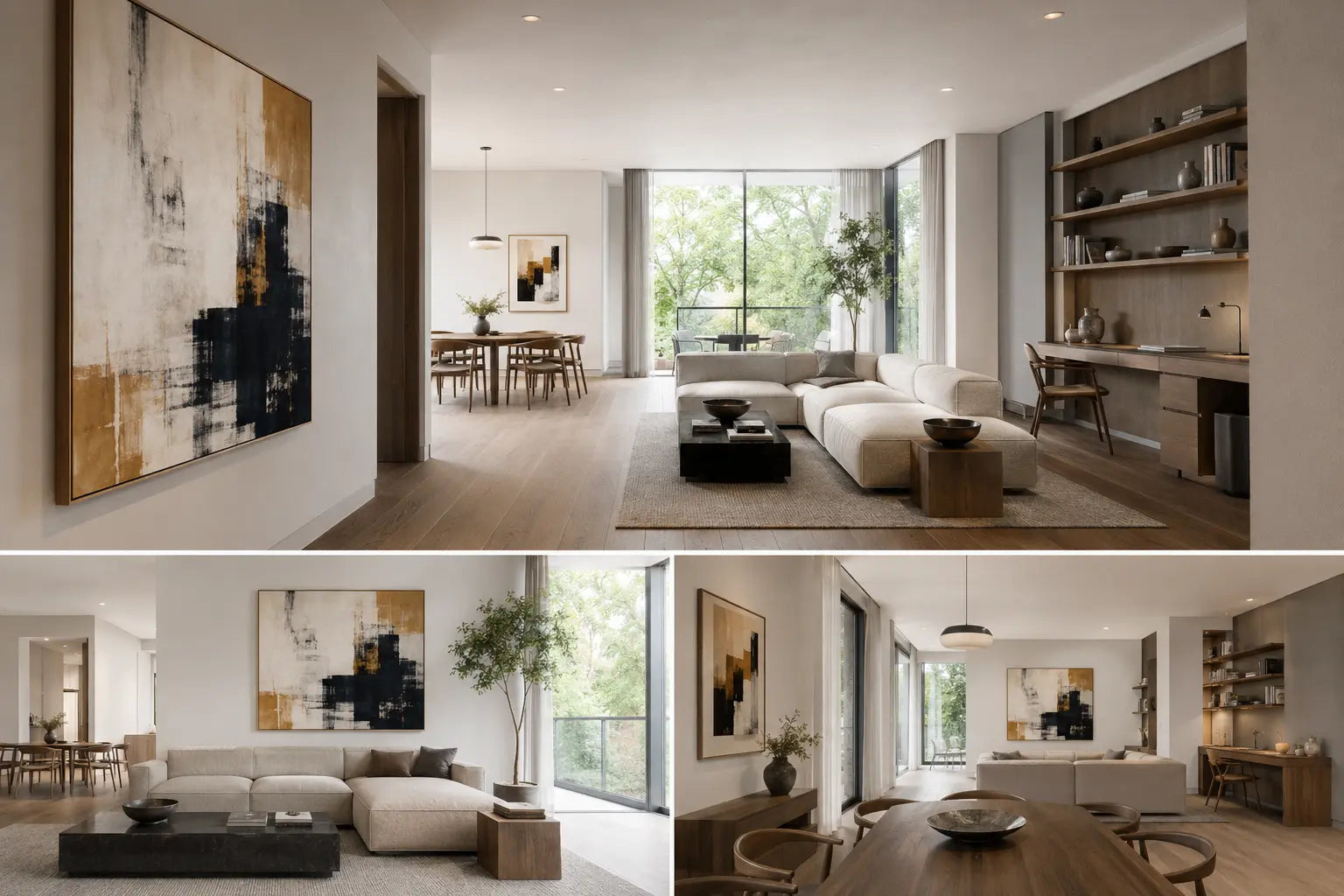
Why room-by-room shopping fails in an open plan
In a closed room, a canvas competes mostly with objects inside that room. In an open plan, the living wall may be visible behind a pendant, across a dining table, beside kitchen cabinets, and opposite a television. Art selected independently for each “room” can look sensible in close-up yet produce three simultaneous focal points from the entry.
The mistake is treating functional zones as visual boundaries. A rug can define a seating area on the floor, but the eye still reads the walls, windows, shelving, screens, and pendants as one continuous composition. The useful unit of planning is therefore not the zone; it is the sightline.
Before choosing art, stand at the entry and take an ordinary phone photo. Repeat from the sofa, the dining chair, and the path between kitchen and living area. Mark what wins attention in each image before adding anything. A black TV, bright window, dense bookcase, sculptural hood, or dramatic pendant already consumes visual capacity.
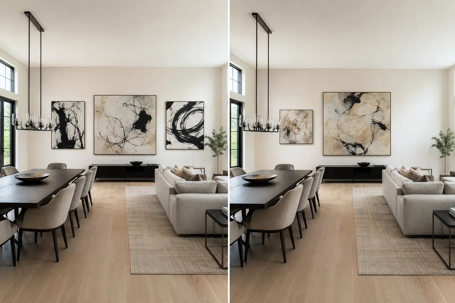
1. LEAD: give one zone primary visual weight
The lead is the artwork or art grouping that should register first across the longest useful view. It is not automatically the largest blank wall. A large wall behind a busy television may be a poor lead location, while a shorter wall seen clearly from the entry may carry authority with less visual noise.
Choose the lead by answering three questions: Which zone represents the home’s main social use? Which wall remains visible rather than repeatedly occluded by people, pendants, or doors? Which position can tolerate the strongest contrast or largest visual field without colliding with a screen or window?
Scale, orientation, and hanging height still matter, but they are separate calculations. Use the Wall Art Size Guide after choosing the lead wall, not before. If the architecture favors a particular envelope, compare the wall’s proportions with the vertical, horizontal, and square format guide.
A lead can be quiet in color and still lead through scale, edge contrast, or compositional density. Conversely, a saturated small work can dominate a pale room. Judge installed visual weight, not product-page dimensions alone.
2. RELAY: repeat one attribute, not the whole artwork
A relay connects a secondary zone to the lead without demanding equal attention. It may repeat one muted color family, one directional line, a similar frame finish, or the same degree of abstraction. It should not copy all of those cues at once.
For example, a large living-room canvas might carry charcoal, warm white, and a small ochre interval. A dining-area relay could borrow only the ochre interval in a lighter, smaller composition. If it repeats the palette, scale, contrast, texture, and black frame, it becomes a second lead. If it shares nothing, the zones can feel like adjacent catalog sets.
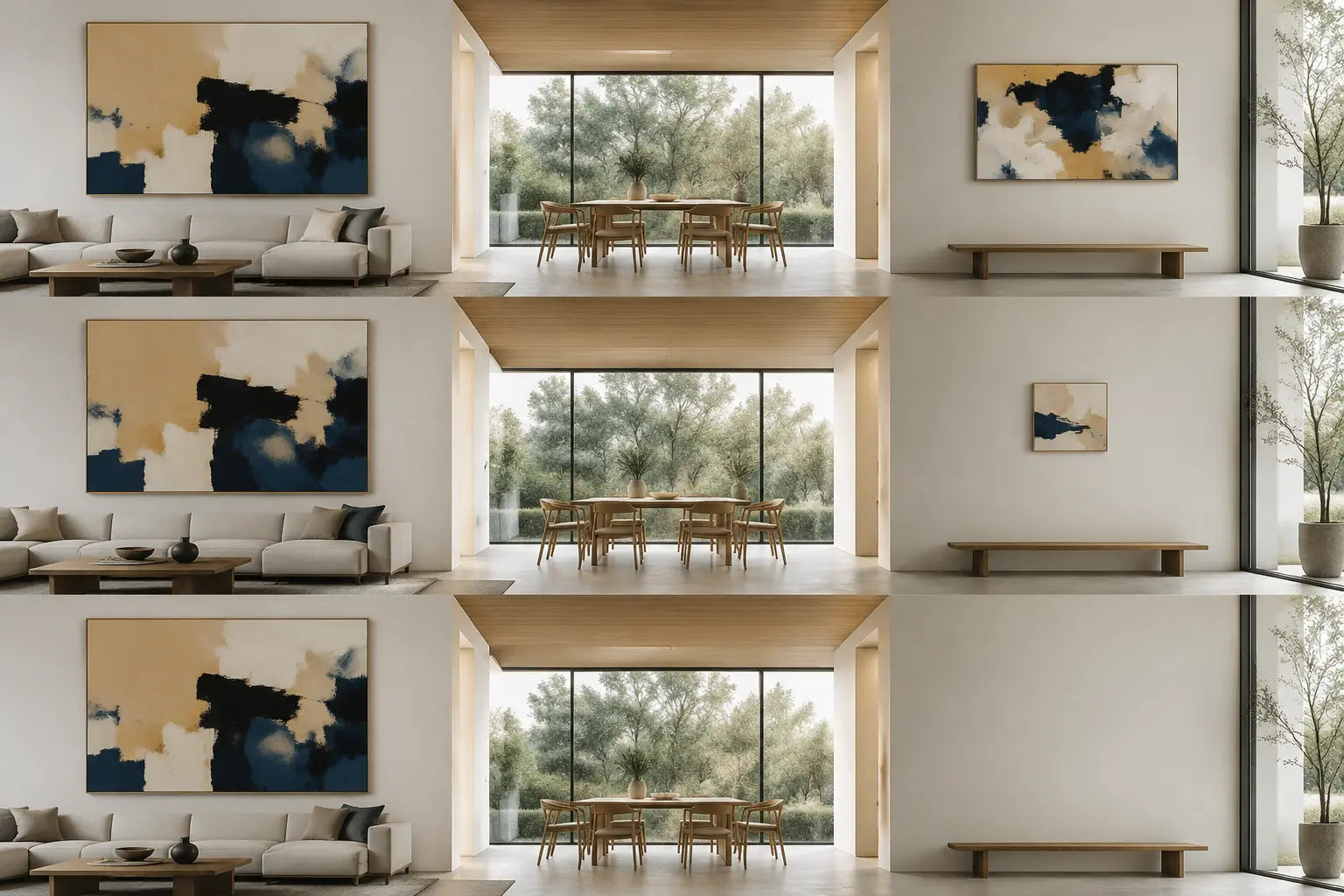
Distance matters. Two works seen together need a clearer difference in authority than two works revealed sequentially around a corner. In an L-shaped layout, a relay can be more assertive if the lead disappears before the second work arrives. In one long uninterrupted view, reduce the relay’s scale, contrast, or complexity.
Do not create a gallery wall merely to fill the secondary zone. If a grouped arrangement is genuinely appropriate, plan its internal spacing with the gallery wall guide; the open-plan decision here is whether that group should lead or relay.
3. PAUSE: leave one visible area intentionally quiet
Blank space is not unfinished space. A pause gives the eye somewhere to stop comparing. It can be an empty wall, a low-contrast textile, a restrained material surface, or a window whose outdoor view already supplies detail. The pause should look intentional because neighboring elements align cleanly—not because the owner ran out of art.
Choose the pause after counting fixed signals. Open shelving, veined stone, multiple pendants, a dark screen, and a city view can make a nominally empty wall visually active. In that case, the pause may need to occur elsewhere. A calm work is not automatically a pause either: a large pale canvas with strong texture can still hold substantial attention.
If the room feels incomplete, test a temporary paper rectangle before buying. If the rectangle improves balance, the wall likely needs mass. If it merely adds another object to track, preserve the pause.
4. ROUTE: test hierarchy from real movement
Online room mockups usually show one ideal frontal view. Open-plan rooms are experienced through movement. The lead may work from the sofa but disappear behind a pendant from the entry. A modest relay may unexpectedly align with a television and become a dark double focal point from the kitchen.
Use four route checks: entry arrival, primary seated view, secondary seated or work view, and the main circulation path. At each point, ask what appears first, what appears second, and where the eye rests. The same answer is not required everywhere; the order should simply feel deliberate.
| Observed evidence | Likely problem | First adjustment | Retest from |
|---|---|---|---|
| Two artworks register at the same instant | No clear lead | Reduce one work’s scale, contrast, or density | Entry and longest diagonal |
| Zones feel unrelated | Relay shares no cue | Repeat one color, line direction, or finish | Boundary between zones |
| Every wall feels “finished” but the room is tiring | No visual pause | Remove one secondary work for 48 hours | Primary seated view |
| Art works frontally but fails from the side | Route/occlusion conflict | Shift position or choose a simpler silhouette | Main walking path |
| TV and canvas form a dark pair | Fixed focal-point collision | Lower contrast or move the art lead away | Sofa and kitchen |
| Small work seems lost at distance | Insufficient field presence | Increase format or create a deliberate grouping | Farthest routine view |
The whole-sightline stress test
A close crop can make almost any wall look resolved. The truthful test includes adjacent windows, screens, lighting, shelving, doorways, and at least part of the next zone. Photograph the proposed wall tightly, then step back until two zones and their fixed focal points enter the frame. Convert both photos to grayscale for a value check, then return to color to judge undertones.
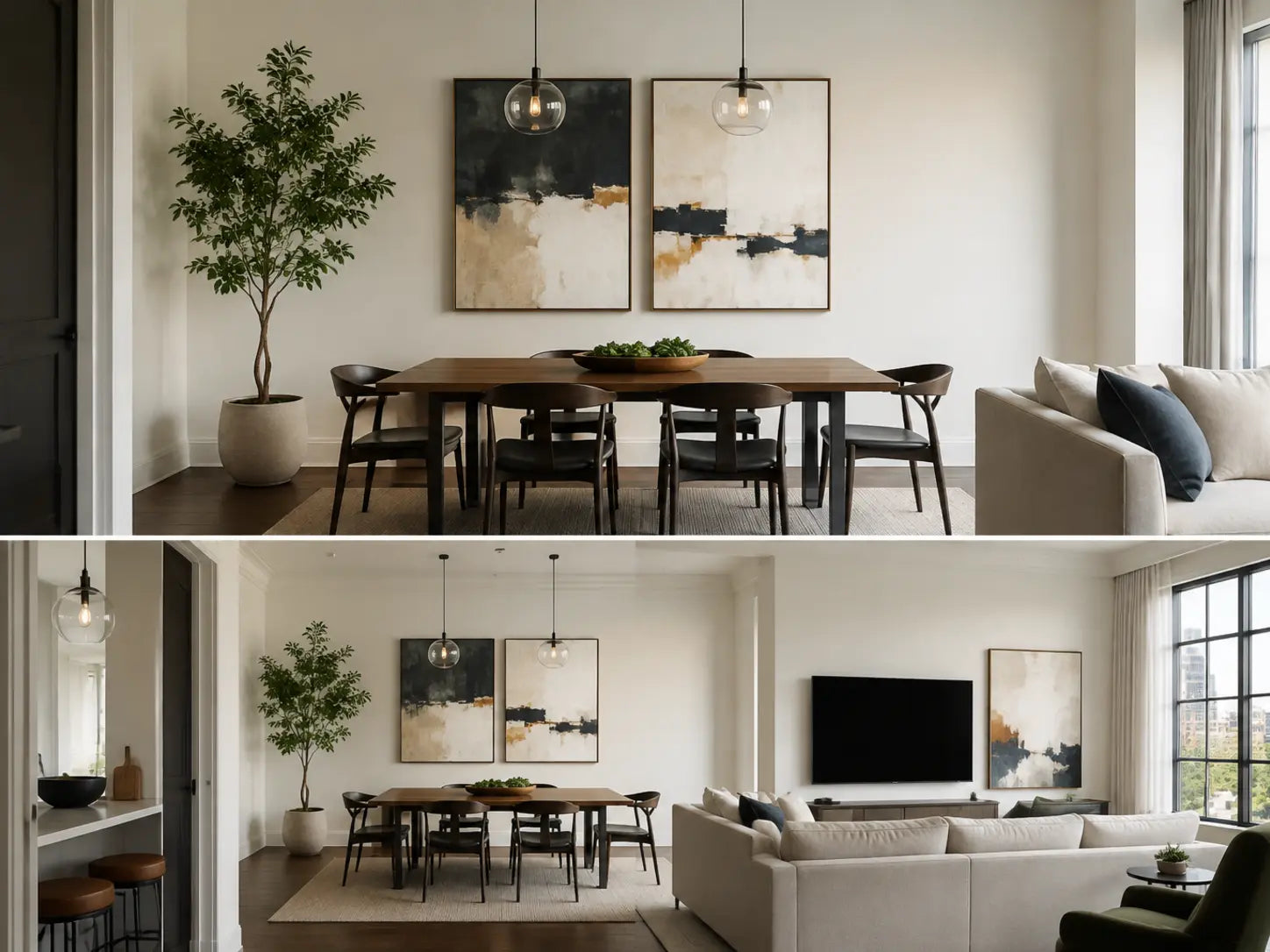
If the close crop succeeds and the wide frame fails, do not automatically replace the art. First identify the competing attribute: dark value, bright color, hard edge, repeated geometry, or sheer size. Change only one variable and retest. This prevents expensive overcorrection.
When deciding between one canvas and a segmented composition, use the one canvas versus three panels guide. The open-plan rule remains the same: whichever format you choose must occupy an intentional role in the shared sightline.
Diagnose the type of clutter before changing the art
Value clutter
Several dark or bright rectangles compete even when their colors differ. A television, black-framed window, dark canvas, and open doorway can form an accidental sequence. Use the grayscale photo to identify this pattern. The least disruptive fix may be a lighter relay or a new position, not a different style.
Edge clutter
Cabinet grids, shelves, window mullions, panel seams, and sharply geometric art all create hard boundaries. When the room already contains many of them, a work with larger connected shapes or softer transitions can lead more clearly. This is about edge frequency, not a rule that open-plan art must be abstract.
Echo clutter
Repetition becomes noise when every zone repeats the same navy, brass, arch, or black frame. Keep the strongest echo in the relay and remove the weaker decorative copies. Coordination becomes easier to read when the repeated cue is scarce enough to feel intentional.
Object-count clutter
A large canvas can be calmer than six small works because the eye tracks one boundary rather than many. Yet one oversized, high-contrast canvas may still overwhelm the field. Count both objects and visual events: frames, internal divisions, strong color blocks, and nearby decor silhouettes.
After identifying the clutter type, alter one variable for the trial. Changing size, palette, position, framing, and furniture at once may produce a prettier photo but teaches nothing about the cause. The best correction is the smallest one that restores a readable first, second, and resting point.
Six common open-plan situations
Living + dining
Let the wall most visible on arrival lead. A dining relay works when it repeats one cue at lower intensity. If a pendant already acts as sculpture, the dining wall may be the pause.
Living + kitchen
Cabinet grids, stone, hardware, and appliances create many edges. Favor a lead with a readable silhouette and restrain secondary art. Avoid matching every kitchen accent color.
Living + home office
Video-call backgrounds tempt owners to add a second strong composition. Keep the work-facing view useful, but check whether it competes with the living lead from the opposite direction.
Loft
Long views amplify repetition. Use fewer, more purposeful placements. Architectural brick, ducts, or columns may already provide the relay, allowing art to lead once and pause elsewhere.
Long narrow plan
Do not line the entire corridor-like axis with equal works. Establish a destination lead at one end, then use a subtle lateral relay so the route has direction rather than a sequence of stops.
L-shaped plan
Because zones reveal sequentially, each leg can tolerate more identity. Still photograph the corner where both are partially visible; that hinge view determines whether the transition feels connected.
Build a buying brief before choosing the work
A useful brief records the job the artwork must do, not only a preferred style. If you still need to establish broader subject, palette, and room-fit preferences, start with the general wall art selection guide. Then complete this open-plan layer:
- LEAD: name the wall and the first routine viewpoint from which it must succeed.
- COMPETITION: list the screen, window, pendant, shelving, stone, or view already visible beside it.
- RELAY: choose exactly one attribute that may continue into a second zone.
- PAUSE: identify the wall or field that will remain quiet.
- ROUTES: record entry, seated, work/dining, and circulation checks.
- REJECT: state the condition that would make the work wrong—for example, “creates a second dark rectangle beside the TV.”
Use painter’s tape or kraft-paper templates for installed scale, then check the actual hanging height separately with the hanging-height guide. View templates in daylight and after dark; open plans often combine several light sources, so a hierarchy that works at noon may flatten when pendants and screens turn on.
Frequently asked questions
Should every zone in an open-plan room have wall art?
No. Functional zoning does not require one artwork per zone. A pendant, window, material change, shelf, or deliberate blank wall may already define that area. Add art only when it has a clear lead or relay job.
Can two large artworks work in one open-plan space?
Yes, especially when they are not visible at equal strength from the same route. If both share one sightline, distinguish their authority through contrast, complexity, edge strength, or surrounding space—not size alone.
Do the artworks need to match?
No. Coherence can come from one repeated attribute: a muted hue, frame finish, line direction, or similar level of abstraction. Full matching often makes the relay too strong and the room feel staged.
Where should the biggest artwork go?
On the wall that best supports the intended visual lead, not automatically the biggest wall. Check visibility, furniture relationship, fixed focal points, and the longest routine view before assigning scale.
How do I coordinate art with a television?
Treat the powered-off screen as a large dark rectangle. Avoid creating an equally dark canvas immediately beside it unless the two are intentionally composed. Often the art lead works better on another wall.
Can the dining area be the visual lead?
Absolutely. If the dining wall is the first clear surface from the entry or the main social focus, it can lead while the living area relays or pauses. The method is based on sightlines, not a hierarchy of room functions.
What if the room already has a strong outdoor view?
Count the view as a focal point. Let art support it with lower contrast or place the lead on a route where the window is less dominant. Trying to outshout a bright landscape usually increases clutter.
How can I test the plan before buying?
Use paper templates, photograph close and wide views, and compare them from four routine routes. Remove one proposed secondary piece for 48 hours; if the room becomes clearer, that wall is probably the pause.
Choose the lead only after mapping the sightline
Once the room has a defined lead, relay, pause, and route test, compare canvas options by the visual job they need to perform.
Explore canvas wall art