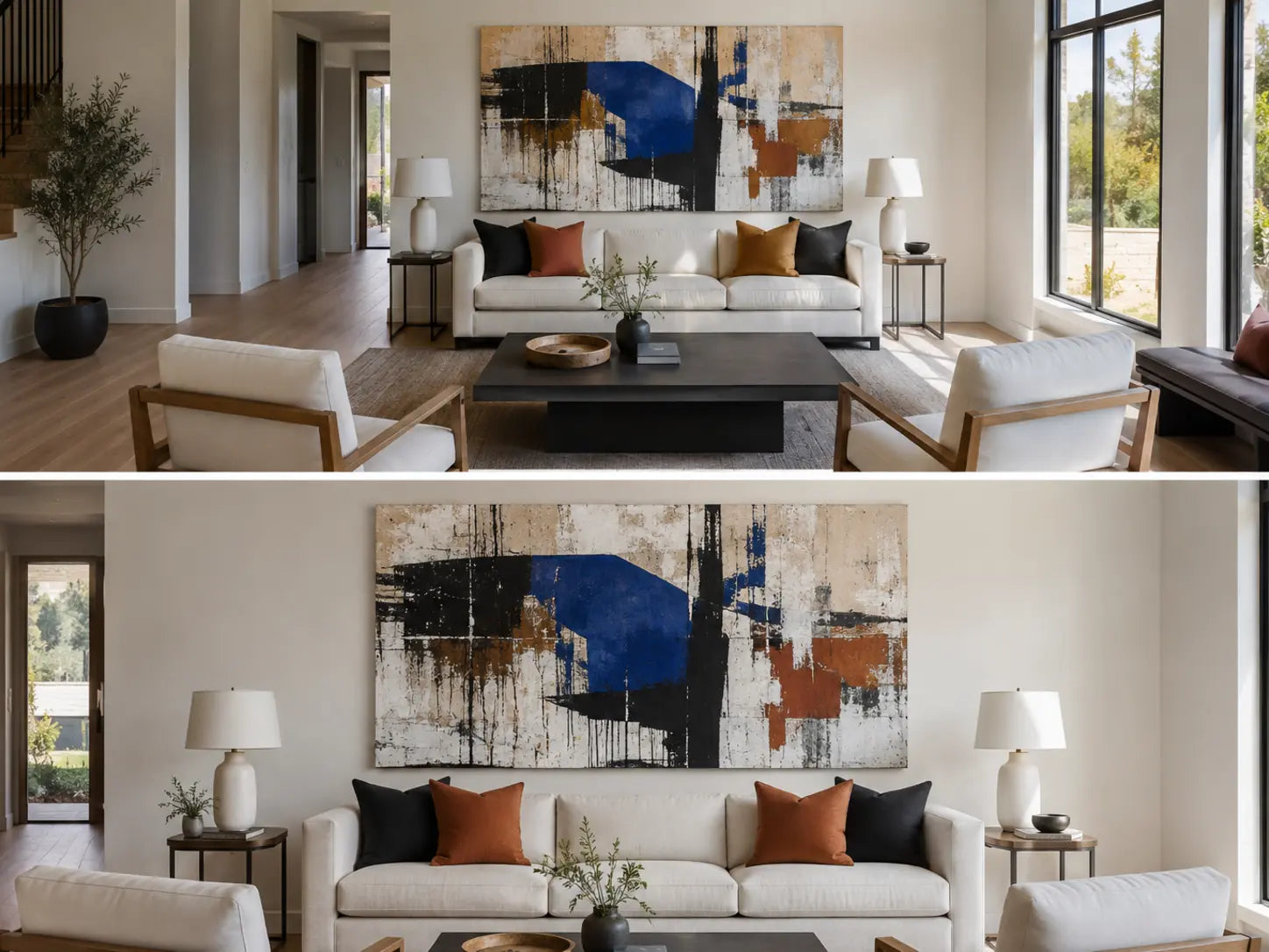
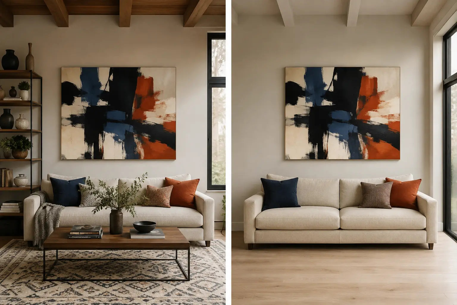
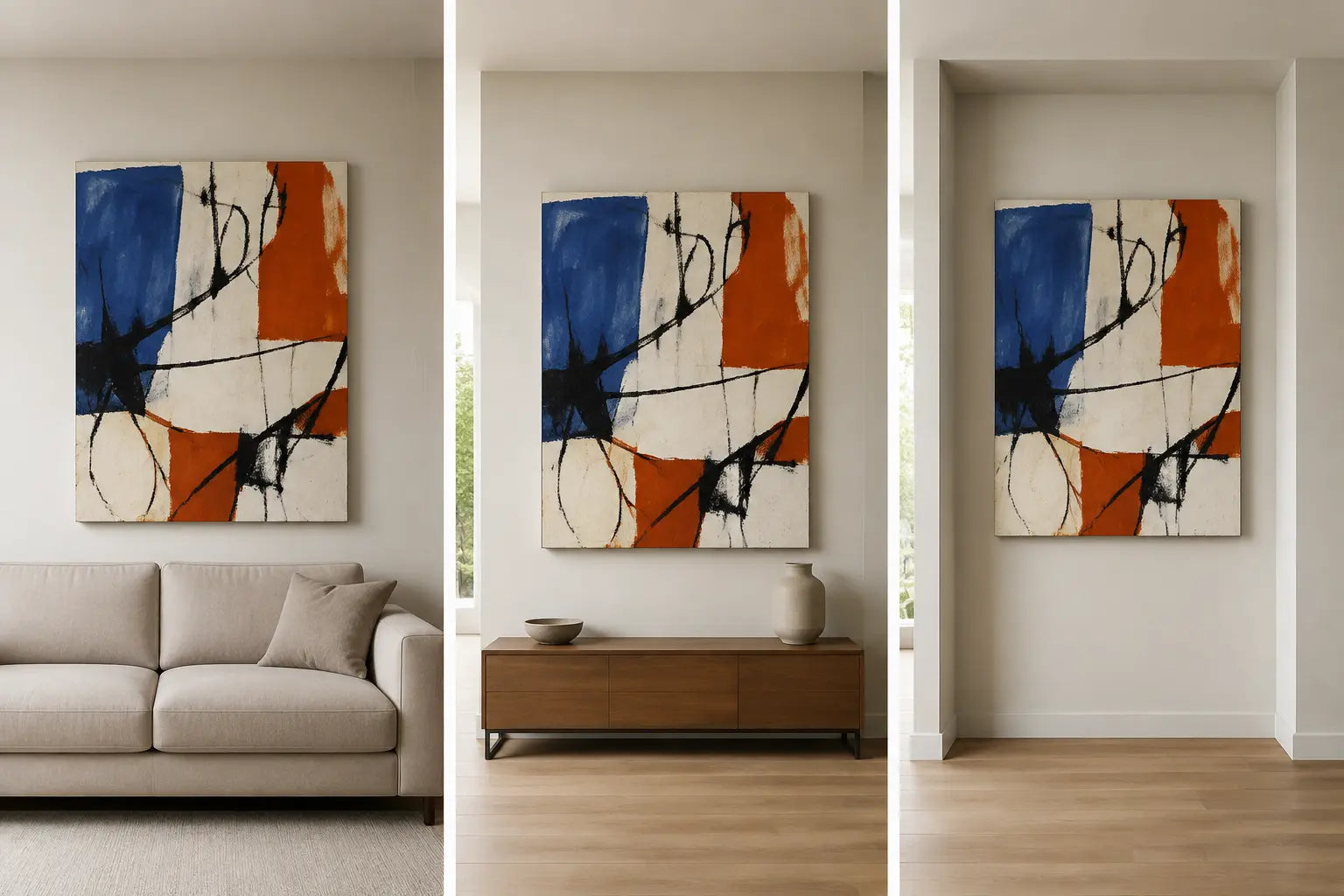
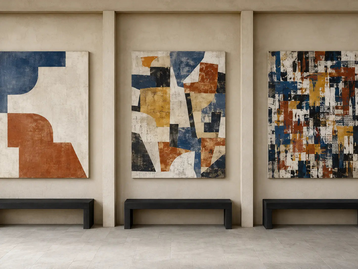
Street-art-inspired canvas tested between rough urban surfaces and a restrained interior wall

Street Art for Home Interiors: Scale, Color, and Placement

Use street art in a home interior by treating one canvas as the main graphic surface rather than copying the look of an entire outdoor wall. Measure the artwork against the furniture or usable wall below it, choose marks and subjects that remain clear from the main viewing distance, repeat one or two colors, and leave a quieter area around the composition.

Street art is a broad category. It can include lettering, stencils, pasted-paper references, figures, mural-like scenes, repeated symbols, abstract marks, and photographs of painted public surfaces. These options carry different levels of detail and different rights questions, so the individual image matters more than the collection label alone.

In this guide

Understand what counts as street art

Street art is a broad description for artwork associated with public walls, urban surfaces, and visual practices developed outside conventional gallery presentation. It may include murals, stencils, posters, stickers, painted figures, symbols, and combinations of several methods.

Graffiti and street art are not always interchangeable terms. Graffiti traditions often give particular importance to names, letterforms, hand styles, crews, symbols, and repeated writing practices. The Getty Graffiti Black Book project documents the importance of lettering, drawing, signs, and collaborative sketchbook culture within Los Angeles graffiti.

Some practitioners explicitly identify their work as graffiti rather than street art. A Smithsonian video with OSGEMEOS presents that distinction from the artists’ own perspective. Because terminology varies by artist, place, and practice, use the individual image and documented source when classification matters.

Street-art-related visual categories used in wall decor
Visual category Common characteristics Useful room condition Main selection check
Graffiti lettering Names, letter structures, outlines, fills, arrows, hand styles, repeated marks, and overlapping characters A clear wall viewed closely enough to read the structure The words, symbols, source, and rights status are understood
Stencil-like imagery Hard-edged silhouettes, limited color, repeated figures, and sharp contrast A wall viewed from medium or long distance The image is original or authorized rather than copied from a known stencil
Poster and collage references Torn-paper layers, photographs, type fragments, pasted shapes, and overlapping surfaces A simple room with limited surrounding pattern Photographs, logos, text, and source images have a clear rights basis
Figurative mural style Large faces, people, animals, social scenes, and broad painted forms A primary wall with enough scale for the figure to remain clear The subject is not hidden by furniture or split poorly across panels
Abstract urban marks Spray-like transitions, drips, scratched lines, blocks of color, symbols, and rough surface references A room where color and line matter more than a literal subject The mark density does not compete with shelving, brick, or patterned textiles
Photographed street surface A photograph of a real mural, wall, poster layer, train, doorway, or public-space artwork A room that can support documentary detail and a strong sense of place The photographer’s rights and the depicted artwork’s status are both reviewed

A canvas can combine several rows. A photographed mural may contain lettering, portraiture, commercial signs, and collage. That combination usually requires more source verification than a newly created generic composition made from original shapes and marks.

Apply the surface–signal–silence method

Street-art-inspired interiors work best when the room borrows selected visual relationships rather than reproducing every feature of an exterior wall. Use three parts: one surface reference, one primary signal, and one quiet zone.

Surface

The surface is the material relationship between the canvas and the room. It may come from brick, concrete, plaster, black metal, pale wood, worn leather, stone, or a smooth painted wall. The artwork does not need to imitate the wall material exactly.

Choose one relationship:

  • Rough printed marks against smooth plaster
  • Light canvas areas against dark brick
  • Black lines connected with metal furniture
  • Warm rust and cream connected with wood
  • Cool blue or gray separated from red-brown masonry

Signal

The signal is the main element that should be understood first. It may be a face, figure, large word, stencil silhouette, color block, geometric symbol, or broad diagonal movement.

Choose artwork with one signal that remains clear from the intended viewing position. A canvas containing several equal-sized faces, words, signs, and symbols can become harder to organize with furniture and nearby objects.

Silence

Silence means an area with less visual information. It can be open wall, a plain sofa, a low console with few objects, an unpatterned rug, or an intentionally empty wall nearby.

The quiet area does not need to be white or neutral. A dark green wall or blue sofa can still act as a quiet field when it uses one uninterrupted color and limited surface detail.

Applying the surface–signal–silence method
Element Question to ask Good evidence in the room Warning sign
Surface What material or wall condition connects with the artwork? One clear relationship through texture, value, line, or color The room repeats brick, drips, torn paper, metal, and distressed objects at the same time
Signal What should be noticed first? One readable figure, word structure, silhouette, or color area Every mark and subject has equal contrast and scale
Silence Where can the eye rest around the composition? Open wall, simple furniture, limited pattern, or an empty facing wall A second large artwork, screen, patterned rug, and dense shelf all compete within the same view

Choose one primary wall

The primary wall should give the artwork a stable relationship with furniture and a clear view from the entrance or main seating position. It does not have to be the largest wall in the room.

Useful locations include:

  • Above the main sofa
  • Above a low sideboard or console
  • On a wall beside rather than around a television
  • Between windows when a vertical format fits the clear space
  • On an entrance-facing wall with enough viewing distance
  • Near a desk, record cabinet, reading chair, or game area

Check the whole sight line

Photograph the proposed wall from the room entrance. Include the sofa, rug, television, shelves, curtains, lamps, plants, and any artwork visible on adjoining walls.

A canvas may look balanced when viewed directly but become one of several competing graphic surfaces from the doorway. The entrance view is especially important for lettering, strong silhouettes, black-and-white contrast, and bright color blocks.

Keep screens and signage separate

A television or monitor already forms a large rectangular visual element. Street art with hard outlines, text, or high contrast can compete with the screen when both are placed on the same wall.

Use a side wall, wall behind the seating, or separate furniture zone when the screen wall contains speakers, shelves, equipment, cables, lights, and other objects.

Protect the main subject

Check whether a lamp, plant, chair, shelf, or tall console object covers the image’s primary face, word, hand, symbol, or direction of movement. Street-art compositions often depend on a strong crop, so covering a small but important area can change the reading of the image.

Plan scale and viewing distance

Set the physical footprint from the furniture or usable wall before comparing subjects. For artwork above a sofa, sideboard, desk, or console, a practical editorial starting width is approximately 60% to 75% of the furniture below it. Treat this as a test range rather than a rule for every room.

Starting artwork width = furniture width × 0.60 to 0.75

Starting street-art canvas widths above common furniture sizes
Furniture width Approximate metric width Starting artwork range Approximate metric range
72 inches 183 cm 43 to 54 inches 109 to 137 cm
84 inches 213 cm 50 to 63 inches 127 to 160 cm
96 inches 244 cm 58 to 72 inches 147 to 183 cm
120 inches 305 cm 72 to 90 inches 183 to 229 cm

Compare the nearest product sizes with removable tape or full-size paper. Use the Artesty canvas sizing guide to review current size groups, then confirm the exact options shown on the individual listing.

Match mark size with viewing distance

Street-art composition detail and practical viewing distance
Composition structure Useful viewing condition Main risk
One large stencil-like figure Medium or long view above a sofa, console, or open wall The figure can dominate a small room when oversized relative to the furniture
Large lettering or one short word Medium view where the complete letter structure remains visible The wording may be unclear, inappropriate, or split badly across panels
Dense layered tags and small marks Closer view near seating, a desk, hallway, or reading area Fine forms can merge into one field from across the room
Broad abstract spray-like shapes Medium or long view on a wall with enough contrast A small pale version can disappear against a similar wall
Photographed mural or street surface Depends on the size of figures, signs, architecture, and wall details within the photograph Important details may be too small to identify at the selected canvas size
Collage with several photographs and type fragments Close or medium view in a room with limited surrounding pattern Images, words, and layers can compete with bookshelves, screens, and textiles

Add the spaces in a panel set

The installed width includes the physical canvases and every open gap between them.

Installed width = sum of panel widths + total width of all gaps

Hypothetical example: Three 18-inch panels with two 3-inch gaps occupy 60 inches:

(18 × 3) + (3 × 2) = 60 inches

Use the full 60-inch measurement when comparing the set with a sofa or wall. Inspect every inner panel edge before choosing a design containing lettering, faces, hands, logos, or long continuous outlines.

Balance mark density with room detail

Mark density describes the number of visible edges, lines, symbols, textures, figures, letters, and color transitions within the artwork. A large canvas with three broad shapes can have lower mark density than a small canvas filled with tags, pasted-paper layers, figures, and signs.

The room adds its own density through:

  • Open shelves and bookcases
  • Patterned rugs, curtains, and upholstery
  • Brick, stone, tile, and wood slats
  • Televisions and monitors
  • Several plants or collected objects
  • Window grids and black metal furniture
  • Other photographs, posters, or canvases
  • Colored lighting and illuminated signs
Room detail and street-art mark density
Room condition Artwork condition Likely result Practical adjustment
Low-detail room High-density collage, lettering, or mural scene The artwork becomes the clear primary graphic surface Leave open wall and limit nearby objects
Low-detail room Low-density stencil or abstract marks The result can remain restrained, but physical scale becomes more important Increase the canvas footprint or wall contrast before adding another artwork
High-detail room Low-density figure, silhouette, or broad abstract composition One clear subject can organize a room with several materials and objects Choose larger forms and a limited palette
High-detail room High-density lettering, collage, and repeated symbols The wall, rug, shelves, and artwork may compete equally Reduce surrounding detail or select a composition with fewer marks

Use the thumbnail test

Reduce the product image to a small thumbnail. If the main figure, word structure, or color direction remains visible, the design is more likely to read from across the room. If every detail becomes an even texture, use a larger format or a closer wall.

Use the doorway test

Mark the physical footprint on the wall and photograph the room from the doorway. Place the product image inside the marked area using a simple room-planning tool or printed paper where possible.

The test should reveal which element appears first:

  • The artwork
  • The television
  • The rug
  • The shelving
  • The sofa color
  • Another artwork

If several elements carry equal graphic strength, choose one to reduce rather than adding more connecting accessories.

Build a controlled color plan

Use three color roles: base, ink, and accent. This method reflects the strong line-and-fill relationships found in many street-art compositions without requiring the room to copy every canvas color.

Base

The base is the largest room field: wall paint, sofa, flooring, large rug, or cabinetry. It provides the background against which the canvas is read.

Ink

Ink is the artwork’s main dark or structural color. It is often black, charcoal, navy, dark brown, or another color used for outlines, lettering, silhouettes, or repeated marks.

Connect the ink color with one existing room element such as:

  • Black metal furniture
  • Dark table legs
  • A charcoal sofa
  • A navy textile
  • Dark window frames
  • A small lamp or cabinet detail

Accent

The accent is one strong color or small related group, such as cobalt blue, rust, yellow, green, red, or violet. Repeat it once or twice in a limited object or textile rather than distributing it across the entire room.

Street-art color plans for common interiors
Room palette Useful artwork direction Bridge element Main check
Cream walls and gray sofa Black or charcoal structure with one blue, rust, yellow, green, or red accent One small object repeating the accent Pale printed areas remain visible against the wall
Brick and dark metal Large cream or white areas with cool blue, green, gray, or controlled warm color Black line or selected rust area Fine dark marks do not merge with mortar, shelving, and window frames
Pale wood and beige furniture Charcoal, navy, green, blue, black-and-white, or a selected red accent Cream or wood-colored background within the artwork Brown and beige printed areas do not merge with the furniture
Dark wall and dark sofa Clear white, cream, pale gray, yellow, or light-blue areas with limited dark contours One light textile or object Important faces, letters, and outlines remain visible under evening lighting
Colorful rug or curtains Restricted street-art palette repeating one textile color and one neutral Shared accent without repeating the full pattern The canvas does not introduce several unrelated saturated colors
Black-and-white room Monochrome street art or one controlled color accent Black furniture line and white or gray wall field A small image does not lose emphasis beside broad furniture

Compare black-and-white wall art when line, silhouette, and light–dark structure should carry more of the composition than a broad color palette.

Choose the subject and visual language

Choose a subject whose main structure remains clear at the planned size and whose source can be verified. Street-art collections often combine original graphic designs with reproductions, photographs, famous names, characters, logos, and mural references. These categories should not be treated as equal from a rights perspective.

Lettering and hand styles

Lettering-based art can work where the complete word or letter structure remains visible. Review spelling, meaning, language, symbols, signatures, and names before choosing.

Large lettering is usually easier to read from a longer distance. Dense overlapping letters and smaller tags work better where viewers can approach the wall.

Stencils and simplified figures

A hard-edged figure, animal, object, or symbol can remain clear above a sofa or across an open room. Check that the image is independently created or authorized rather than a direct copy of a recognized artist’s stencil.

Portraits and public figures

Portraits create a strong focal subject. Verify the photographer, source image, identity, licensing, and any publicity-right considerations. Do not assume that a changed color treatment establishes permission.

Poster and graphic layouts

Street-art-inspired graphic designs may use grids, signs, symbols, cut-paper shapes, type fragments, and repeated images. Use graphic design wall art when layout and communication structure matter more than wall-surface references.

Grunge and brush-like marks

Grunge compositions use scratches, drips, rough edges, layered colors, and irregular marks. They can support the same room types as street art but may contain less recognizable urban subject matter.

Compare grunge and brushstroke wall art when texture, painted marks, and layered color are the main selection factors.

Abstract urban compositions

Abstract urban art can use spray-like transitions, blocks, symbols, lines, and pasted-surface references without relying on a named person or recognizable character. This can reduce some subject-specific rights questions, although the exact design and source still require review.

Photographs of actual walls or murals

A photograph of a public wall can contain several separate creative elements: the photographer’s composition, the mural or graffiti shown, commercial signs, faces, architecture, and public art. Review the source of the photograph and the depicted content before treating it as a safe reproduction.

Choose the physical format

Street art can work as one large canvas, a pair, a repeated series, or a multi-panel arrangement. Choose the format from the internal composition rather than from the wall width alone.

Display formats for street art in home interiors
Display format Choose it when Main image check
One large canvas The artwork contains one connected scene, word, face, stencil, or broad abstract composition The main structure remains uninterrupted
Vertical canvas The wall sits between windows, beside shelving, near a doorway, or above narrow furniture The figure or lettering fits the vertical crop without compressed edges
Square canvas The design has a centered figure, face, symbol, or compact mark system The square is large enough for the surrounding furniture
Coordinated pair Two works share color, lettering structure, subject, or outside dimensions and each functions independently The pair does not look like two accidental fragments of one image
Three-panel set The design was prepared for two gaps and the wider footprint suits a sofa or console Words, eyes, hands, logos, faces, and long outlines are not divided poorly
Repeated series Several related images use a common outside size and controlled color system The sequence has consistent spacing and enough wall length
Gallery group The wall is viewed closely and the pieces share one subject, palette, or graphic system Several lettering styles, figures, colors, and frame shapes do not compete equally

Inspect every inner panel edge

Panel breaks can change street-art compositions more substantially than broad abstract landscapes. Check whether a gap crosses:

  • A word or letter connection
  • An eye, mouth, hand, or face
  • A signature or artist name
  • A logo or recognizable product mark
  • A long stencil edge
  • A repeated sequence of figures
  • A photograph’s main architectural line

The wall color visible between panels becomes part of the composition. A bright wall can make the gaps more noticeable than a wall color closer to the printed edge areas.

Work with interior materials

Street-art-inspired canvas can connect with industrial materials, but it can also work on smooth plaster, painted walls, pale wood, and restrained furniture. The interior does not need exposed brick or concrete.

White or cream plaster

A light smooth wall gives rough printed marks and dark contours a clear boundary. Check pale cream and white areas within the canvas so they do not disappear into the wall.

Brick

Brick adds color, mortar lines, and repeated texture. Choose a canvas with larger forms and enough light–dark separation. Fine black lettering and rough dark marks can merge with the masonry from a distance.

Concrete or gray walls

Warm rust, cream, blue, green, white, black, and selected yellow or red areas can separate from gray concrete. Avoid a canvas dominated by similar mid-gray marks unless its scale or edge contrast is strong enough.

Natural wood

Wood introduces grain and warm color. Connect the canvas through cream, rust, brown, black, or one cool contrast. Do not repeat several brown and beige shades if the artwork begins to merge with the furniture.

Black metal and open shelving

Black lines in the canvas can connect with metal shelving, but dense lettering and repeated outlines may add too many edges. Choose larger shapes or leave more open wall around the artwork.

Loft-style interiors

Large windows, brick, metal, ducts, open shelving, and long views already create several structural lines. Use the loft wall art selection to compare formats after deciding whether the street-art canvas should repeat or contrast the architecture.

Confirm the mounting surface

Brick, concrete, drywall, plaster, and other wall types may require different mounting methods. Confirm the wall construction, artwork weight, hardware requirements, and property restrictions before installation. Follow the instructions supplied with the product and mounting hardware.

Apply the method by room

Living room

Use the sofa, sideboard, or main seating group as the scale reference. One large figure, stencil-like image, or abstract urban composition is usually easier to organize than several small unrelated pieces.

Check the canvas with the television on and off. Keep another visible wall quieter when the primary artwork contains lettering, several faces, or strong color blocks.

Bedroom

Review the artwork with the headboard, bedding, curtains, lamps, and wall color. A lower-density composition with one figure or broad mark system may be easier to coordinate with patterned textiles than a dense wall of tags and collage fragments.

Read all text and inspect portraits at the planned size before placing them close to the bed. The presence of a large face or word can feel different at close range than it does in a product thumbnail.

Home office or studio

Measure the wall after monitors, shelves, lamps, speakers, boards, and storage are installed. A vertical canvas beside a desk may fit better than a wide design placed above several screens.

Check how fine lettering and repeated patterns appear on camera when the wall is used as a video-call background. A simpler silhouette or broader color structure may remain clearer at reduced video size.

Hallway or entryway

Hallways allow close viewing but offer less time to examine a complex image. Use one clear figure, vertical word structure, or compact graphic composition. Keep doors, switches, lighting, and the circulation path clear.

Game room or personal lounge

Count screens, signs, game equipment, shelving, and collected objects before adding street art. A single large canvas on a side wall may work better than placing artwork around the television or active game area.

Open-plan loft

Assign the street-art canvas to one functional zone. The living area can carry the primary piece while the dining or work wall uses a smaller supporting canvas or remains empty. Review all visible walls together from the entrance.

Review the image source and rights

Street art is visible in public space, but public visibility does not establish permission to reproduce an artwork, photograph, logo, character, or portrait on a commercial canvas. Review the exact image and its source rather than relying on the category label or product title.

The U.S. Copyright Office explains that original paintings, photographs, illustrations, graphic art, and other visual works can receive copyright protection. Copyright owners may control reproduction, distribution, adaptation, and public display of protected work.

Logos, brand names, slogans, and other source-identifying marks may also require trademark review. The USPTO trademark basics provide official information about names, logos, and other marks used to identify goods or services.

Check these elements before choosing a product

  • The identified creator of the artwork
  • The photographer or source of any mural photograph
  • The date and location of the original image when provided
  • Whether the product is original, licensed, authorized, public domain, or otherwise supported by a documented source
  • Whether a famous artist’s name appears in the title or description
  • Whether a recognizable person, character, logo, product, team, or brand is shown
  • Whether the work copies a known stencil, mural, poster, album cover, comic panel, or photograph
  • Whether text, quotations, or slogans are reproduced
  • Whether the exact product image and panel configuration preserve the source accurately

Do not rely on these assumptions

  • A mural is free to reproduce because it is outdoors.
  • A photograph is safe because the photographer found the wall in public.
  • Changing the colors creates a new independent work.
  • Adding “inspired by” establishes permission.
  • Removing a logo removes every copyright question.
  • An online product listing proves licensing.
  • An artist’s anonymity means their work has no rights protection.

Build a practical three-option shortlist

Compare three designs that fit the same wall and approximate physical footprint. Use different visual structures so the final choice reflects the room rather than several near-duplicate product images.

  1. Choose one low-density option. Use one stencil-like figure, broad word structure, or several large abstract marks.
  2. Choose one medium-density option. Use a figure combined with lettering, collage, or several surface layers.
  3. Choose one high-density option. Use a photographed wall, repeated tags, detailed city surface, or layered poster composition.
  4. Mark one equal footprint. Compare all three within the same outside wall dimensions.
  5. Check the main signal. Identify the figure, word, silhouette, or color area noticed first.
  6. Run the doorway test. Confirm that the composition remains legible from the room entrance.
  7. Run the quiet-zone test. Remove nearby objects and compare the wall with and without additional decor.
  8. Check daytime and evening lighting. Review pale fills, dark contours, and saturated accents under both conditions.
  9. Inspect the exact crop and panel layout. Check every inner edge and the total installed width.
  10. Complete the rights review. Confirm the source, attribution, and status of every recognizable element.
Fields for comparing street-art canvas candidates
Comparison field What to record
Visual category Lettering, stencil, figure, collage, abstract marks, mural scene, or photographed wall
Primary signal The first figure, word, symbol, silhouette, or color area noticed
Mark density Low, medium, or high relative to the room
Dominant colors Base field, structural ink color, and principal accent
Viewing distance Close, seated, medium, or entrance view
Complete footprint Canvas dimensions plus every panel gap
Panel risks Letters, faces, hands, logos, long outlines, or photographs crossing inner edges
Source status Creator, photographer, image source, attribution, license, permission, or unresolved rights issue

Avoid these street-art placement mistakes

  • Copying an entire outdoor wall into the room. Use one surface reference and leave the surrounding interior controlled.
  • Treating street art and graffiti as exact synonyms. Terminology varies by artist, practice, and context.
  • Choosing the subject before measuring the wall. Set the footprint and viewing distance first.
  • Using a small high-density image on a distant wall. Fine tags, signs, and collage fragments may disappear from across the room.
  • Repeating every artwork color. Use one structural color and one or two limited accents.
  • Combining dense street art with dense shelving and patterned textiles. Reduce one layer of room detail.
  • Placing strong artwork around a television. Use a separate wall when the screen and canvas compete.
  • Ignoring lettering content. Read the complete wording, names, symbols, and slogans before ordering.
  • Forgetting panel gaps. Add every opening to the installed width.
  • Splitting faces, words, hands, logos, and stencil edges poorly. Inspect every panel boundary.
  • Assuming printed wall texture is physical texture. Check the product description before inferring raised paint, torn paper, or surface depth.
  • Using room mockups as measurements. Mark the actual listed dimensions on the real wall.
  • Assuming public artwork is free to reproduce. Check the creator, photographer, source image, and rights status.
  • Using famous artist names or characters without review. Product availability does not prove authorization.

Frequently asked questions

Is street art the same as graffiti?

No single definition is accepted by every practitioner. Graffiti often places greater emphasis on writing, names, letterforms, hand styles, crews, and repeated marking practices. Street art is often used more broadly for stencils, murals, posters, stickers, figures, and other public-space imagery. Some artists identify only with graffiti and reject the street-art label.

Can street art work in a neutral living room?

Yes. A neutral room can give one street-art canvas a clear boundary and enough open wall to become the primary graphic surface. Connect the artwork through one dark structural color and one or two small accent objects rather than repeating its entire palette across furniture and textiles.

What size street art works above a sofa?

A practical starting width is approximately 60% to 75% of the sofa width. A 96-inch sofa gives a test range of about 58 to 72 inches. Adjust the footprint for lamps, plants, shelves, side furniture, and available wall space. Include every gap in a multi-panel arrangement.

Can street-art canvas hang on a brick wall?

Yes, when the image has enough scale and contrast to remain clear against the brick pattern. Broad light areas, larger figures, and clearly separated colors are often easier to read than fine dark lettering. Confirm the wall construction, product weight, suitable hardware, and property requirements before installation.

Is one large canvas better than a street-art gallery wall?

Choose one large canvas when the room already contains screens, shelves, patterns, or collected objects, or when the artwork is viewed from a longer distance. Choose a measured group when the wall is viewed closely and the pieces share one subject, palette, outside boundary, and verified source standard.

Can street art contain text, logos, or famous characters?

It can, but those elements require careful review. Check the meaning and source of all text, the status of logos and slogans, and the rights connected with characters, celebrities, teams, brands, photographs, and known artworks. Do not assume that a changed color or the phrase “inspired by” establishes permission.

Can street art be mixed with minimalist or abstract art?

Yes. Connect the pieces through one color, line direction, shape, or material reference, then give them different roles. Use the street-art canvas as the larger primary work and place a smaller minimalist or abstract composition on another wall or within a separate furniture zone.

Does street art suit a bedroom?

It can. Choose the individual subject and level of detail rather than the category alone. Review lettering, portraits, colors, and contrast from both the room entrance and the bed. A broad figure or limited abstract composition may be easier to coordinate with patterned bedding than dense tags and collage.

Choose one wall and one primary graphic signal

Begin with the furniture, usable wall, and main viewing distance. Select one composition whose figure, lettering structure, or color direction remains clear at the planned size. Connect it to the room through one surface relationship and a limited color bridge, then leave enough open space for the artwork to remain distinct.

Use the street art wall decor selection after the wall requirements are clear. Review the exact product image, dimensions, panel configuration, attribution, source information, rights status, and current availability before making the final choice.

Back to blog