

Vintage Wall Art with Modern Furniture: How to Mix Eras
The Era Seam
Keep the difference. Control the contact.
Vintage wall art and modern furniture do not need to look the same age. The room works when the time difference remains legible and one precise contact makes the pairing intentional.
Quick answer: let the artwork carry the vintage signal, let the furniture remain recognizably modern, and join them through one controlled contact—value, line, color, or material tone. Preserve neutral wall air around the installation and stop before period cues spread into every prop and finish.
Locate the age signal before styling
“Vintage” may describe an original object from an earlier period, a later authorized reproduction, a contemporary work using historical visual language, or simply a seller’s mood label. Those are not interchangeable. Read the listing for artist or maker, date, source image, edition, reproduction method, substrate, frame, condition, and rights statement. If those facts are missing, describe only what you can verify.
Then separate three layers. Image evidence includes subject, cropping, printing grammar, typography, and palette. Surface evidence includes actual paper, canvas, ink, fading, stains, or physical wear. Presentation evidence includes frame, mat, glazing, and surrounding props. A printed image of cracked paper is not itself old paper; a distressed digital canvas is not an antique. This distinction keeps the room decision honest and prevents decorative “age” from being added to every layer.
Useful age evidence
Modern restraint
One clear historical or reproduction grammar
A clean crop and legible dominant mass
Verified material, condition, or depicted wear
No invented claim about physical age
Frame or mat supports the object
Outside boundary remains simple enough to read
One period signal is allowed to lead
Furniture and architecture keep their own date
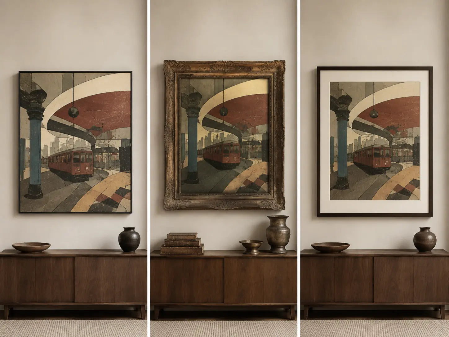
Build one contact, not a disguise
The seam is the smallest visible agreement that makes two eras belong in one composition. It should not erase their difference. Choose the contact after reading the modern furniture’s strongest feature: a long horizontal rail, a black steel outline, a pale stone top, a walnut field, a low dark mass, or a repeated curve.
Test four seam types one at a time. A value seam repeats the furniture’s darkest or lightest weight inside the artwork. A line seam lets one horizon, border, or directional edge answer the furniture silhouette. A color seam repeats one restrained hue without matching every finish. A material-tone seam connects warm paper, tobacco, bronze, or wood color while keeping the actual materials distinct.
Remove the seam in a mockup. If the pairing becomes random, it was doing useful work. Add a second and third seam. If the artwork begins to look selected only because it matches the sofa, restore the single strongest contact. The objective is recognition, not camouflage.
| Modern furniture evidence | First seam to test | What remains different | Reject or retest when |
|---|---|---|---|
| Long low sofa or credenza | One lateral line in the image | Subject, paper tone, and period grammar | Art and furniture become two thin parallel bands |
| Black steel outline | One dark value or slim frame | Warm aged palette and softer image edges | Every art edge turns black and severe |
| Walnut or tobacco wood | One warm paper or brown-red field | Actual material and furniture geometry | The whole room becomes brown and low-contrast |
| Pale stone or glossy lacquer | One light interval | Vintage image texture and color | The print disappears into the wall and surface |
| Curved contemporary seating | One arc or rounded crop | Period subject and print grammar | Repeated curves become a motif set |
| Mixed modern materials | Name one primary furniture feature first | All secondary materials | The art attempts to repeat metal, wood, stone, and upholstery |
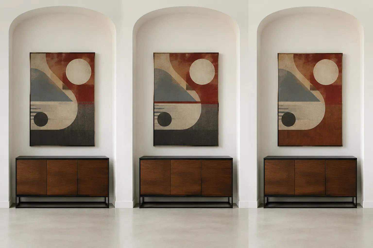
Protect the air around the seam
Many supposed era conflicts are edge conflicts. A frame crowds a doorway; a canvas nearly touches a tall lamp; the bottom edge presses into the sofa; a gallery arrangement accumulates too many small perimeters. The eye reads those collisions before it interprets historical style.
Audit the complete installed outline: artwork, frame, mat, every panel, and every gap. View it with the furniture, openings, trim, lamps, and shelves that share the wall. You do not need a universal spacing formula. You need enough uninterrupted wall for the vintage object to read as one deliberate event and enough connection for it not to float above the modern anchor.
If the only available wall zone is segmented, simplify the outside boundary before changing the art. A cleaner frame, one larger work, or a different crop may solve the installation while preserving the desired image. Use the orientation guide for the envelope decision and the dedicated size guide for exact scale; this article owns the relationship between eras, not universal dimensions.

Decide where the vintage reference stops
STOP is the editing rule that keeps “mixed eras” from becoming “period theme.” After the artwork and one seam are established, do not automatically add an aged lamp, stack of old books, distressed cabinet, retro clock, or matching typography. Each added cue moves the room from dialogue toward reenactment.
A clean contemporary frame can protect the contrast. An original historical frame may be significant in its own right and should not be casually discarded or altered; in that case, let the frame become part of the artifact and quiet the surrounding room. The Canadian Conservation Institute advises careful consideration before changing an original frame and provides material-specific guidance for paintings. See its basic care guidance.
Use a removal pass: photograph the complete wall, then digitally cover every accessory that echoes the artwork’s period. Restore items one by one. Stop when the first clear seam survives. If the art works only after a collection of props explains it, the artwork–furniture relationship is not yet strong enough.
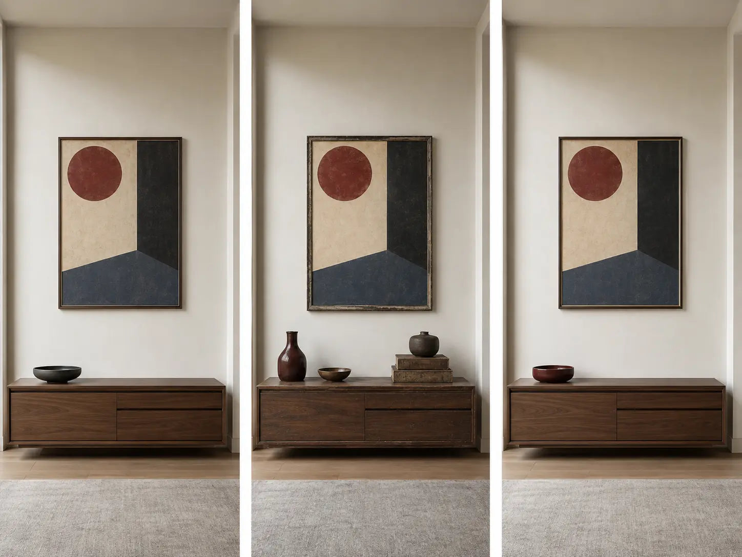
Six room scenarios with a stop condition
Walnut-and-steel living room
Evidence: long horizontal furniture, warm wood, and a black outline. Resolution: use one dark value contact or one warm paper tone; let the vintage subject remain distinct.
Stop: when black frame, black artwork border, black lamp, and black accessories turn the seam into a repeated outline system.
White lacquer dining wall
Evidence: reflective pale furniture and few tactile surfaces. Resolution: let the artwork provide paper tone and visual grain while one light interval answers the lacquer.
Reject: a faint reproduction whose age cues disappear in dining light and leave only a beige rectangle.
Curved modern bedroom
Evidence: rounded headboard and soft upholstery already create arcs. Resolution: one curve inside the image can connect; a clean outside frame prevents the motif from spreading.
Stop: before lamps, mirrors, pillows, and artwork all repeat the same arch.
Glass-and-metal office
Evidence: cool precision and multiple reflections. Resolution: a warmer vintage graphic or photograph can supply human trace; use one charcoal seam with the metal.
Reject: paper or glazing that produces uncontrolled reflections at the actual desk view.
Line-rich hallway
Evidence: doors, trim, and a short approach already segment the wall. Resolution: prioritize one complete readable boundary and a strong far-view mass.
Reject: a multi-frame vintage cluster that adds perimeters faster than the corridor can resolve them.
Open-plan mixed materials
Evidence: walnut, stone, steel, and upholstery compete for the bridge role. Resolution: declare the furniture anchor first and connect to only its dominant feature.
Reject: artwork chosen because it repeats every material; that is inventory, not a seam.
Verify source, medium, rights, and care
Age and ownership of an object do not automatically settle reproduction rights. Vintage photographs, posters, advertisements, maps, and portraits may still involve copyright, trademark, privacy, publicity, or contractual restrictions. Verify the seller’s license and source; do not treat an old appearance or an online scan as permission. The U.S. Copyright Office includes photographs, prints, art reproductions, maps, and graphic works within visual-arts categories; local law and the specific work still govern. Review the official visual-arts overview as a category reference, not individual legal clearance.
Care depends on the actual object. Original works on paper can be vulnerable to handling, light, humidity, and poor enclosures. The Library of Congress recommends minimal intense light and stable, protective storage for works on paper. A contemporary canvas reproduction has different needs. Follow the seller, framer, conservator, and hardware guidance for the verified medium rather than applying “vintage care” to everything that looks old. See the Library of Congress paper-care guidance.
Write the seam brief
ARTIFACT: The verified vintage signal is __________.
MODERN ANCHOR: The furniture’s dominant feature is __________.
SEAM: One contact will be VALUE / LINE / COLOR / MATERIAL TONE.
AIR: The complete installed boundary must remain clear of __________.
STOP: The period reference ends after __________.
REJECT IF: The room needs extra props to explain __________.
Choose the era seam first. Then compare vintage works by the signal they carry, not by how many retro cues can be added around them.
Browse Vintage Wall ArtFrequently asked questions
Can vintage wall art work with very modern furniture?
Yes. Preserve the visible time difference and create one intentional contact through value, line, color, or material tone. The pairing does not need several matching details; it needs one readable seam and a complete outside boundary.
Does vintage wall art have to be physically old?
No. A contemporary licensed reproduction or a new work using historical visual grammar may be sold as vintage-style. Describe it accurately. A depicted stain, paper fiber, or cracked surface is not physical age or provenance.
Should I use an ornate frame?
Only when the frame belongs to the verified object, strengthens the intended artifact, or solves a specific room relationship. An ornate distressed frame added merely to announce “vintage” can over-signal the period. A clean frame often preserves a clearer difference with modern furniture.
What is the easiest bridge between eras?
A shared dark value or one repeated directional line is often easy to test, but it is not universally best. Read the furniture first and rehearse one contact at a time. The seam should remain visible without making the artwork match every finish.
Can black-and-white photography work in this mix?
Yes, but it is not automatically easy. Check subject, contrast, crop, source, rights, glare, and viewing distance. A deep black can connect to modern metal; a soft gray print may disappear against pale architecture.
How do I avoid a themed retro room?
Keep the strongest period signal inside the artwork, add one seam, preserve neutral wall air, and perform a removal pass on accessories. Stop restoring props as soon as the relationship reads. Furniture does not need to imitate the artwork’s date.
Should vintage art match the wood tone?
Not exactly. One warm paper, tobacco, oxblood, or brown-black field can acknowledge walnut without turning the room monochrome. Compare value and undertone in real light, then keep other art colors independent.
Can I mix several vintage periods with modern furniture?
Yes, but name the visual hierarchy. One work or period signal should lead; secondary works need a shared boundary or quiet repeat. If every piece introduces a different frame, palette, typography, and date, the problem becomes gallery-wall editing rather than era mixing.
Method note: ARTIFACT / SEAM / AIR / STOP is an Artesty editorial decision tool, not a historical-authentication method, conservation assessment, or legal opinion.
Repeat the rehearsal in the light used most often. Daylight may separate warm paper from walnut, while evening light can collapse them into one brown mass. A black value seam can feel precise by day and too heavy at night. Do not solve that change by adding more period cues. Adjust the candidate, frame value, wall zone, or lighting plan while preserving the single seam.
Finally, say the decision aloud: “The art is vintage because of __________; the furniture remains modern because of __________; they meet only through __________.” If the blanks require several colors, shapes, materials, and props, the edit is not finished. If the sentence remains precise from both viewpoints, the eras can differ confidently without looking accidental.