
-
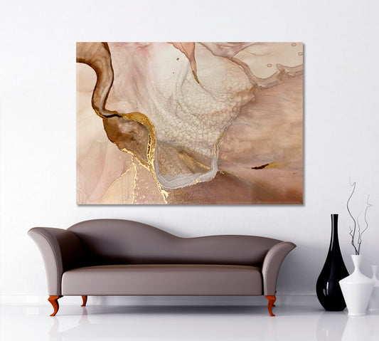
Tender Beige And Ivory Pastel Colors Golden Veins Abstract Marble
Regular price From €65,95 EURRegular priceUnit price per -
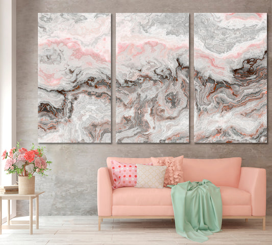
Marble Pattern Gray Off White Pink Beige Pastel Colors
Regular price From €65,95 EURRegular priceUnit price per -
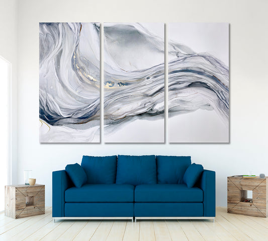
Beautiful Tender Blue Gray Abstract Waves Marble Effect Painting
Regular price From €65,95 EURRegular priceUnit price per -
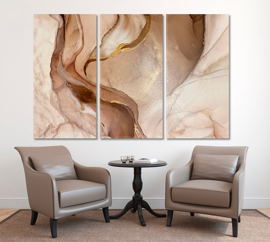
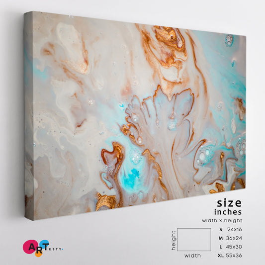
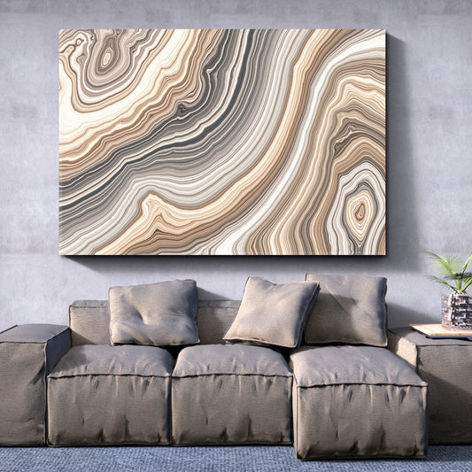
Abstract Marble Beige Golden Veins Neutral Earth Tones Ink Painting
Regular price From €65,95 EURRegular priceUnit price per -
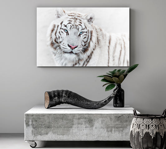
Beautiful Mighty White Tiger
Regular price From €65,95 EURRegular priceUnit price per -
Plumeria Beautiful Flowers
Regular price From €65,95 EURRegular priceUnit price per -
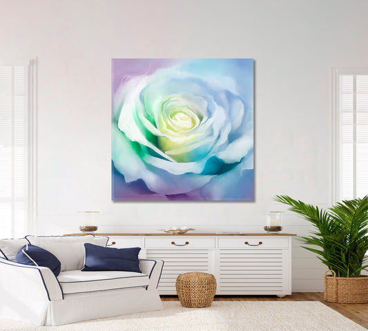
Soft And Dreamy White Creamy Roses
Regular price From €65,95 EURRegular priceUnit price per -
Mystical Heaven Amazing Colors Sky Blur Fantasy Cloud Sunlight
Regular price From €65,95 EURRegular priceUnit price per -
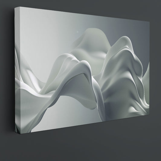
SILK Light Gray Beautiful Luxury Elegant Splash 3d Effect Poster
Regular price From €65,95 EURRegular priceUnit price per -
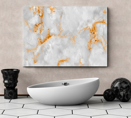
White Marble With Golden Veins Poster
Regular price From €65,95 EURRegular priceUnit price per -
Abstract Beautiful White Flower
Regular price From €65,95 EURRegular priceUnit price per -
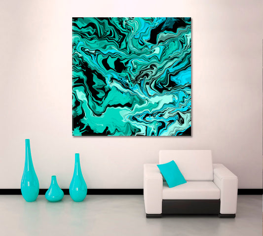
MARBLING Abstract Turquoise Black Waves
Regular price From €65,95 EURRegular priceUnit price per -
White Rose Petals Soft Colorful Artwork
Regular price From €65,95 EURRegular priceUnit price per -
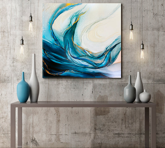
Abstract Marble Clouds Emerald Ocean Tidewater Blue Green Waves
Regular price From €65,95 EURRegular priceUnit price per -
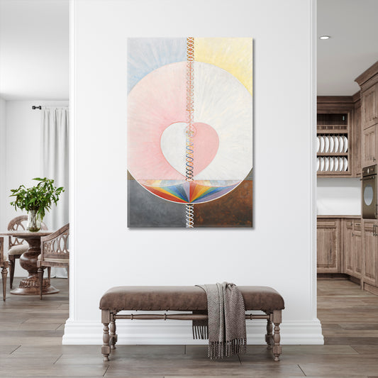
Abstract Geometric Style Forms Shapes Lines Soft Pastel Painting
Regular price From €118,95 EURRegular priceUnit price per -
Abstract Modern Marble Unusual Trendy Contemporary
Regular price From €65,95 EURRegular priceUnit price per -
Cream Golden Blue Mixed Eastern Oriental Style Beautiful Pattern EBRU
Regular price From €65,95 EURRegular priceUnit price per -
Beige Marble Pattern Curly Veins Abstract Soft Tones
Regular price From €65,95 EURRegular priceUnit price per -
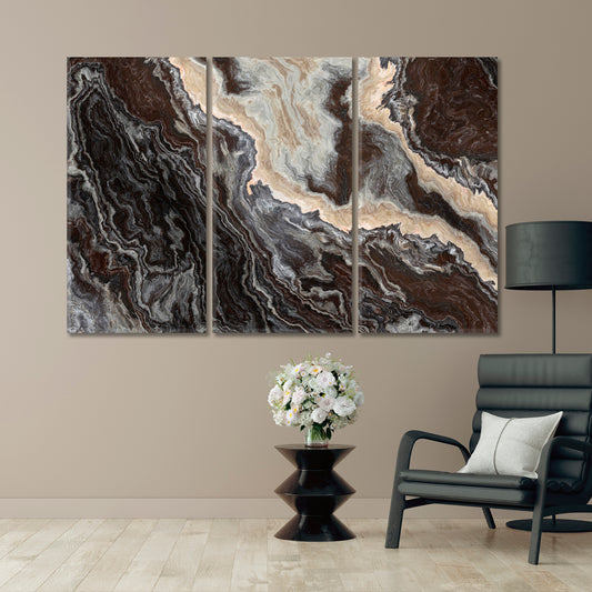
MARBLE Pattern Curly Grey Black Brown Veins Abstract
Regular price From €65,95 EURRegular priceUnit price per -
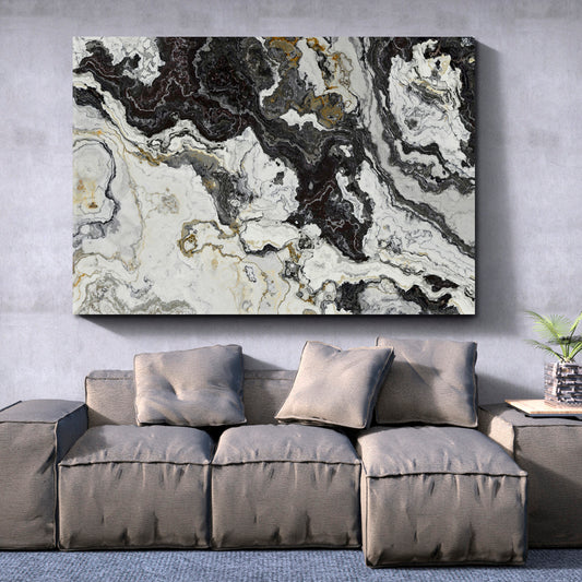
Black White Marble Pattern Curly Grey Veins Abstract
Regular price From €65,95 EURRegular priceUnit price per -
Marble Pattern Ivory Beige Pastel Colors Suminagashi
Regular price From €65,95 EURRegular priceUnit price per -
MARBLE Abstract Onyx Rose Inclusions Wavy Pattern Natural Beauty
Regular price From €65,95 EURRegular priceUnit price per -
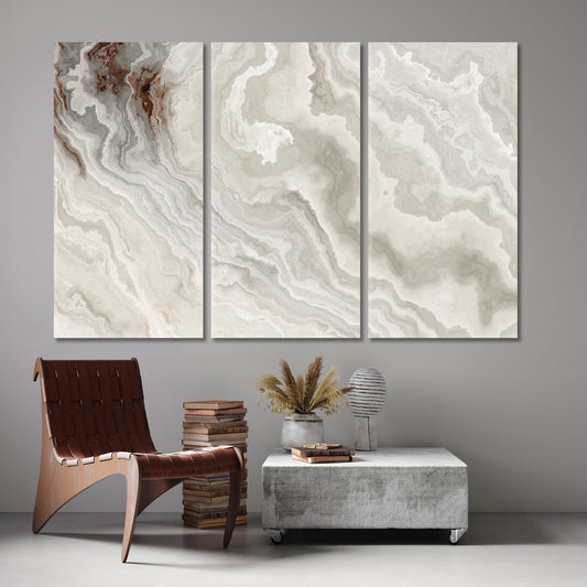
MARBLE Abstract White Onyx Wavy Pattern Natural Beauty
Regular price From €65,95 EURRegular priceUnit price per -
Beautiful Curly Marble Texture Abstract Pastel Grey Beige Swirls
Regular price From €65,95 EURRegular priceUnit price per





















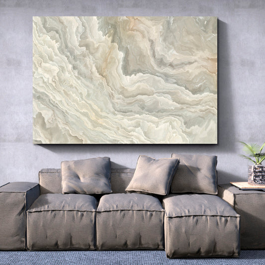

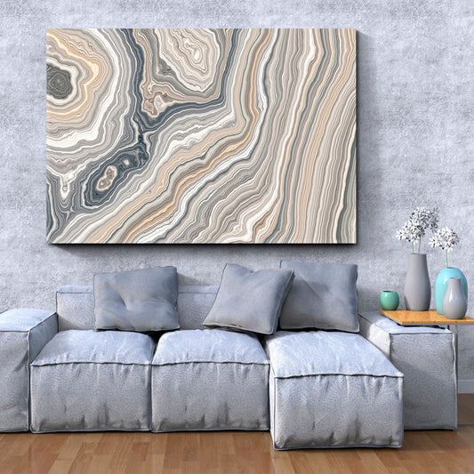
Cream and Ivory Wall Art for Neutral Interiors
Explore cream and ivory wall art with abstract forms, floral subjects, marble effects, painted textures, landscapes, and simple graphic compositions. These canvas prints can work in living rooms, bedrooms, dining rooms, home offices, entryways, studios, and reading corners.
Cream and ivory designs sit between bright white and deeper beige or brown tones. They can connect with light wood, stone, linen, woven fabrics, warm metals, white walls, and neutral furniture without requiring every item in the room to use the same shade.
Shop Cream and Ivory Canvas Prints by Subject
This collection includes artwork in warm off-white, vanilla, parchment, pale beige, and light neutral color groups. Some designs use cream or ivory as the main background, while others combine these shades with brown, gold, gray, black, green, pink, blue, or muted orange.
Begin with the subject and contrast level that fits the room. Artwork with one clear flower, figure, or geometric form can remain visible from across the space. Prints with layered paint, marble lines, or smaller botanical details may work better where they can be viewed more closely.
- Neutral abstract canvas prints with cream and ivory backgrounds
- Floral artwork with white, beige, blush, and green details
- Marble and fluid designs with gold, gray, or brown lines
- Landscapes with sand, stone, mist, and pale natural colors
- Simple graphic compositions for bedrooms and home offices
Cream Wall Art and Beige Color Pairings
Cream and beige can be used together when the room contains warm flooring, natural wood, upholstered furniture, rugs, curtains, or woven storage. The shades do not need to match exactly. Small differences help the artwork remain separate from the wall and furniture.
Browse beige wall art for additional designs with sand, tan, taupe, and warm neutral colors.
Against a cream wall, choose artwork with darker brown, gray, black, green, or gold details so the edges and main subject remain clear. On beige or brown walls, lighter ivory sections can provide contrast.
Ivory and White Wall Art
Ivory has a warmer appearance than bright white and can work with rooms that use cream fabrics, light wood, warm lighting, brass, or beige furniture. White details can add clearer contrast inside an ivory composition without changing the neutral direction of the room.
Explore white wall art for additional artwork with bright backgrounds, pale landscapes, flowers, architecture, and abstract forms.
When placing light artwork on a white wall, check that the design has enough lines, color changes, or shadowed sections to remain visible. A pale canvas with very little contrast may blend into the wall when viewed from across the room.
Abstract Cream and Ivory Canvas Art
Abstract artwork can use curved forms, brush-like marks, divided color fields, lines, circles, and layered neutral surfaces. Cream and ivory backgrounds may be combined with black, brown, gold, gray, blue, or muted green to create a clearer central composition.
Browse abstract canvas art for additional painted, geometric, fluid, and color-based designs.
A horizontal abstract canvas can work above a sofa, bed, sideboard, or desk. Vertical compositions may fit beside shelving, windows, or narrow furniture. Square artwork can suit compact walls, reading areas, and balanced furniture arrangements.
Floral and Botanical Neutral Wall Art
Floral cream and ivory artwork may include white flowers, pale leaves, dried plants, blossom branches, grasses, and simple botanical outlines. Green, blush, beige, brown, gray, and gold can add controlled color without changing the overall neutral palette.
Explore floral and botanical wall art for additional flowers, plants, leaves, and garden subjects.
A botanical print can work above a bed, dresser, reading chair, console, or dining sideboard. In a room containing real plants, select artwork with a clear composition so the printed foliage does not compete with every leaf and plant container nearby.
Fluid Art and Marble Effects
Fluid and marble-style designs use flowing lines, layered color, veining, and curved movement. Cream and ivory often appear with gray, beige, brown, black, gold, blue, or muted pink in these compositions.
Browse fluid art and marbling for additional flowing designs and stone-inspired color combinations.
Artwork with broad marble lines can remain visible from across a room. Designs containing fine veins and small color changes may be better placed near a sofa, desk, dining table, or reading area.
Cream and Ivory Wall Art for Living Rooms
Living room artwork is commonly placed above a sofa, sideboard, fireplace, media unit, or reading chair. Compare the canvas with the furniture below it and with the wall section that remains visible after lamps, shelving, plants, and curtains are installed.
Cream and ivory artwork can connect with white, beige, brown, gray, green, navy, black, and light wood furniture. A neutral canvas does not need to disappear into the room. Black lines, gold details, green leaves, or darker painted sections can help the design remain distinct.
Choose one main wall for the strongest canvas. When the room already contains several cushions, books, photographs, plants, and decorative objects, leaving clear space around the artwork creates a cleaner arrangement.
Neutral Canvas Prints for Bedrooms
Cream and ivory prints can work above a bed, dresser, desk, or reading area. Compare the artwork with the bedding, headboard, curtains, rug, wardrobe, lamps, and wall color before selecting the final design.
A horizontal abstract, floral, or landscape canvas can suit the wall above a bed. Vertical artwork may fit beside a wardrobe, mirror, or window. Square prints can work above compact dressers and desks.
Measure the distance between the headboard and ceiling before ordering. Leave enough open wall around the canvas so it does not appear compressed between lamps, shelves, curtains, and nearby furniture.
Cream and Ivory Artwork for Dining Rooms
Dining room artwork should remain visible when chairs are occupied and when pendant lights are switched on. Horizontal designs can work above sideboards, benches, or along walls beside the dining table.
Neutral abstracts, pale botanicals, marble effects, and simple landscapes can connect with wood tables, cream upholstery, black chairs, woven details, ceramics, and warm metal lighting.
Check the artwork under the lighting normally used during meals. Warm lamps can make ivory, beige, brown, and gold appear stronger, while cooler lighting may make gray, white, and blue details more noticeable.
Neutral Wall Art for Home Offices
A home office may share space with a bedroom, living room, guest room, or studio. Cream and ivory artwork can fit around desks, shelves, monitors, lamps, books, and storage without introducing a large number of additional colors.
A canvas behind the desk should remain visible after the chair and screens are positioned. A composition with one clear central form may work better as a video-call background than a print containing many small details.
For side walls near a desk or reading chair, more detailed floral, marble, or painted designs can work because they can be viewed from a shorter distance.
Entryway and Hallway Placement
Cream and ivory artwork can suit entryways and hallways that use white walls, natural wood, mirrors, consoles, coat storage, and neutral flooring. Vertical prints can fit narrow wall sections, while square artwork may work above a compact console.
Check the canvas from the main entrance and from both directions of the hallway. Doors, mirrors, lamps, plants, and coat storage should not cover the central part of the design.
Because entryways are often viewed from a distance, select artwork with enough contrast to remain clear. Very pale artwork may need darker lines, botanical details, or a defined central shape.
Using Cream and Ivory with Other Colors
Cream and ivory can support several color combinations without requiring the entire room to remain neutral. Black provides strong contrast, while brown and beige continue the warm direction. Green adds a natural color, blue introduces a cooler section, and muted pink can work with floral or painted subjects.
Gold and brass details can connect with lighting, table legs, handles, mirrors, and decorative objects. Gray and silver may suit rooms containing metal, concrete, glass, or cooler furniture finishes.
Choose one or two supporting colors from the canvas and repeat them in a limited number of room details. Matching every shade from the artwork is not necessary.
Choosing the Right Neutral Shade
Compare the artwork with the wall before selecting a design. Cream, ivory, beige, off-white, and pale gray can look similar on a product screen but create different results under room lighting.
A warmer cream canvas may connect with yellow-toned lighting, wood, beige upholstery, and brown flooring. Cooler ivory or pale gray details may suit white walls, black furniture, silver hardware, and cooler lighting.
Review product images on more than one screen when possible. Phones, tablets, and monitors can display neutral colors differently, and daylight or room lamps can change how the finished canvas appears.
Planning Canvas Size and Placement
Measure the usable wall rather than the complete wall. Account for windows, doors, mirrors, shelves, lamps, switches, vents, curtains, and furniture before selecting the final dimensions.
A horizontal canvas works well above sofas, beds, desks, dining tables, and sideboards. Vertical artwork fits narrow walls and spaces beside windows, wardrobes, or shelving. Square prints can be placed above compact consoles, dressers, desks, and reading chairs.
If a design is offered in several panels, the listed dimensions normally refer to the complete artwork without the spaces between individual panels. Include the planned gaps when calculating the final wall width.
- Mark the planned canvas width and height on the wall
- Compare the artwork with the furniture below it
- Check contrast between the canvas and wall color
- Review placement from seated and standing positions
- Keep the canvas away from direct heat and strong moisture
Ready-to-Hang Cream and Ivory Canvas Prints
Artesty canvas prints are produced with high-resolution printing and pigment inks. The printed canvas is stretched over wooden stretcher bars and finished with gallery-wrapped sides, so an additional outer frame is not required.
Hanging hardware is installed before shipping. Each finished canvas is wrapped in protective materials and packed in a sturdy cardboard box to help protect the print and wooden frame during delivery.
Choose Cream and Ivory Wall Art for Your Space
Use the product options to compare abstract designs, floral subjects, marble effects, landscapes, colors, orientations, sizes, and available formats. Select cream and ivory wall art that fits the wall color, furniture, lighting, room layout, and normal viewing distance.



Photo Review - Get 15% Off
- Show us how your canvas looks in your space
- Send your photo to:[info.artesty@gmail.com]
- We’ll send you a promo code for your next order
We’re happy to be part of your space 💛
Need something custom or got a question? Drop us a message — we’ve got you covered!
-

We use high-quality, durable canvas and eco-friendly pigment inks. Every image is carefully color-corrected for sharpness and rich, vivid tones.
-

Each canvas is hand-stretched onto a sturdy wooden stretcher bar using a gallery wrap technique—the image continues around the edges, giving it a modern, ready-to-hang look.
Your canvas comes with pre-installed metal hardware, making it easy to hang on the wall -

We protect each canvas with:
multiple layers of bubble wrap for impact protection and a sturdy cardboard box for worldwide shipping.


