
-
Black, White Red Abstract Contemporary Fluid Art Pattern Giclée Print
Regular price From $71.99 USDRegular priceUnit price per$116.99 USDSale price From $71.99 USDSale -
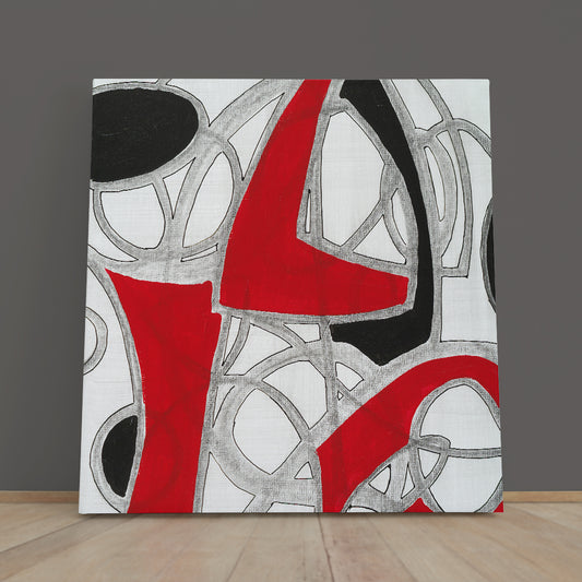
MODERN ABSTRACT EXPRESSIONISM RED BLACK GREY WHITE
Regular price From $129.99 USDRegular priceUnit price per$173.99 USDSale price From $129.99 USDSale -
LADY Red Gloves Abstract Art Woman Portrait
Regular price From $71.99 USDRegular priceUnit price per$116.99 USDSale price From $71.99 USDSale -
Black Red White Abstract Geometric Modern Minimalism
Regular price From $71.99 USDRegular priceUnit price per$116.99 USDSale price From $71.99 USDSale -
Lord Krishna Religious Abstract
Regular price From $71.99 USDRegular priceUnit price per$116.99 USDSale price From $71.99 USDSale -
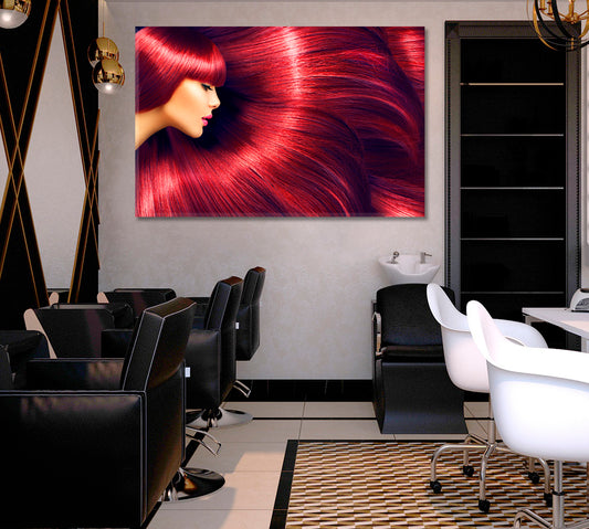
BEAUTY CONCEPT Beautiful Luxurious Long Red Hair
Regular price From $71.99 USDRegular priceUnit price per$116.99 USDSale price From $71.99 USDSale -
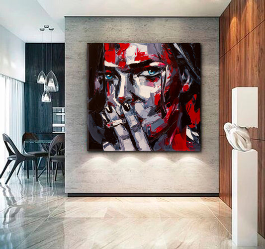
SMOKING GIRL High Life Beauty Woman Modern Art - Square Panel
Regular price From $71.99 USDRegular priceUnit price per$116.99 USDSale price From $71.99 USDSale -
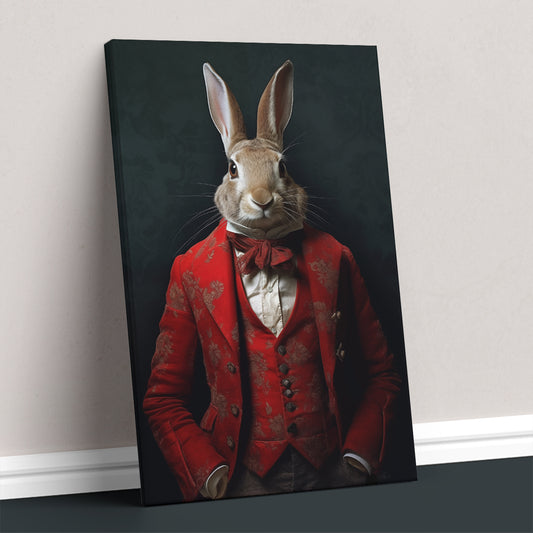
Rabbit in Victorian Red Suit
Regular price From $129.99 USDRegular priceUnit price per$173.99 USDSale price From $129.99 USDSale -
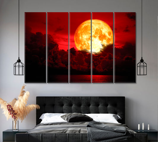
Eclipse Full Blood Moon Fabulous Landscape
Regular price From $71.99 USDRegular priceUnit price per$116.99 USDSale price From $71.99 USDSale -
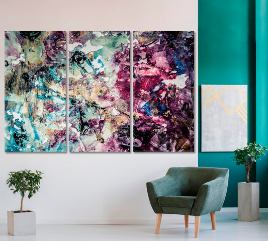
Creative Bright Stain Contemporary Abstract Composition
Regular price From $71.99 USDRegular priceUnit price per$116.99 USDSale price From $71.99 USDSale -
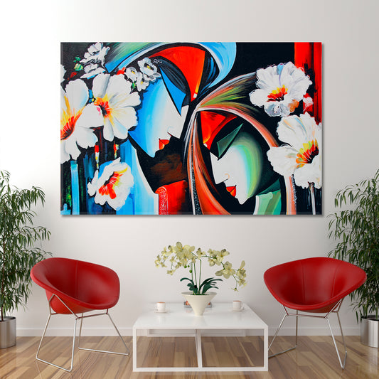
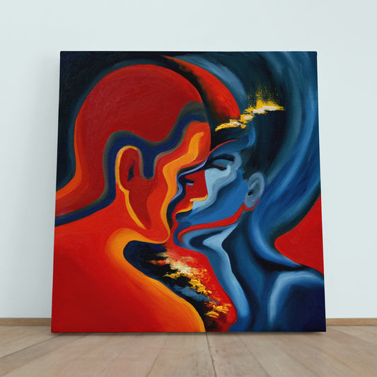
KISS Blue And Red Abstract Modern Painting
Regular price From $71.99 USDRegular priceUnit price per$116.99 USDSale price From $71.99 USDSale -
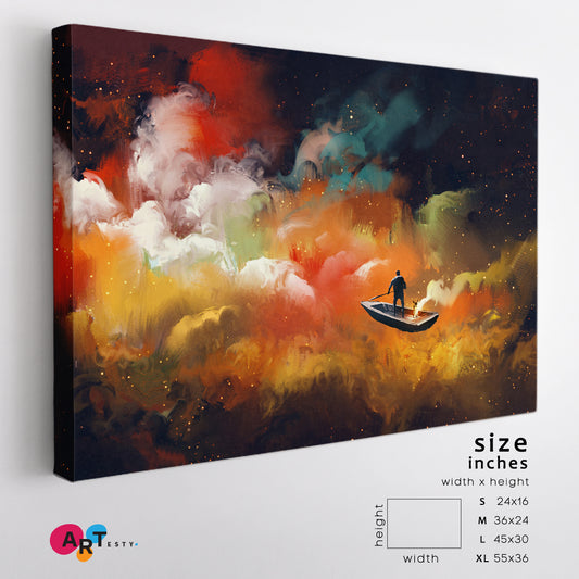
Surreal Dreamlike Man on Boat Outer Space Colorful Clouds
Regular price From $71.99 USDRegular priceUnit price per$116.99 USDSale price From $71.99 USDSale -
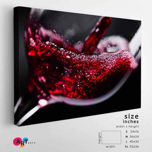
RED WINE Red on Black
Regular price From $71.99 USDRegular priceUnit price per$116.99 USDSale price From $71.99 USDSale -
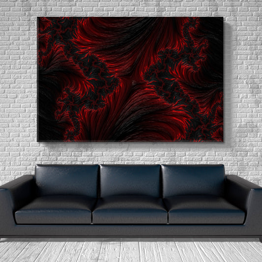
FRACTAL BLACK RED Graphic Design Abstract Creative Pattern
Regular price From $71.99 USDRegular priceUnit price per$116.99 USDSale price From $71.99 USDSale -

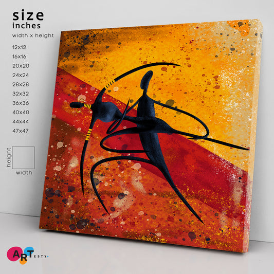 Sale
SaleAfrican Motives
Regular price From $71.99 USDRegular priceUnit price per$116.99 USDSale price From $71.99 USDSale -
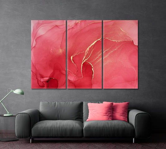
CERISE Pink Red Tones Abstract Fluid Ink Colors
Regular price From $71.99 USDRegular priceUnit price per$116.99 USDSale price From $71.99 USDSale -
Black Panther Animal Decor, Wild Cats Art
Regular price From $129.99 USDRegular priceUnit price per$173.99 USDSale price From $129.99 USDSale -
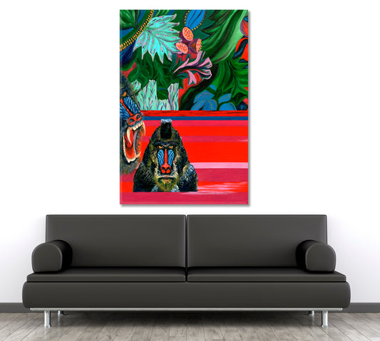
Vivid Tropical Forest And Monkey
Regular price From $129.99 USDRegular priceUnit price per$173.99 USDSale price From $129.99 USDSale -
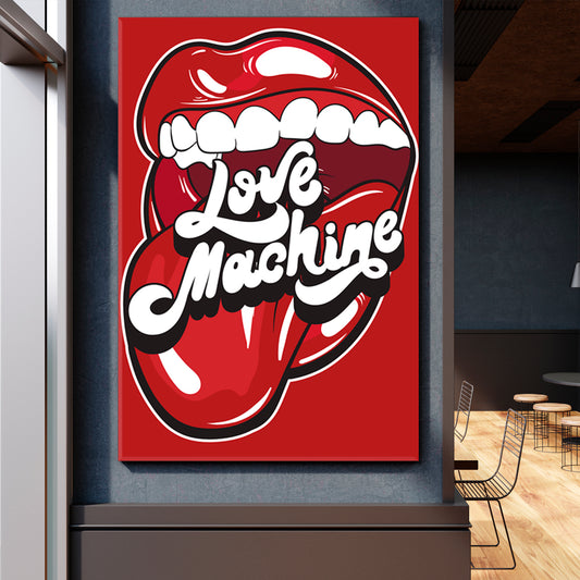
Love Machine Open Mouth Poster
Regular price From $129.99 USDRegular priceUnit price per$173.99 USDSale price From $129.99 USDSale -
Rolling Stones Tongue Open Mouth Rock And Roll Poster
Regular price From $71.99 USDRegular priceUnit price per$116.99 USDSale price From $71.99 USDSale -
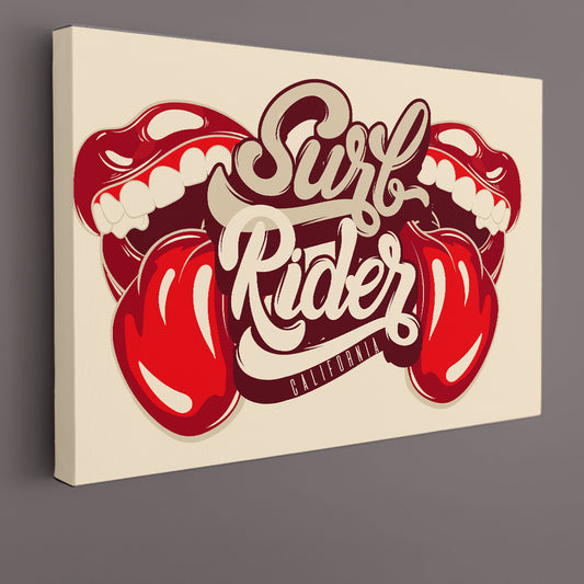
Surf Rider California Rock & Roll Mouth With Tongue Poster
Regular price From $71.99 USDRegular priceUnit price per$116.99 USDSale price From $71.99 USDSale -
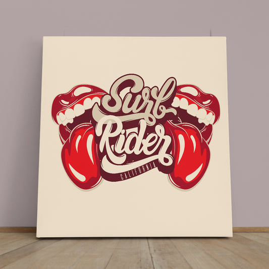
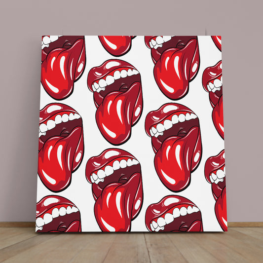
Mouth With Tongue Large Square Poster
Regular price From $71.99 USDRegular priceUnit price per$116.99 USDSale price From $71.99 USDSale -
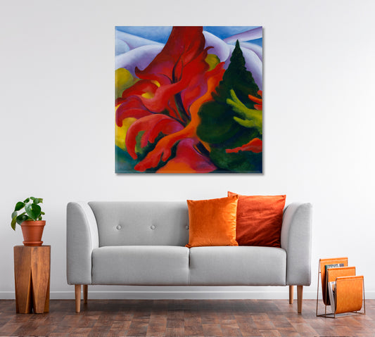
NATURE Georgia o Keeffe Inspired Abstract Style Art
Regular price From $71.99 USDRegular priceUnit price per$116.99 USDSale price From $71.99 USDSale -
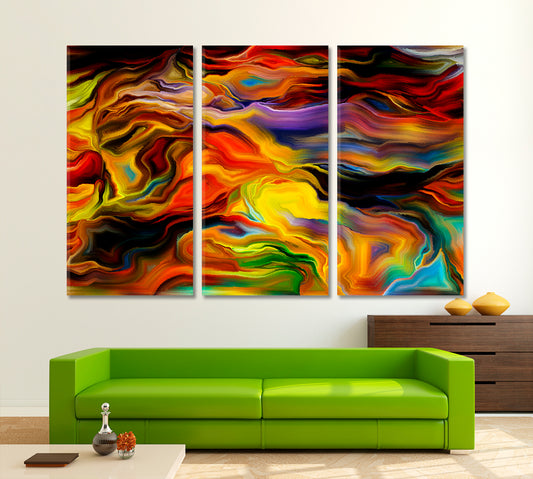
ABSTRACT ART BEAUTIFUL Interlacing of Colored Lines
Regular price From $71.99 USDRegular priceUnit price per$116.99 USDSale price From $71.99 USDSale

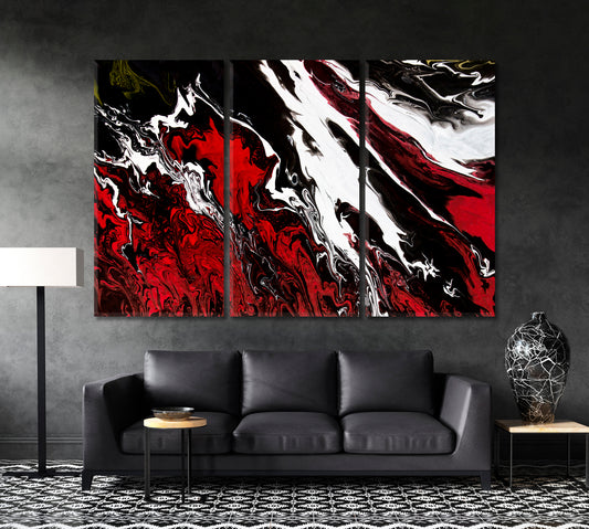

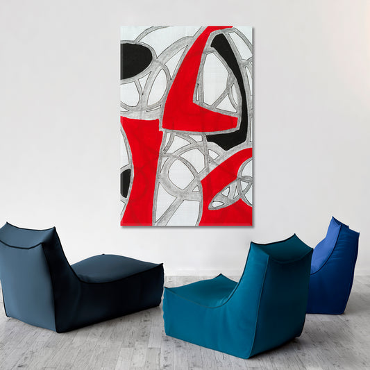

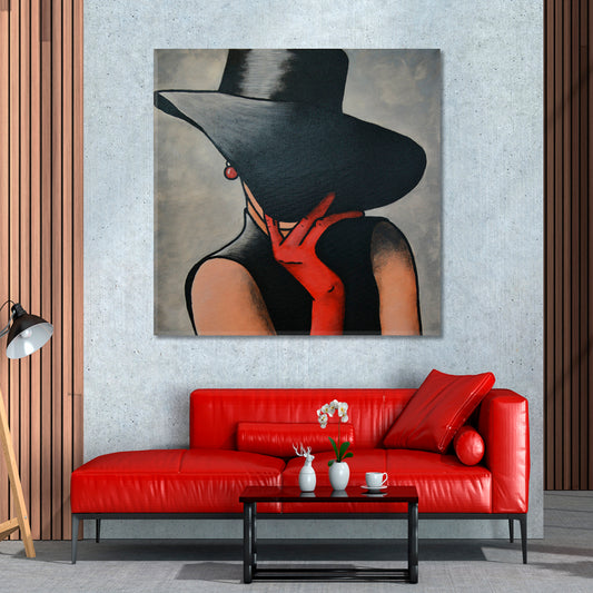





















Red wall art brings clear color contrast to an interior and can become the main visual point on an open wall. This collection includes red canvas prints with abstract shapes, black and white details, expressive portraits, floral subjects, geometric compositions, and painted textures. The range covers both color-led designs and artwork where red appears as a controlled accent.
Choose a design according to the colors already present in the room, the available wall space, and the amount of natural or artificial light. Deep burgundy and dark red work well with charcoal, black, brown, and warm wood, while brighter red shades can be paired with white, gray, beige, or cream surroundings.
Red Abstract Wall Art
Abstract compositions are one of the main directions in this collection. They include fluid forms, painted marks, geometric structures, layered textures, and combinations of red with black, white, gray, gold, or neutral tones.
Red abstract wall art can work as a central piece above a sofa, dining table, console, desk, or low cabinet. In rooms with simple furniture and plain walls, a composition with strong red sections can add definition without requiring several decorative objects around it.
For a wider selection of non-figurative subjects, explore the abstract canvas art collection.
- Choose red and black artwork for clear contrast.
- Use red, white, and gray designs in light modern interiors.
- Consider textured or painted compositions for rooms with simple surfaces.
- Select geometric artwork when the furniture has clean, straight lines.
Red and Black Wall Art
Red and black wall art creates a clear color structure for modern living rooms, dining rooms, home offices, studios, game rooms, and commercial interiors. Black provides a stable background or outline, while red directs attention to selected parts of the composition.
This pairing works especially well with black lighting fixtures, dark shelving, metal furniture, charcoal upholstery, or small red details already used in the room. To avoid making the wall feel too heavy, keep enough open space around the canvas and use balanced lighting.
For designs focused on dark tones without a strong red element, see the black wall art collection. For lighter monochrome combinations, browse black and white wall art.
Portraits and Figurative Red Canvas Prints
Portrait and figurative artwork often uses red in clothing, lips, accessories, backgrounds, or graphic details. These controlled accents make the subject easy to notice while keeping the composition suitable for a wide range of interiors.
A red portrait canvas can be placed above a sideboard, console table, dressing table, reading chair, or desk. Portraits with a simple background are easier to combine with patterned furniture, while detailed compositions usually look better against a plain wall.
Browse the people and portrait canvas art collection for more artwork focused on faces and figures.
Floral Designs with Red Accents
Floral artwork may feature red roses, poppies, abstract petals, botanical forms, or close-up flower details. These designs can introduce red in a softer way than a fully abstract or geometric composition.
Red floral canvas prints can be used in bedrooms, dining rooms, entryways, beauty spaces, home offices, and living rooms. They pair naturally with cream walls, warm wood, brass details, beige textiles, and small green botanical elements.
For more flower and plant subjects in other color combinations, visit the floral and botanical wall art collection.
Choosing Red Wall Art for a Living Room
In a living room, start by identifying the main wall and the largest piece of furniture near it. A canvas above a sofa should relate to the sofa width without extending beyond its outer edges. Leave visible wall space around the artwork so the composition does not feel crowded.
Red wall art for a living room can connect with small existing details such as cushions, books, ceramics, rugs, or lamps. The colors do not need to match exactly. A dark burgundy print can work with brick red textiles, while a bright scarlet accent can be balanced by softer cream or gray surroundings.
- Use one clear focal piece above a main sofa or console.
- Keep surrounding wall decor limited when the artwork contains many details.
- Position the center of the canvas close to normal eye level.
- Check how the red tones look in both daylight and evening lighting.
Red Canvas Prints for Bedrooms and Dining Rooms
For a bedroom, consider designs with controlled red sections, neutral backgrounds, or simple flowing forms. Dark red, burgundy, muted terracotta, and red-brown combinations are generally easier to coordinate with bedding, curtains, and wooden furniture than compositions dominated by bright red.
In a dining room, stronger red and black combinations can work above a sideboard or on the main wall beside the table. Choose a landscape or horizontal orientation for a wide wall, and a portrait orientation for narrow wall sections between doors, windows, or furniture.
Red Artwork for Offices and Studios
Red canvas prints can add a clear visual marker to an office, meeting room, reception area, or creative studio. Abstract geometry, architectural details, painted textures, and controlled color-block compositions are practical choices for professional interiors.
When selecting office wall art, consider where the canvas will be seen from desks, meeting tables, or entrance areas. Avoid placing highly detailed artwork where it will be partly hidden by monitors, shelving, or tall furniture. A single well-positioned canvas often works better than several unrelated pieces.
For more work-focused options, browse the office wall art collection.
How to Coordinate Red with Other Colors
The secondary colors in the artwork determine how easily it will fit into the room. Review the full composition rather than choosing only by the red sections.
- Red and white: a clear combination for bright interiors and light walls.
- Red and black: suitable for clear contrast and darker furniture.
- Red and gray: works with concrete details, silver finishes, and neutral upholstery.
- Red and beige: connects stronger color with warm neutral surroundings.
- Red and gold: pairs with warm lighting, brass details, and brown wood.
- Red and blue: creates a cooler contrast that works well in graphic and abstract compositions.
Lighting and Placement
Natural daylight can make bright red appear clearer, while warm evening lighting may make burgundy, brick red, and red-brown shades look deeper. Before selecting a final location, compare how the wall looks at different times of day.
Avoid placing canvas prints where direct sunlight remains on the surface for long periods. Position wall lights so they illuminate the artwork evenly without creating a strong reflection or shadow. In rooms with limited daylight, lighter backgrounds and clear white details can help the composition remain readable.
Ready-to-Hang Canvas Construction
Artesty canvas prints are produced with high-resolution printing and pigment inks. The canvas is stretched over wooden stretcher bars, with gallery-wrapped sides that create a clean finished edge.
Hanging hardware is installed, so the artwork arrives ready to place on the wall. Each canvas is prepared with protective packaging and shipped in a sturdy cardboard box to help protect the surface and frame during delivery.
Find the Right Red Wall Art
Choose red wall art by first deciding how much red the room needs. A design dominated by red can become the main feature of a simple interior, while a black, white, gray, or beige composition with smaller red accents can connect with existing furniture and decor more quietly.
Compare abstract, figurative, floral, geometric, and painted designs, then select an orientation and size that match the available wall. The final choice should fit both the color structure of the room and the viewing distance from which the artwork will usually be seen.



Photo Review - Get 15% Off
- Show us how your canvas looks in your space
- Send your photo to:[info.artesty@gmail.com]
- We’ll send you a promo code for your next order
We’re happy to be part of your space 💛
Need something custom or got a question? Drop us a message — we’ve got you covered!
-

We use high-quality, durable canvas and eco-friendly pigment inks. Every image is carefully color-corrected for sharpness and rich, vivid tones.
-

Each canvas is hand-stretched onto a sturdy wooden stretcher bar using a gallery wrap technique—the image continues around the edges, giving it a modern, ready-to-hang look.
Your canvas comes with pre-installed metal hardware, making it easy to hang on the wall -

We protect each canvas with:
multiple layers of bubble wrap for impact protection and a sturdy cardboard box for worldwide shipping.


