
-
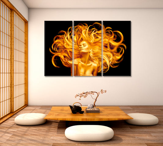
BEAUTIFUL WOMAN Fluttering Hair Fashion Art Portrait Hairstyle Beauty Salon Concept
Regular price From $71.99 USDRegular priceUnit price per$116.99 USDSale price From $71.99 USDSale -
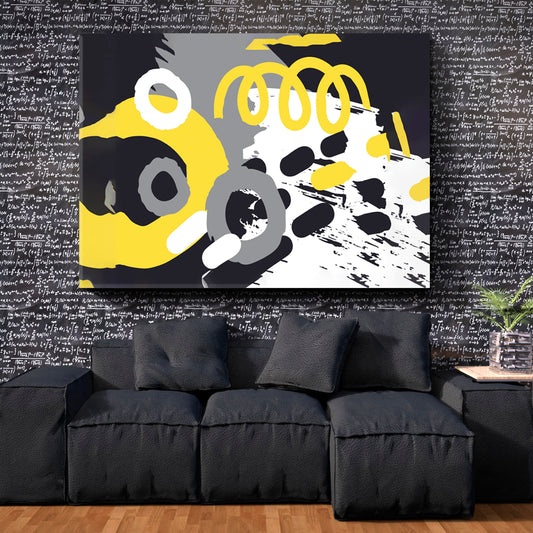
TRENDY GRAY YELLOW Illuminating and Ultimate Grey Colors of the Year 2024
Regular price From $71.99 USDRegular priceUnit price per$116.99 USDSale price From $71.99 USDSale -
Abstract African Art Vivid Shapes
Regular price From $71.99 USDRegular priceUnit price per$116.99 USDSale price From $71.99 USDSale -
MODERN ART Interlacing Colored Lines
Regular price From $71.99 USDRegular priceUnit price per$116.99 USDSale price From $71.99 USDSale -
Ego and Nature Abstract Allegory
Regular price From $71.99 USDRegular priceUnit price per$116.99 USDSale price From $71.99 USDSale -
Man Riding Old Retro Bicycle Graffiti Style Yellow Poster
Regular price From $129.99 USDRegular priceUnit price per$173.99 USDSale price From $129.99 USDSale -
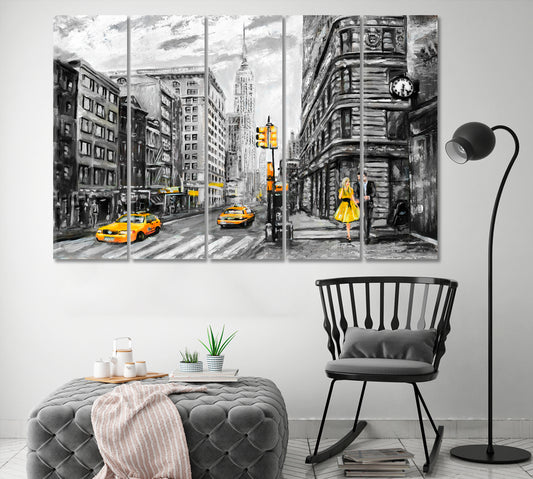
Romantic Gray Yellow New York Man Woman Modern Art
Regular price From $71.99 USDRegular priceUnit price per$116.99 USDSale price From $71.99 USDSale -
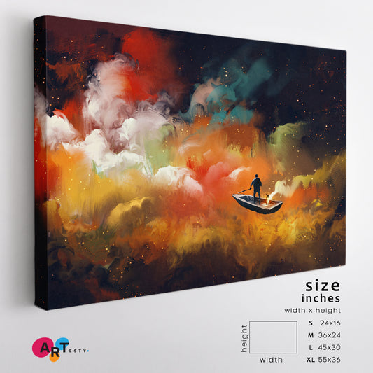
Surreal Dreamlike Man on Boat Outer Space Colorful Clouds
Regular price From $71.99 USDRegular priceUnit price per$116.99 USDSale price From $71.99 USDSale -
Yellow Green Blue Mixing Ink Colors Marble Pattern
Regular price From $71.99 USDRegular priceUnit price per$116.99 USDSale price From $71.99 USDSale -
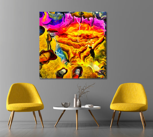
ABSTRACT Thoughts And Emotion Contemporary Surrealism
Regular price From $71.99 USDRegular priceUnit price per$116.99 USDSale price From $71.99 USDSale -
Beautiful Abstraction
Regular price From $71.99 USDRegular priceUnit price per$116.99 USDSale price From $71.99 USDSale -
Group Of Kangaroo Jumping On Moonlight
Regular price From $71.99 USDRegular priceUnit price per$116.99 USDSale price From $71.99 USDSale -
The Creation of Adam by Michelangelo Modern Art
Regular price From $71.99 USDRegular priceUnit price per$116.99 USDSale price From $71.99 USDSale -
NFT Poster Abstract EYE Mustard Yellow
Regular price From $71.99 USDRegular priceUnit price per$116.99 USDSale price From $71.99 USDSale -
Abstract Figurative Portrait Gustav Klimt Style
Regular price From $71.99 USDRegular priceUnit price per$116.99 USDSale price From $71.99 USDSale -
SPACE ALIEN Beautiful African Girl With Red Black Body Paint Art
Regular price From $71.99 USDRegular priceUnit price per$116.99 USDSale price From $71.99 USDSale -
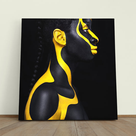
SPACE ALIEN Beautiful African Girl With Yellow Black Body Paint Art
Regular price From $71.99 USDRegular priceUnit price per$116.99 USDSale price From $71.99 USDSale -
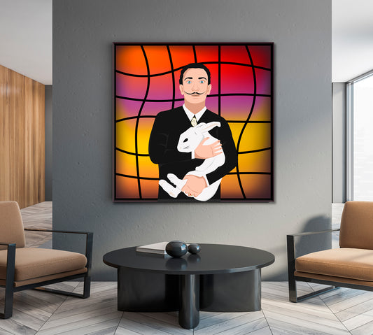
Abstract Portrait Of Salvador Dali With Rabbit
Regular price From $71.99 USDRegular priceUnit price per$116.99 USDSale price From $71.99 USDSale -
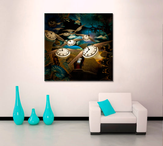
FLOW OF TIME Lord Eye And Winged Clocks Surreal Painting
Regular price From $71.99 USDRegular priceUnit price per$116.99 USDSale price From $71.99 USDSale -
MEN'S MIND PUZZLE Surreal Сonsciousness Art Composition
Regular price From $71.99 USDRegular priceUnit price per$116.99 USDSale price From $71.99 USDSale -
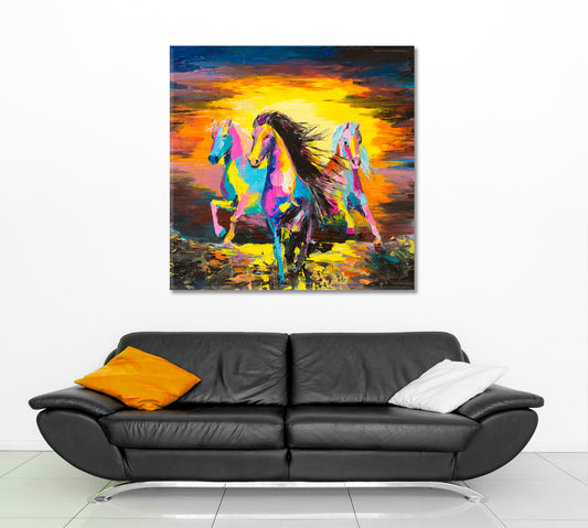
VIVID FINE ART Racing Horses
Regular price From $71.99 USDRegular priceUnit price per$116.99 USDSale price From $71.99 USDSale -
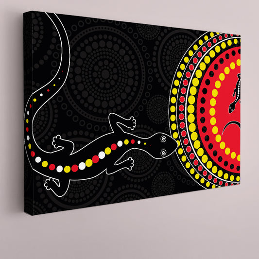
BLACK AND RED Lizard Abstract African Style Pattern Vivid Art
Regular price From $71.99 USDRegular priceUnit price per$116.99 USDSale price From $71.99 USDSale -
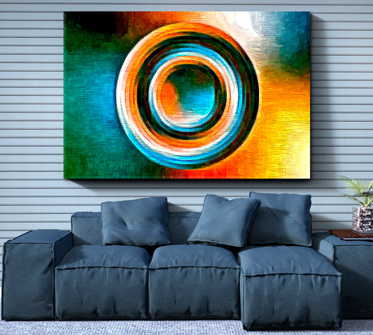
Colored Circle Focal Point Turquoise Orange Geometric Shape Modernism
Regular price From $71.99 USDRegular priceUnit price per$116.99 USDSale price From $71.99 USDSale -
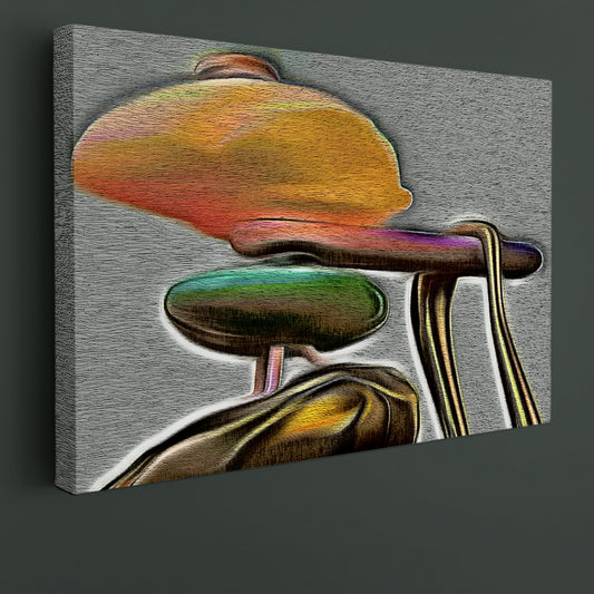
Contemporary Psychedelic Shape Orange Gray Painting
Regular price From $71.99 USDRegular priceUnit price per$116.99 USDSale price From $71.99 USDSale






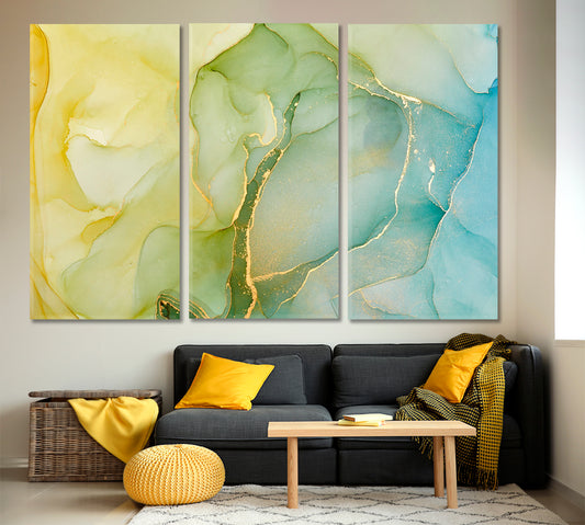

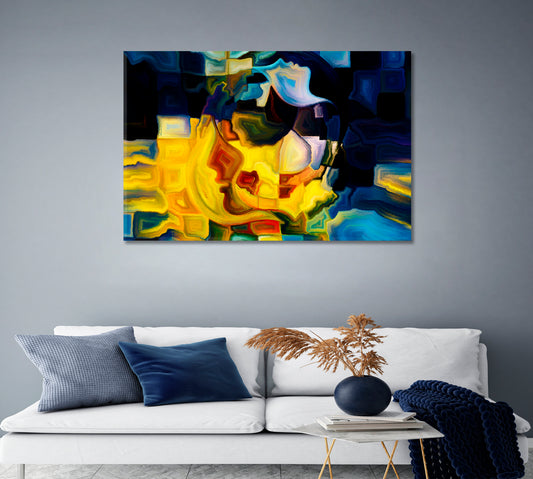

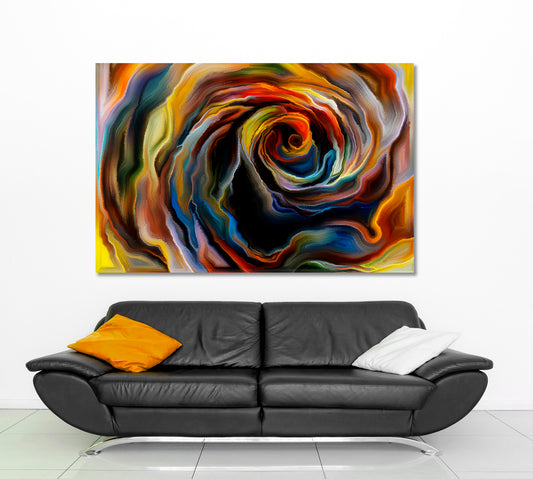

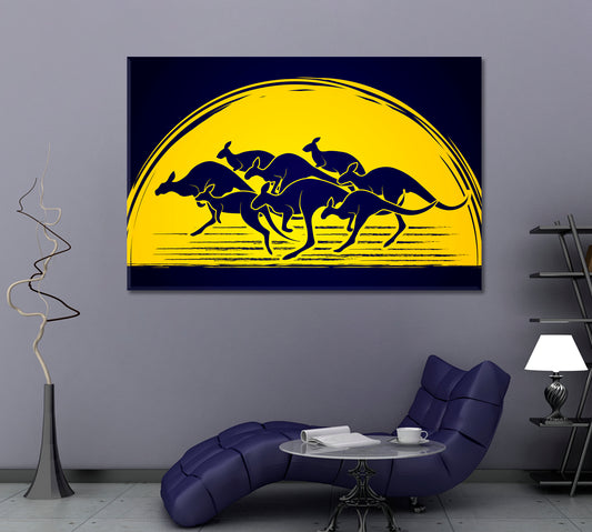

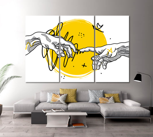

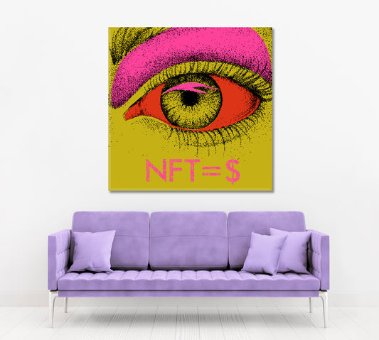

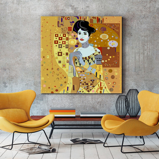

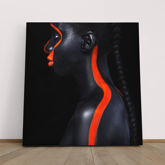








Yellow wall art brings mustard, gold, lemon, ochre, and soft yellow tones into a room through abstract compositions, portrait details, floral subjects, marble patterns, city scenes, animal artwork, and modern painted designs. This collection includes both artwork where yellow is the main color and pieces where yellow appears as a controlled accent.
Yellow works well with white, gray, cream, beige, black, natural wood, brass details, brown leather, and small green or blue accents. A soft yellow canvas can support a light neutral room, while mustard and gold-yellow artwork can create a stronger color point on a plain wall.
Yellow Abstract Wall Art
Abstract artwork is one of the clearest ways to use yellow. In this collection, yellow can appear through painted marks, geometric lines, marble-like movement, fluid color, surreal compositions, and layered shapes. These designs are useful when the wall needs color without relying on a specific object or scene.
Yellow abstract wall art can work above a sofa, bed, console, desk, or dining sideboard. A gray and yellow canvas can fit modern interiors with cooler furniture, while a warmer mustard design can connect with wood, beige textiles, brass lamps, and brown accents.
For more non-figurative designs in other palettes, browse the abstract canvas art collection.
- Choose yellow and gray artwork for modern neutral rooms.
- Use mustard yellow with beige, brown, and natural wood.
- Select yellow and black designs for stronger contrast.
- Consider marble or fluid artwork for rooms with simple furniture.
Mustard, Gold and Soft Yellow Canvas Prints
Yellow covers a wide range of tones, so the exact shade matters. Some artworks lean toward soft lemon and pale yellow, while others include mustard, ochre, gold, amber, orange, gray, black, or cream. Review the full palette before choosing a piece for a specific room.
If the room already includes light walls, cream textiles, or pale wood, softer yellow canvas prints are usually easier to place. If the room has dark shelving, black metal, leather, or charcoal upholstery, mustard and gold-yellow designs can create a clearer contrast.
For cooler neutral combinations, see the gray wall art collection. For warmer yellow-gold tones, browse gold wall art.
Yellow Floral, Nature and Animal Designs
Yellow can appear naturally in floral subjects, plant details, animal artwork, and nature-inspired compositions. These designs can add warm color while keeping the subject easy to understand.
Yellow floral canvas prints can work in bedrooms, dining rooms, entryways, studios, and living rooms. Animal and nature-led pieces can fit rooms with wood furniture, green plants, woven textures, and simple neutral walls.
For more plant and flower subjects in other color combinations, visit the floral and botanical wall art collection.
Yellow Portrait and Figurative Artwork
Portrait and figurative designs can use yellow in clothing, backgrounds, body paint, lighting effects, hair, accessories, or graphic details. These works are useful when you want a human subject but still want the page to stay focused on a color-led wall art choice.
A yellow portrait canvas can work above a console table, dressing area, reading chair, desk, or bedroom wall. Designs with a simple background are easier to combine with patterned textiles, while more detailed compositions usually need a quieter wall around them.
Yellow Wall Art for Living Rooms
In a living room, yellow wall art can become the main color point above a sofa, fireplace, media unit, or console. A wide horizontal canvas usually works well above long furniture, while a square or vertical format can fit better between windows, shelves, or narrow wall sections.
Yellow pairs well with gray upholstery, white walls, beige rugs, black metal, brown leather, natural wood, brass lighting, and small green plants. If the artwork contains strong mustard or black contrast, leave enough open wall space around the canvas so the composition stays readable.
- Use one main canvas above the sofa or console.
- Repeat one small yellow, mustard, or gold detail elsewhere if the room needs connection.
- Choose softer yellow artwork for smaller or darker rooms.
- Use stronger yellow contrast on open walls with balanced lighting.
Yellow Canvas Prints for Bedrooms
For a bedroom, yellow works best when the artwork has a controlled palette, soft contrast, or open space. Pale yellow, cream-yellow, muted mustard, and yellow-gray designs can pair with white bedding, beige walls, light wood, gray textiles, and warm neutral curtains.
Above a bed, choose a canvas that relates to the width of the headboard without extending too far beyond it. If the room already has patterned bedding or detailed textiles, a simpler yellow composition is usually easier to place.
Yellow Artwork for Dining Rooms and Entryways
In a dining room, yellow artwork can work above a sideboard, buffet, or main wall near the table. Abstract, floral, marble, city, and nature-inspired designs are practical choices because they add color without making the room feel crowded.
For an entryway or hallway, choose artwork that remains clear from a short viewing distance. Vertical yellow canvas prints can work well on narrow walls, while square designs can fit above a console table or small bench.
Yellow Wall Art for Offices and Studios
In an office or studio, yellow canvas prints can add a clear color direction without using a dark palette. Abstract lines, geometric forms, gray-yellow compositions, painted textures, and modern portrait designs can work behind a desk, near shelving, or beside a meeting area.
For professional interiors, avoid placing detailed artwork where it will be partly hidden by monitors, tall storage, or equipment. A single clear canvas on an open wall usually works better than several unrelated pieces placed close together.
For more work-focused wall decor, browse the office wall art collection.
How to Match Yellow with Room Colors
Yellow is easier to place when you decide whether the room needs a soft yellow tone, a mustard accent, or a stronger gold-yellow color. The best match depends on the wall color, furniture finish, lighting, and surrounding textiles.
- Yellow and white: a clean pairing for bright rooms and simple walls.
- Yellow and gray: works with modern furniture, concrete tones, and silver details.
- Yellow and beige: connects warm artwork with neutral furniture and natural textures.
- Yellow and black: creates defined contrast for modern interiors.
- Yellow and gold: works with brass lamps, warm lighting, and brown wood.
- Yellow and orange: suits warmer abstract and painted compositions.
For a stronger warm-color direction, explore the orange wall art collection.
Lighting and Placement
Yellow tones can change throughout the day. Natural daylight may make pale yellow and lemon details appear lighter, while warm evening lighting can make mustard, ochre, and gold-yellow areas look deeper. Before choosing the final wall, compare how the artwork looks in both daylight and artificial light.
Avoid placing canvas prints where direct sunlight stays on the surface for long periods. In rooms with limited daylight, choose artwork with lighter backgrounds, white areas, or clear contrast so the composition remains visible from a normal viewing distance.
Ready-to-Hang Canvas Construction
Artesty canvas prints are produced with high-resolution printing and pigment inks. The canvas is stretched over wooden stretcher bars, with gallery-wrapped sides that create a finished edge around the frame.
Hanging hardware is installed, so the artwork arrives ready to place on the wall. Each canvas is prepared with protective packaging and shipped in a sturdy cardboard box to help protect the print and frame during delivery.
Find the Right Yellow Wall Art
Choose yellow wall art by deciding whether the room needs soft yellow, mustard, ochre, or gold-yellow tones. A lighter canvas can support a neutral bedroom or living room, while artwork with stronger yellow areas can become the main color point on a plain wall.
Compare abstract, floral, portrait, nature, city, marble, and painted designs, then choose the orientation and size that fit the available wall. The final choice should match both the room palette and the distance from which the artwork will usually be seen.



Photo Review - Get 15% Off
- Show us how your canvas looks in your space
- Send your photo to:[info.artesty@gmail.com]
- We’ll send you a promo code for your next order
We’re happy to be part of your space 💛
Need something custom or got a question? Drop us a message — we’ve got you covered!
-

We use high-quality, durable canvas and eco-friendly pigment inks. Every image is carefully color-corrected for sharpness and rich, vivid tones.
-

Each canvas is hand-stretched onto a sturdy wooden stretcher bar using a gallery wrap technique—the image continues around the edges, giving it a modern, ready-to-hang look.
Your canvas comes with pre-installed metal hardware, making it easy to hang on the wall -

We protect each canvas with:
multiple layers of bubble wrap for impact protection and a sturdy cardboard box for worldwide shipping.


